Logo: what it is, its types and how to use it in your brand and your emails
Logotype, isotype, imagotype or isologo: what each one is and how to make the most of yours, in your emails too
A logo (or logotype) is a graphic symbol that represents a company, brand or product. The dictionary of the Royal Spanish Academy (RAE) defines it as the “distinctive graphic symbol of a company, commemoration, brand or product”, and lists “logo” as its short form.
It can include the brand name, an icon, or both, and its goal is to be easily recognizable.
Think of brands like Nike or Apple.
You can probably picture their logos instantly, and just seeing them likely brings up some emotion or idea connected to the brand, right?
That’s what a good logo does: it creates an instant emotional connection.
It’s a key piece of any company’s visual identity and, at the same time, works as a symbolic representation of everything that company or product offers.
A good logo is memorable, simple and conveys the values and personality of the brand.
The evolution of logos over time
Logos have evolved quite a bit over time.
In the early decades of the 20th century, logos tended to be more elaborate, with lots of detail and ornamentation.
However, as advertising and marketing developed, logos followed a trend toward simplicity and clarity.
A good example of this is Apple’s famous logo.
In the beginning, Apple’s logo was a complex drawing, with details including Isaac Newton sitting under a tree.
Over time, it was simplified to the iconic bitten apple we know today. Changes like this are often part of a rebranding.
This change wasn’t arbitrary: simpler logos are easier to remember and therefore much more effective from a marketing perspective.
Why does a good logo matter so much?
There are several important aspects to consider at this point.
First impression
It’s your brand’s business card.
A potential customer forms their first impression of your company within seconds of seeing your logo.
If your logo looks outdated or poorly designed, people will form a negative brand image, even if you offer high-quality products or services.
Brand identity
A well-designed logo strengthens brand identity.
It becomes a visual symbol that captures the company’s values and mission.
It also generates consistency across all customer touchpoints, whether on your website, social media, packaging, or advertising.
Differentiation
In a saturated market, a unique logo helps you stand out from the competition.
While your product or service may be similar to others, a memorable logo can make consumers choose your brand over others.
Being memorable
Consumers are bombarded with thousands of images and advertising messages every day.
A good logo is simple and striking enough to be remembered, even if people see it for just a second.
Types of logos
Not all logos are the same, and depending on the type of company, different types of logos are used:
Typographic logos or wordmarks
A typographic logo, or wordmark, is simply the company name written in a specific typeface.
Examples of this type of logo include Google or Coca-Cola.
In these cases the typeface carries a lot of weight, since it has to convey the essence of the brand.
Pictorial logos
These logos use a symbol or image to represent the brand.
Examples include the Nike swoosh or Apple’s apple. Some also hide a shape, like the arrow formed by the space between the “E” and the “x” in FedEx: it’s a hidden message, not subliminal advertising, because you can see it if you look closely.
These logos are so strong they can be recognized without the need for words.
Combination logos
A combination logo includes both a symbol and the company name. It’s often accompanied by a slogan or a short phrase.
This is one of the most common types as it offers the best of both worlds.
Examples of combination logos include Adidas or Starbucks.
Abstract logos
An abstract logo doesn’t represent something literal; instead, it uses geometric shapes or abstract concepts to convey an idea.
The electricity company Enel, for example, uses an abstract logo that evokes modernity and sustainability.
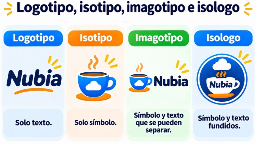
Logotype, isotype, imagotype and isologo
In everyday speech, people say “logo” or “logotype” for any graphic brand mark. In design, however, four forms are distinguished according to how they combine text and image. You don’t need to use the exact term day to day, but it helps when you commission a design or talk to an agency.
| Type | What it includes | When it fits |
|---|---|---|
| Logotype | Text only: the name set in its own typeface | Short names that are easy to read |
| Isotype | Symbol only, no text | Well-known brands that are recognized without the name |
| Imagotype | Symbol and text that can be used separately | The most versatile: the symbol works as an icon on social media or in the app |
| Isologo | Symbol and text merged into a single piece | Brands that are always shown in full |
Make your brand visible in every email
Put your logo in the header of your templates and keep the same style across all your campaigns. Get started for free with Mailrelay.
Elements to consider when designing a logo
Creating a good logo isn’t easy, but keep these factors in mind. If you want to do it yourself, our post on how to create logos for free walks you through the tools and steps.
Simplicity
A logo’s design should be simple.
Remember, the goal is for it to be easily recognizable and memorable.
Logos with too many details or colors can be difficult to reproduce and remember.
Versatility
A good logo must work in a variety of contexts: from a business card to a giant billboard ad.
It should also be adaptable to different colors and sizes without losing its impact.
Relevance
Your logo should reflect what your company does and be aligned with your values.
If you have a tech company, a logo that looks like it’s from the 1980s is probably not the best option.
Timelessness
The goal is for your logo to last for years, even decades.
Designs that are too tied to current trends may look outdated in a few years, which could force you to spend more money on a redesign.
Logos and their relationship with digital marketing
A logo plays an important role in digital marketing.
On websites, social media and email marketing campaigns, the logo is the visual element your customers will see most.
Imagine you’re creating an email marketing campaign: your logo will appear in the header of every email, creating visual consistency and helping strengthen your brand’s presence.
By constantly reminding people of your brand, the logo also builds trust and boosts recognition among your subscribers.
If you use an email marketing tool like Mailrelay, every email you send should stay visually consistent, and your logo is the most visible piece.
By featuring your logo prominently in every email, you strengthen the emotional connection with your subscribers and increase the chances they’ll recognize your brand on other channels.
Your logo in email
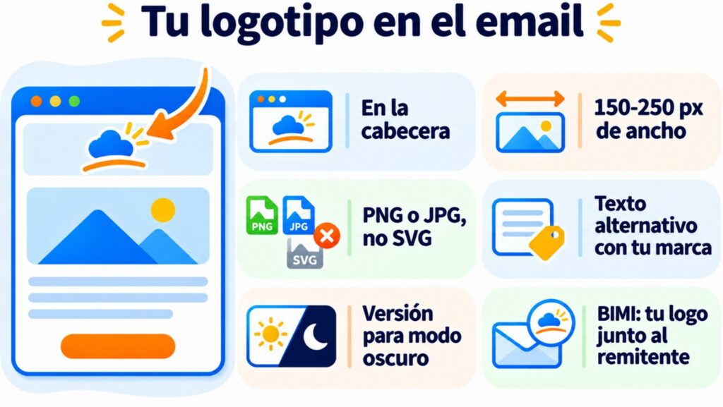
Place it in the header at a moderate width: in a 600 px template, 150-250 px is usually enough. Use PNG or JPG, because many email clients, such as Gmail and Outlook, don’t display SVG. And add alt text with the brand name, since some clients block images until the reader downloads them.
If your logo is dark on a transparent background, it can disappear in dark mode: prepare a version with an outline or a light background. And with BIMI, some inboxes show your logo next to the sender if your domain complies with DMARC.
Examples of iconic logos
Some of the most iconic logos in the world have several things in common: they are simple, memorable, and timeless:
- Nike: the swoosh is one of the most recognized logos in the world. It’s simple and conveys movement, which is perfect for a sports brand.
- Apple: the bitten apple is another example of a logo that has become universally recognizable. It reflects innovation and simplicity.
- McDonald’s: the golden arches are a pop culture icon, and their simplicity makes them easy to remember, on top of being present all over the world.
How Mailrelay helps you
In the Mailrelay editor you upload your logo once and place it in the header of your email templates, so all your campaigns go out with the same look. The free account includes up to 80,000 emails a month and carries the Mailrelay logo in the footer, which you can remove for €4.95 a month.
Your logo, your sender, your style
Design your newsletters with your brand and send them from your own domain. Up to 80,000 emails a month for free with Mailrelay.
What to remember about logos
In short, a logo is much more than just a graphic. It’s an integral part of your brand identity.
It’s not only the first impression people will have of your company, but it can also be a key factor in helping you stand out in a competitive market.
If you’re thinking of creating a logo, or redesigning yours, remember these key principles: simplicity, versatility, relevance, and timelessness.
And don’t forget: every time you send an email in your next marketing campaign, that logo will be reinforcing your identity and building a lasting connection with your customers.
Logo FAQs
What’s the difference between a logo and a logotype?
None in everyday use. According to the RAE dictionary, “logo” is the short form of “logotipo” (logotype) and both mean the same thing. In design, “logotype” is sometimes reserved for the text-only version.
What is an advertising logo?
It’s the brand’s own logo used in an ad. It usually goes at the end or in a corner, as a signature, so viewers associate the ad with the company.