The subscriber list is the foundation of any email marketing campaign.
After all, without a list, there can be no email marketing campaign.
Plus, logic tells us that the bigger the list, the more opportunities it will generate.
It’s a simple calculation: if I can make one sale with ten contacts, I can make two with twenty, right?
So, how do you get more contacts for your list?
There are several ways, of course. Offering subscription options to your clients is one, but for “acquisition” mode, forms and landing pages work very well.
That is exactly what we are going to look at.
We’ll discover some strategies and little tricks you can use to make your forms more effective.
Even small changes can have a huge impact on your lead generation results.
Let’s take a look.
- 1 Why are subscription forms and landing pages the key to growing your email list?
- 2 More effective subscription forms = multiply your subscriber list
- 3 Effective landing pages: essential elements to convert visitors into subscribers
- 4 Some tips on your landing page copy, aspects you can’t overlook
- 5 Sales triggers: little things that encourage reader action
- 6 Follow these tips
Why are subscription forms and landing pages the key to growing your email list?
You need forms and landing pages to allow contacts to subscribe to your email list.
You’ve likely seen forms placed in visible spots on websites.
And in the case of landing pages, they are usually the ideal option for converting traffic from campaigns (social media, Google Ads, Facebook Ads, etc.).
In short, they are a means for the traffic arriving at your website or landing page to turn into contacts. Contacts that you can then nurture with your email campaigns.
If you don’t have forms or landing pages, that traffic is simply lost.
Keep in mind that most visitors won’t buy your product or service on their first visit. How can you stay in touch?
Sending emails.
But to send them emails, you need them to sign up via your forms or landing pages.
They are, therefore, essential tools.
More effective subscription forms = multiply your subscriber list
Subscription forms can’t just be thrown together, especially if you want them to be effective.
There are some aspects to keep in mind, principles that, if followed, will help make your forms better.
· Only necessary fields, clean design:
Ideally, the form should have only the necessary fields, such as email and name.
If the form has too many fields, it may seem too complex to fill out, and many visitors won’t do it.
Make sure to ask only for the fields you really need.
This helps the form look visually appealing, easy, and quick to complete.
What else helps?
Keeping the design clean and ensuring elements aren’t cluttered.
That’s very simple with the Mailrelay form editor, for example:
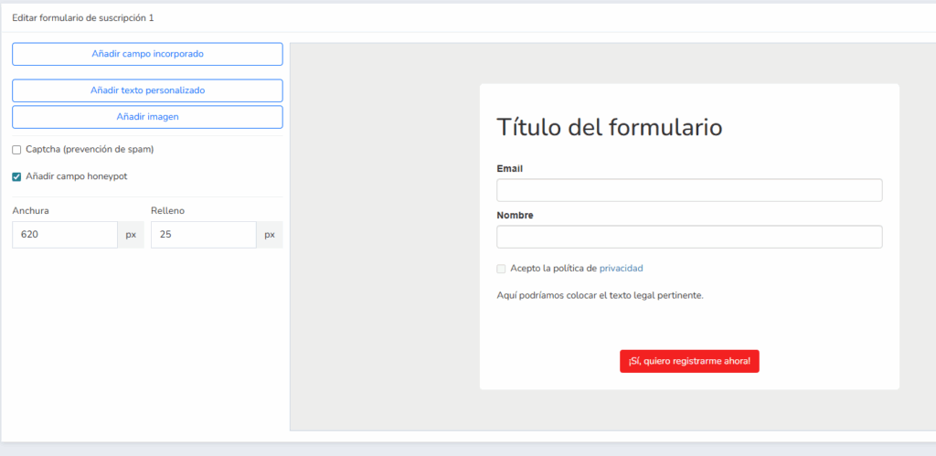
Note that you can adjust the form width, add built-in field blocks (which are the system’s default fields), text blocks, images, and if you had custom fields, that option would appear too.
· And if you want a horizontal form?
That’s easy too.
You can edit the fields (hovering over them reveals the move/edit/delete buttons):
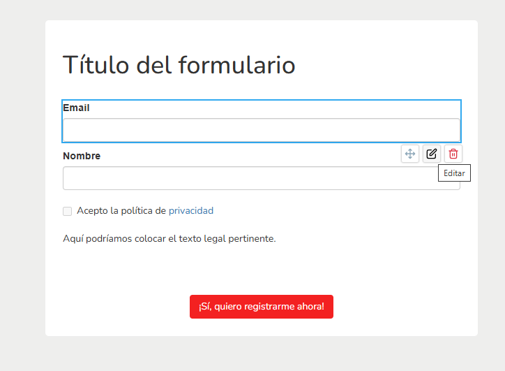
That will take you to this field editing screen:
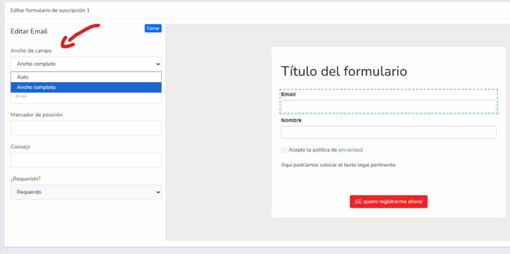
By default, it will be “full width,” making the field use the entire available width of the form.
Choose the “auto” option to have the width selected automatically.
Do the same for the rest of the form fields.
This is how the form would look horizontally:
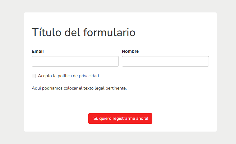
It’s a matter of taste, or what best fits your website’s style.
· Offer an irresistible incentive to get new subscribers:
This sounds obvious, right?
If you want your website visitors to give you their email, you’ll have to give them something in return; it’s only fair.
An email address is personal; most people value it as their own property, and above all, they don’t want to receive spam.
So if you want them to give you something, you’ll have to give them something in return.
For instance
- Discounts (work very well if the traffic is moderately interested)
- Ebooks / exclusive content
- Videos or demos
In general, you need to find a reason for them to subscribe.
And offer it on the subscription form.
Be aware that your website visitors know that subscribing means receiving emails where you’ll want to sell them something.
Knowing that, offer something in return that makes it truly worth their while (this is usually called a lead magnet).
· · Place forms where they can be seen:
Don’t hide the form.
If your website visitors don’t see them, they certainly won’t subscribe.
Which locations are interesting?
- The website header is usually a good spot
- At the end of blog posts
- In the website sidebar, if there is one
- You can also link to the form in your social media bio links
- And of course on landing pages (we’ll see how to do this later in this article)
Generally, if you put it in more locations, it will be easier to capture new subscribers.
· Use clear and attractive calls to action:
The call to action to encourage subscription is usually related to what you offer in exchange for subscribing.
Write something as relevant as possible, such as:
- I want to get my discount now
- Subscribe and download the ebook
- Sign me up for the VIP list
- Etc.
However, it’s important to indicate that the form must make it clear they will receive more emails from you, not just the lead magnet.
· Test, measure, and optimize your forms:
There are many ways to do this, but the easiest is perhaps by viewing the conversions tab of the form itself:
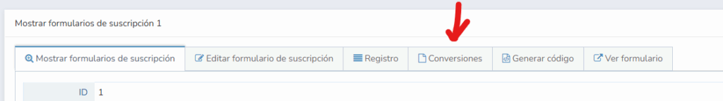
From that screen, you can see which contacts have subscribed using that specific form.
And you can also filter by date.
So when you make adjustments to the subscription form, by filtering by time frames, you’ll know if the subscriber volume is higher or lower.
You can make adjustments and improvements knowing whether they are effective or not.
Until you create the perfect subscription form for your website.
In the following section, we will see how to prepare landing pages.

Effective landing pages: essential elements to convert visitors into subscribers
Although what concerns us in this article is how to get more subscribers for your mailing list, we are going to show some general tips that will work well for any landing page you need to create.
· Impactful headline:
You need to hook the reader.
That’s why the headline is so important; it’s the sentence that will entice the visitor to read on or leave the page.
If they start reading, perfect, we’ve got their attention, and now we have to keep it.
What can you focus on?
For example, on how your product or service solves the visitor’s problems; that usually works.
Or something that grabs attention.
Some classic headline examples:
- What if it happens here? – Christmas Lottery. Starting with a question usually hooks the reader.
- Come home for Christmas – El Almendro Nougat. It hooks by evoking pleasant feelings.
- The taste of coming together – Mahou. Associates pleasant situations with the product.
- We change with you – BBVA. A promise of adaptation to the client’s needs. It hooks because the reader will want to know how and why.
- Electricity prices shouldn’t rule your life – Endesa. A direct statement based on a real problem of the potential customer, effective.
- Life is cool – Desigual. Another statement focused on enjoying life; who doesn’t want that?
If we look closely, most of these headlines don’t speak about the product or service directly.
Why?
Because the goal of the headline isn’t to sell; you have the whole page for that.
The goal of the headline is for the visitor to “start” reading.
We haven’t seen examples of headlines that generate fear, but they are also effective, for example:
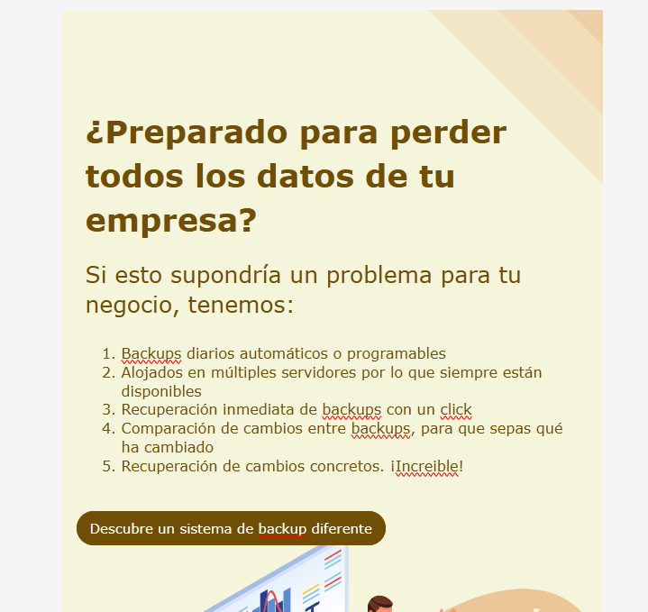
- Are you prepared to lose all your company data?
How would that look in the Mailrelay landing page editor? Something like this:
It’s a basic example, written in a couple of minutes.
Stick with what I was telling you: the headline must be created to encourage reading.
· Brief content focused on benefits:
Whoever visits your landing page wants to see precise information about what they gain from your product or service.
They surely won’t want to see all the information, as that can be quite time-consuming, until they’ve at least reasoned that your product or service is an alternative for their needs.
For instance
The idea is, with little text, to guide the contact with small samples of solutions to their most common problems.
So that they want to keep learning more.
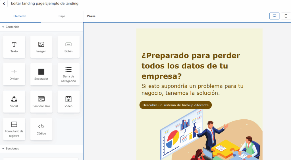
Ideally, you should use images that are related to your product or service.
Remember that with Mailrelay, you have the ability to search for free images:
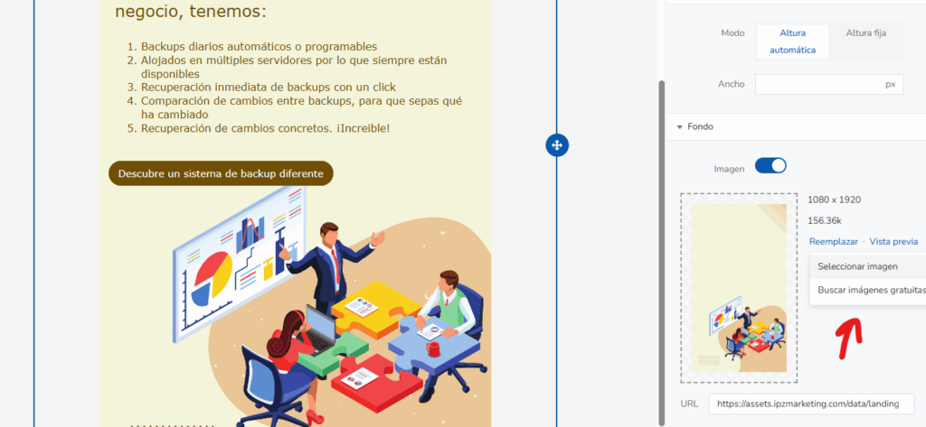
So it’s very easy to create a landing page with the right visual elements.
Plus, nowadays you can generate the images you need with any AI:
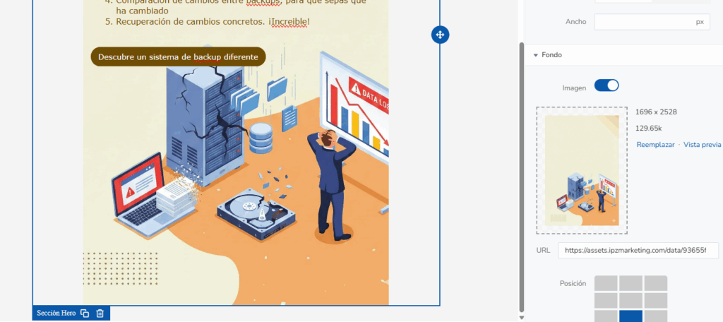
As you can see, you can generate a specific image for whatever you need in a moment.
And this way, your landing page is focused, both in text and images, on what you want to sell.
Therefore, there’s no excuse for using unsuitable or low-quality images.
· Clean design without distractions:
Usually, on a landing page, you don’t want elements that can distract the visitor.
For example, a menu leading to other parts of your website can cause a large part of the traffic to leave the landing page.
Simply out of curiosity.
But surely you don’t want that to happen, so keep the landing page clean of elements that could drive traffic away.
In addition to this:
- Create a clear flow, with headers, paragraphs, and images, that guides naturally to the call to action
- Make the call to action visible, clear, and stand out
- Use white space so as not to visually clutter the page
- And remove distractions
In other words, create a landing page with purpose.
· Visible form following the points discussed in the previous section:
The goal of the article is to show you how to increase your subscriber list, right?
And for that, you’ll have to add a form to your landing page.
For instance
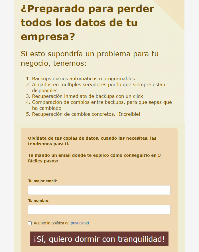
It’s best if the landing page doesn’t have too much content and the form remains as visible as possible.
If the goal is registration, it has to be clear, and possible to do easily.
By the way, don’t forget to publish your landing page to get the final URL:
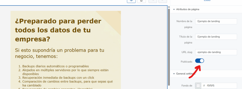
That way you can link that landing page on your website, social networks, or wherever you need.
· Prominent Call to Action (CTA):
The call to action is one of the most important elements.
Usually, you will put it on a button, clearly visible and with compelling text.
They should understand what they will get if they signup.
In the example above, you saw that we put:
- Yes, I want to sleep peacefully!
Of course, who doesn’t.
Offer your potential clients the benefit you know they are looking for.
How do you know?
Well, it will be what you have developed your product or service for, but from a personal perspective.

Some tips on your landing page copy, aspects you can’t overlook
I don’t want to drag on with hundreds of tips you’ll forget.
I want to focus on the practical stuff, what helps you and sticks with you.
· Address the user directly:
This is the best approach.
Speak to the reader as if they were right in front of you:
- Are you prepared to lose all your company data?
It is much better than:
- Most companies could lose their data at any moment
The second is more general, vaguer, and doesn’t specify a problem for the reader.
In fact, the reader might think directly, “that wouldn’t happen to my company.”
However, the first question is direct, aimed at the reader, and makes them think about their specific situation.
In short, speak to your reader in the second person (“you”).
· Specify benefits:
I’m repeating myself, I know.
But it’s one of the things that gets forgotten most quickly because often you want to talk about how great your product or service is.
And that’s normal.
But it doesn’t sell.
What sells is what offers benefits to the reader.
For instance
- Yes, I want to sleep peacefully!
It’s tangible; everyone knows what it is to sleep peacefully. It is, therefore, a tangible benefit.
However:
- I want information about the 24/7 backup
Well, that’s a feature, but it doesn’t specify the benefit.
It’s clear you’ll have to mention this feature at some point, yes, but hook the reader first.
Benefits hook more, because, well, everyone wants something.
First give them what they want (benefit).
Then explain how you do it (feature).
· Create urgency or exclusivity:
Exclusivity sells.
Find a way, if possible, to show your product or service in a more exclusive and unique way.
For example, on the previous page we could add:
- The first 100 sign-ups will receive access to a 14-day free trial.
But be realistic, don’t invent something that seems unbelievable either.
· Maintain a clear and conversational tone:
Generally, this is achieved by avoiding jargon.
How do you avoid jargon?
By focusing on the benefits.
Benefits are usually concrete, clear, and self-explanatory.
However, features are usually technical, complex, and require analysis.
A reader without much time can quickly evaluate benefits, but not features.
Features typically require comparison, analysis, and evaluation.
That doesn’t happen in a few seconds.
However, you automatically know what sleeping well means, right?
· Remove fears and friction:
This would be important too.
The person reading your landing page will see the benefits, which is good.
But of course, they know the problem, and they will have doubts.
Those doubts translate into fears and friction.
They are usually related to:
- The use of the service or product
- The price
- The effectiveness in solving the problem
- Difficulty of use
- Real utility
You can surely think of more regarding your product or service.
The next step?
Answering these fears.
For instance
- When you need to restore your data from a backup, you can do it with just one click. Fast, immediate, just when you need it.
If the problem is the price, try to frame it:
- From just €50 a month, the cost of a coffee, but invested in peace of mind.
· Test different versions and optimize:
Like forms, landing pages also report on conversion volume so you can run tests and evaluate changes.
The recommendation would be to run tests that help you determine which copy is best.
Sometimes small changes lead to significant improvements in sign-ups to your contact list.

Sales triggers: little things that encourage reader action
There are certain elements you can add to your copy to motivate the reader to take the action you want.
We’re going to look at some very interesting ones that you can easily apply to your texts.
Very simple and effective, as they are proven methods.
· Reciprocity
It’s easier to get something (the visitor’s email) if you give something in return; an equal relationship is established.
That’s why we mentioned that the lead magnet is important.
If you give something, it’s easier for the visitor to give you something in return.
What can you give?
As we’ve mentioned: discounts, free trials, ebooks, whatever.
In the example we’ve been discussing, you could state:
- Just for subscribing to our list, you’ll get a 15% discount
· Commitment and Consistency
This tries to appeal to people’s habitual intention to keep their commitments and intentions.
How could we do it in this case?
Let’s continue with the example we’ve been working with.
- If you have already become aware of the importance of your company’s data, the gravity of losing it, and the paralysis of your business, the next step is knowing how to protect, maintain, and recover it when you need it most. We’ll explain it all to you.
It would be a kind of “creating a path” starting from the entry point the visitor themselves acknowledged by visiting the page.
We make them see that, in fact, they already know they are at that point, and from there we continue moving forward.
It’s a simple but convincing process.
· Social Proof
Perhaps the saying “thousands of people can’t be wrong” doesn’t always age well; however, in many situations, not everyone wants to be the first to take a risk.
For example, in the case of your company’s data protection, would you trust a company that thousands of people already use more?
Or would you risk being the first to try a newly created solution?
It’s about stating:
- Thousands of companies already have their data absolutely secure with our service
Also, if you have logos or some comments from these companies rating your product or service, that would be ideal.
Demonstrating in that way that it is a reliable service, effectively serving many companies.
· Authority
This would be the reason why your company or service can demonstrate that it “knows what it’s talking about.”
For instance
- Our team consists of more than 7 computer systems engineers with years of experience in the creation, management, and maintenance of backup systems
You can surely find something similar in your company to demonstrate the security the client seeks and needs.
It can also be related to social proof, although in principle they are different things.
· Liking (Affection)
This can be one of the most emotional ones, where you somehow try to empathize with the person reading the text and show understanding of their problems.
That’s why I recommended above speaking in the second person, directly to the reader.
It is harder to show empathy with abstract groups; it simply takes more effort.
For instance
- We usually talk to our clients to understand their needs. And we know that losing all our data, paralyzing our business, is a huge worry. We don’t want you to feel that emptiness when looking for data that no longer exists, without knowing what to do. That won’t happen to you; we’ll be there to recover your data immediately.
Showing understanding for the problems of others, of potential clients, undoubtedly humanizes your product or service.
Dealing with people who understand you is relaxing and fosters trust.
That can never be a bad thing.
· Aspirational
Discover what your potential client really wants, and give it to them.
Usually, this is somehow related to the benefits we mentioned earlier in the article.
For instance
- Save time for what truly generates profitability for your company; we’ll take care of protecting your data, the data that helps you achieve your goals.
In conclusion, there’s no need to overcomplicate it; it’s mainly about understanding your clients’ real needs.
Follow these tips
If you want to get more contacts for your newsletters or potential clients, use the tips we’ve seen in this article in your forms and landing pages.
You’ll be able to improve them with very little effort, and you will notice the results.
The more time you dedicate to it, the better, obviously, but spending even just half an hour, with this article in front of you, following step by step, will already be much better.