Newsletter examples to inspire you: 13 real cases and templates to copy
13 real newsletter examples, templates by type of business, creative ideas and a corporate newsletter template to copy.
13 real newsletter examples, templates by type of business, creative ideas and a corporate newsletter template to copy.
Looking for newsletter examples to plan your next campaign? You’ve come to the right place.
In this article you’ll find 13 real newsletters from brands like Canva, Casa del Libro and Amazon Music. You’ll also find templates by type of business, creative ideas and a corporate newsletter structure ready to copy.
If you don’t have one yet, before looking at these examples, learn how to create a free newsletter step by step.
You’ll see that most of the examples are simple, even those from big brands. A clean design and a good call to action usually perform better than a cluttered template.
Let’s get to the examples.
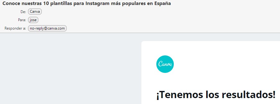
Canva is an interesting alternative to Photoshop that you can use right from your browser. As you can see from this weekly mailing, they send newsletters with content that may interest their users and subscribers, with tips, tricks and guides.
Obviously, they know a thing or two about design, and as you can see, they use a simple newsletter with few elements that gets straight to the point.
A logo, a headline, a featured image, some text with a few tips and a call to action: nothing complicated or superfluous.
I like it because I don’t think anything more is needed.
They’ve published new content, and what they want is for you to visit it and discover tricks and tips that help you use their tool better and get better results with your designs.
To me, it’s an example of a good newsletter for increasing conversions, but maybe what you’re interested in is seeing more sales-oriented examples, right?
Well, don’t worry, you’ll find those in this post too.
For example, the following fashion and perfume newsletter example:
Design your newsletter with Mailrelay
Choose a template, customize it with the drag-and-drop editor and send it today. Free up to 80,000 emails a month.
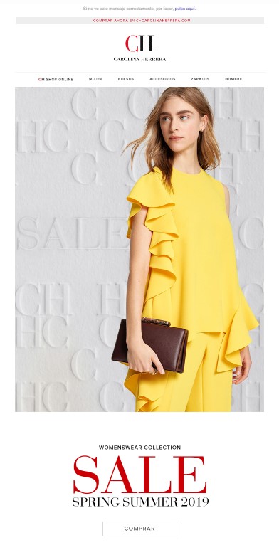
In this case I’m not showing you the full newsletter example, because it’s very long, but the same structure repeats practically all the way through:
True, at the top we see the brand’s logo and a small “menu” of links, but once again this example has a very simple design, and it’s surely not because the brand lacks resources, but because it’s an effective format.
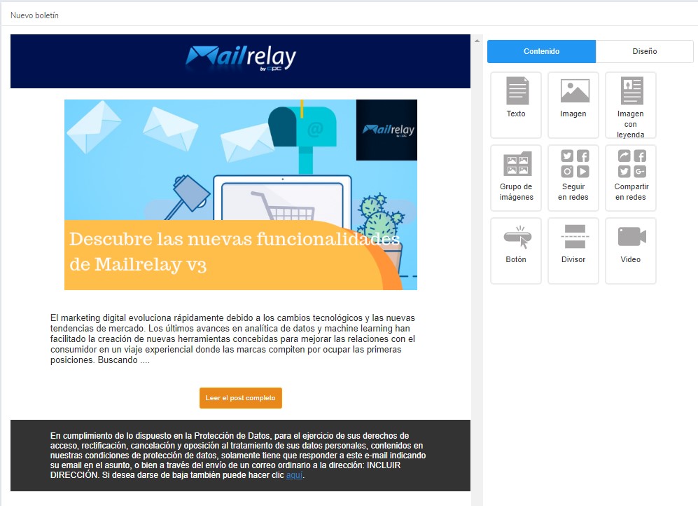
Designing an advertising email like this one is very easy. Using Mailrelay’s newsletter editor, you could have it ready in a few minutes.
Now let’s look at another very, very interesting newsletter example from a celebrity.
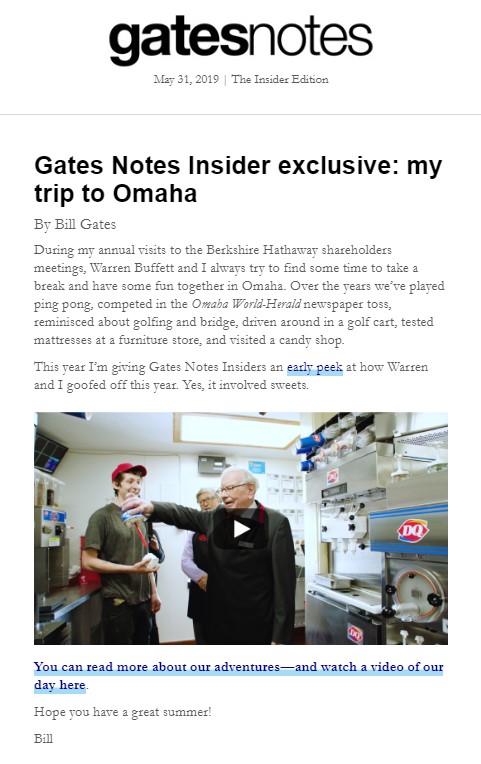
This is what Bill Gates sends from his blog Gates Notes. As with the previous designs, it keeps a plain, simple format, with a few extra touches of color in the underlining of some words (links).
Frankly, we can only conclude that if this type of newsletter design is good enough for Bill Gates, I think it can also work for most people / businesses.
The only distinguishing feature is the inclusion of a video.
Although the video isn’t actually embedded directly: it’s an image that links to the video. This improves compatibility and ensures that most people can watch the video.
Mailrelay’s new newsletter editor lets you add YouTube videos very easily.
In the end, the goal is simply to share the article and video from his blog, and it doesn’t even use a button for that, but a text link instead.
Now let’s move on to another sales newsletter example, for some variety.
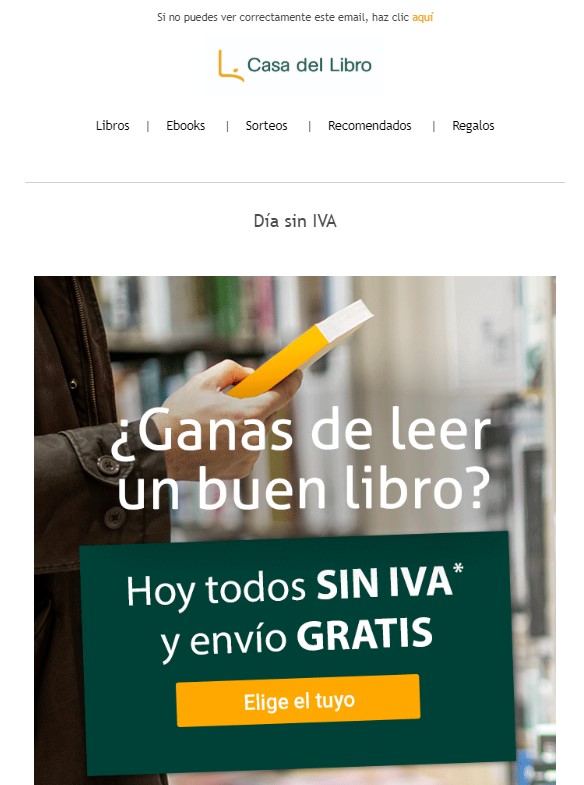
Here we have another simple, schematic email design, with a logo, a menu and an image that includes the call to action. The newsletter’s only goal is to announce the promotion and give the contact a button / link to go to the store and buy.
There’s no need to keep the contact entertained, because what we want is for them to buy, and for that, we have to take them to the store. A simple, short sales text is all we need.
Also, in this case it’s a discount, so it will work for every contact on their list; no heavy optimization is needed.
Let’s switch again and look at an informational newsletter example.
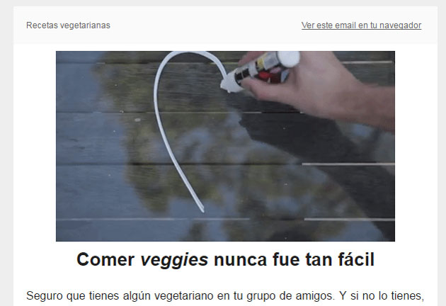
It uses the same layout as the previous mailings: logo, image and text. But in this case the goal isn’t to sell, but to inform the brand’s contacts and customers about important aspects of the service.
So the key to a good design is not to distract the subscriber with superfluous elements, but to get straight to the point and inform.
Let’s keep going with more examples, and since there can’t be a post about newsletter examples without an example from Amazon, here it is.
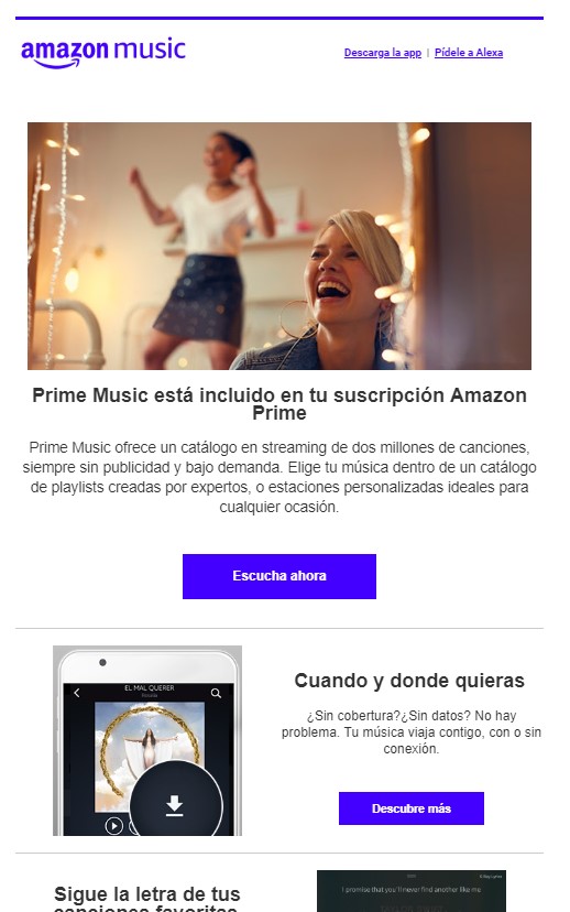
Amazon is undoubtedly one of the companies that makes the most use of email marketing services. Many people get practically one email a day from Amazon, whether it’s:
In short, Amazon makes extensive use of email marketing, although it follows more or less the same layout as the others we’ve seen: image, text and a button with a call to action.
The newsletter is extended with a few more sections to give more information about the service or answer frequently asked questions users may have, but in a fairly light way, linking to the service’s own website to give contacts more information.
Now let’s look at a sales newsletter with a small variation.
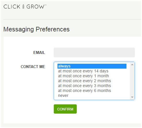
This is one of the shortest texts we’ve seen, with a similar structure, but now the image appears below the call to action.
This way they show the discount code as early as possible, which is ultimately what can help convince the potential customer to buy; it’s the most important part of this email.
Otherwise, the structure is identical to the rest of the examples we’ve seen, and the truth is it’s a very effective structure.
And the next example has no links or buttons at all!
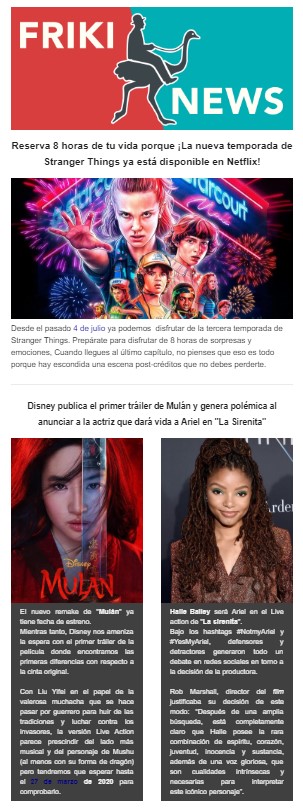
In fact, we only see some images and text, with no links or buttons pointing to the website. It’s simply an informational newsletter, nothing more, meant to be read. It only aims to keep contacts up to date on news and updates that may interest them.
It’s the brand’s attempt to stay top of mind with its customers and potential customers, so that selling its services will be easier in the future.
Even so, the design is very simple, and you could build it with the newsletter editor of any email marketing tool, such as Mailrelay.
It’s a good strategy for staying in touch when we have no offers or anything else to share.
In the end, staying in touch with the customer or subscriber is essential. In the next example you can see another strategy:
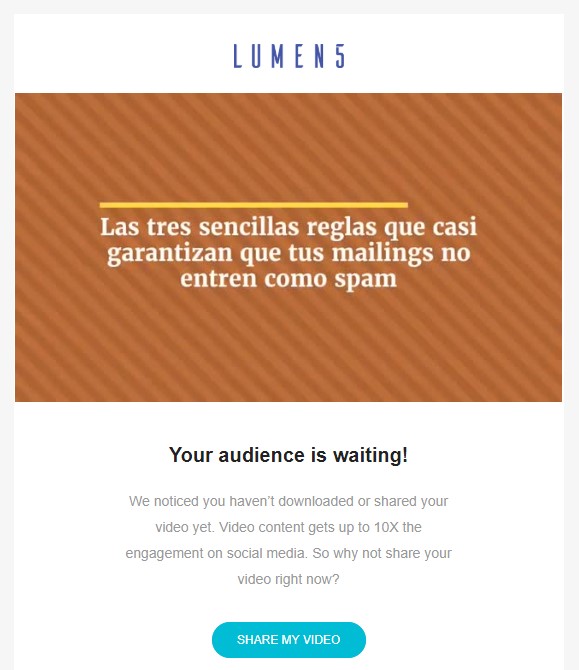
Here we see the same structure: logo, image, text and a clearly visible button with a call to action.
The goal is for us to share a video we’ve created with the Lumen5 tool. The purpose is simply to spread the word: the tool wants us to make videos and get good results, because that way we’ll keep using it.
It’s an incentive, a reminder, for us to make better use of the tool, or simply to use it.
Want to see another, different sales email?
No problem
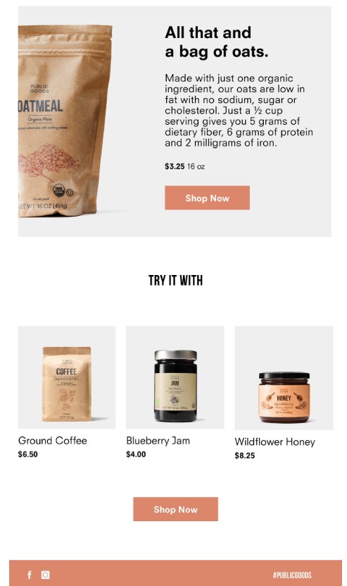
The structure is similar, except that there are three columns with small product thumbnails below the main block.
The goal is to increase cross-selling, with a main product, which is the one the newsletter is trying to sell, followed by several products that can be used separately or together with the main product.
This can certainly be an interesting way to increase the average order value per target customer, by offering products that make sense to buy together.
At this point, you’re probably thinking “but Jose, these are specific examples, not every brand will send this kind of email, right?”
Maybe, but look, here’s one more newsletter example from a shoe brand:
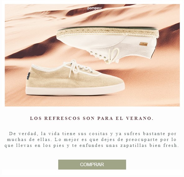
Exactly the same structure.
What changes is the text and the product.
In short, your product is what should make the difference. Don’t overcomplicate your newsletter design: stick to simple, proven designs that leave no doubt about their goal.
Now I’m going to show you two different designs. Bear in mind, though, that they’re different because the circumstances call for it, and because it works for them. This doesn’t mean you should copy them, because, as I said, the difference reflects a different strategy, which won’t necessarily match your case.
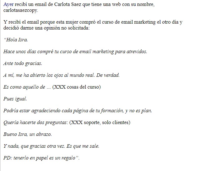
An all-text newsletter?
Yes, of all the newsletter examples we’ve seen so far, this is the only text-only email. It makes very interesting use of storytelling to encourage us to read the whole email and reach the link, which leads to his sales landing page.
He sends these emails daily because, like using plain-text emails, it fits his product and service.
The takeaway from this example is that the design should support our email marketing strategy. The goal isn’t to send pretty emails; the goal is to send emails that do what they’re meant to do.
And to do that, we’ll use the design that fits best and can do the job effectively.
You’ll need to run tests and evaluate each design as you go.
Now let’s look at a completely opposite case.
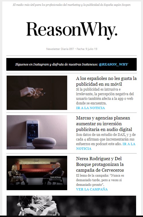
Here we have the counterpoint: a newsletter with a much more complex layout, with plenty of images and text in two columns, which suits the goal of this newsletter: to quickly show a lot of content so that subscribers can choose and visit the article that interests them.
So it’s a newsletter design that fits its specific needs.
Not all newsletters have the same goal. Before choosing an example, define what you want to achieve with the send. If you need a refresher on the basics, here we explain what a newsletter is.
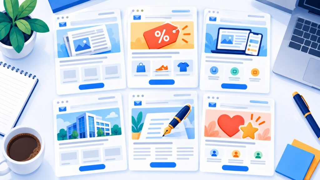
| Type of newsletter | Goal | What it includes | Usual frequency | Example in this article |
|---|---|---|---|---|
| Informational or content | Educate and maintain the relationship | Articles, guides and industry news | Weekly or every two weeks | Gatesnotes, Lumen5 |
| Promotional | Sell | Offers, discounts and launches | Based on the retail calendar | Carolina Herrera, Public Goods |
| Product | Activate and retain users | New features, tutorials and use cases | Monthly | Canva, Click and Grow |
| Corporate | Strengthen the brand and trust | Company news, milestones and team | Monthly or quarterly | Corporate template (below) |
| Editorial or personal | Build a bond with the author | Opinion, stories and a single idea | Daily or weekly | Isra Bravo |
| Loyalty | Get customers to come back | Thank-you notes, points and birthdays | Triggered by events | The 8 loyalty examples |
Tip: if in doubt, start with an informational newsletter with a single promotional block at the end. It’s the format that best balances value and sales.
Do you already know what kind of newsletter you want to send?
Build your list, design your first send and track opens and clicks in real time, all from a single account.
And now, for real, let’s get to those eight customer loyalty strategies that we hope will inspire you for your business.
We all like to feel special, and so do your customers.
There’s nothing better than a gift to show them how much they’re worth to you and make them aware of the advantages of sticking with you.
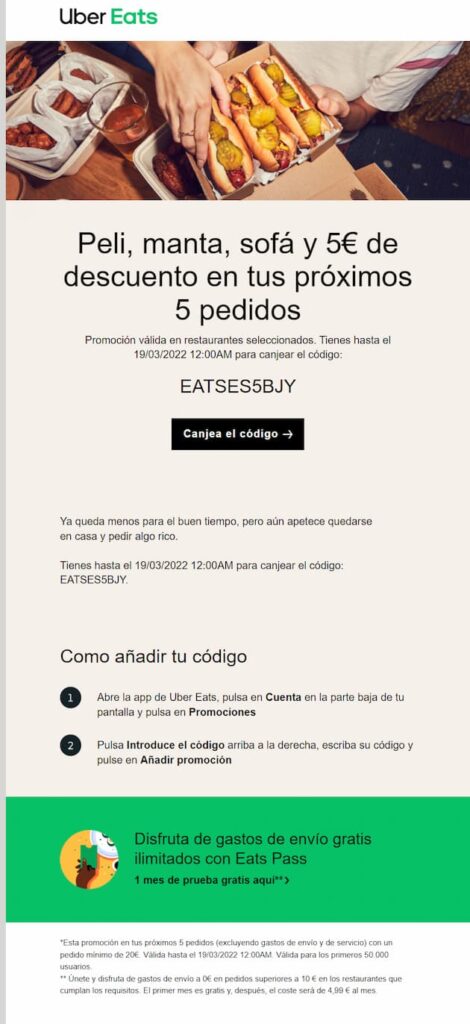
That gift can take the form of a discount or voucher, as Uber and Vitfarma often do; after all, money matters are always important to users.
For services, such as paid memberships, they usually come as extra content just for students.
The truth is that the range of information products has grown considerably over the last two years, and it has become necessary to actively retain those who already trust the brand.
Whatever service you offer, borrow the idea and join the list of companies that build customer loyalty with a practical guide, extra support for the same price or any other little touch you can think of.
Email has changed customer satisfaction analysis so much.
Gone are the paper surveys that took forever (and a big investment) to carry out. Not to mention how long it took for questionnaire results to reach the decision-makers.
Now your customer is just a click away.
So ask them: easy, fast and direct. With autoresponders, you’ll have their feedback in your inbox in record time.
When you tell someone you want to know how satisfied they are, they feel heard and their emotional connection with you grows stronger, and that’s the foundation of loyalty.
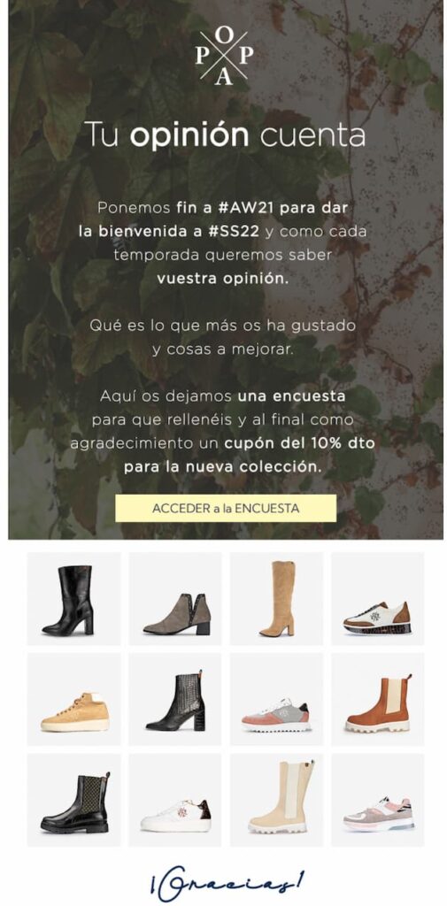
Here are some examples of companies that build customer loyalty through email surveys and, in some cases, offer a discount with a triple purpose: encouraging responses, thanking customers for taking part and, while they’re at it, promoting a purchase.
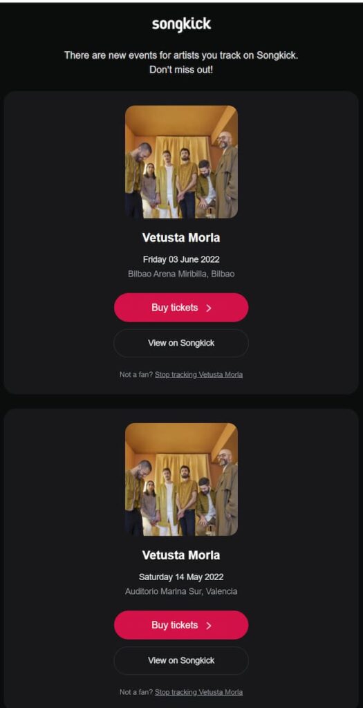
Sometimes the difference between losing a customer and keeping them is as simple as staying on their mind: use the segmentation we mentioned earlier to spot users who haven’t bought in a while or customers who might like one of your products.
For example, Songkick, the concert ticketing platform, never misses a chance to send you a quick email every now and then with shows you might be interested in.
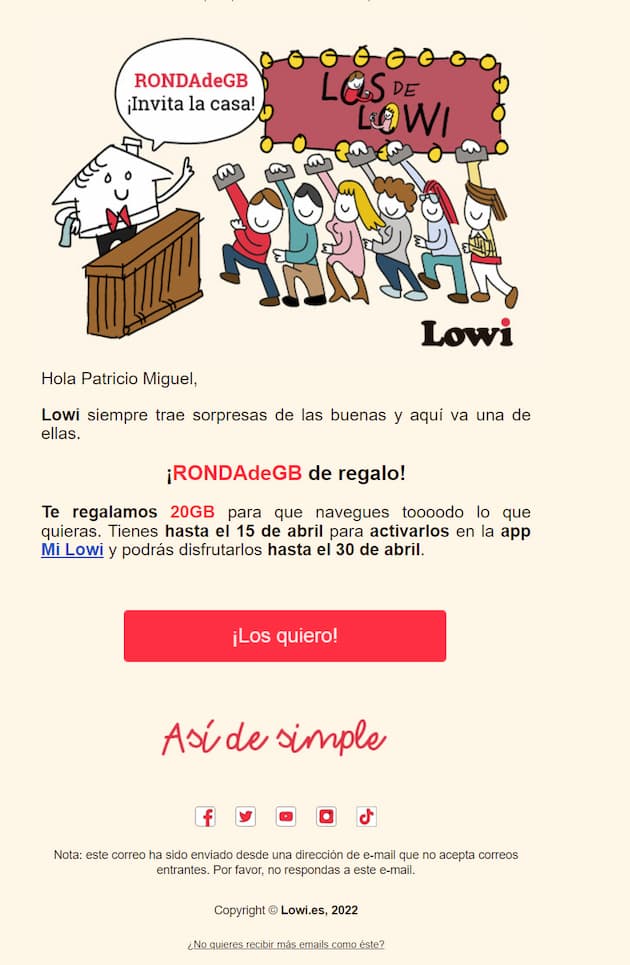
You can also keep rewarding your most loyal customers with perks that keep the temptation to switch to the competition at bay. That’s what Lowi does. The fresh-style mobile operator gives you a gift every so often that acts as a bond between the user and the company.
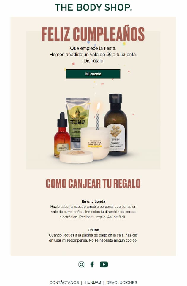
Sending greetings to someone is probably one of the most widely used customer loyalty strategies, both online and offline.
Easy? Yes.
Classic? No doubt.
Overused? That too.
Useless? Nooo, not at all.
It’s a golden opportunity to make customers feel important, and almost a must for all brands, which pair the greeting with discounts, as in the example from The Body Shop you’re about to see.
You make a good impression and encourage a purchase. What more could you ask for?
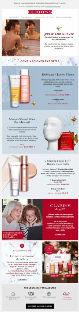
But don’t stop at birthdays: New Year’s Eve, Valentine’s Day, Father’s Day… the year is full of special dates. Use them to reach out to your users and remind them you’re there, with a greeting card, discounts or promotions, as Clarins does.
And here’s a productivity tip: make a calendar of universal celebrations that may interest your buyer persona and schedule a send for each one every year.
Another customer loyalty strategy that has to be in your action plan: saying thank you should be among your techniques for building an emotional connection with customers and keeping them by your side.
Thank them for their purchase, of course. But also for registering, subscribing or any other gesture they make toward your brand.
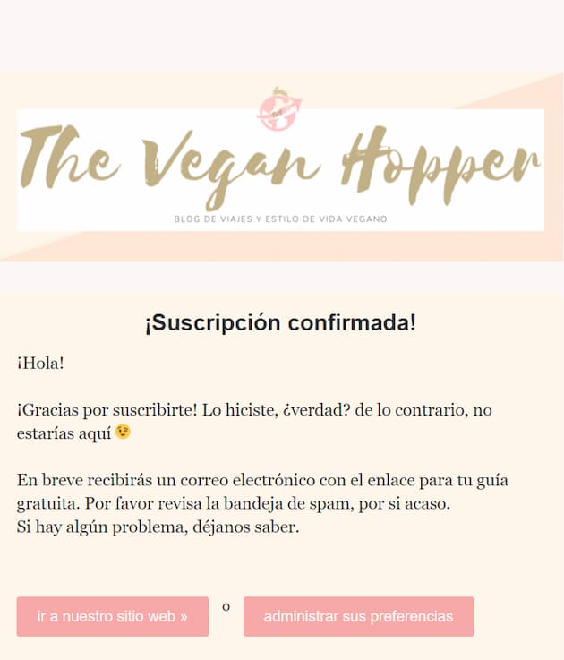
Besides making them feel valued, it’s a key element for usability and for improving the customer experience. There’s nothing more confusing for a user than clicking a CTA or giving their details or money to a company and not getting a confirmation.
And you don’t need to be a multinational. Just look at how the blog The Vegan Hopper does it: simple and effective.
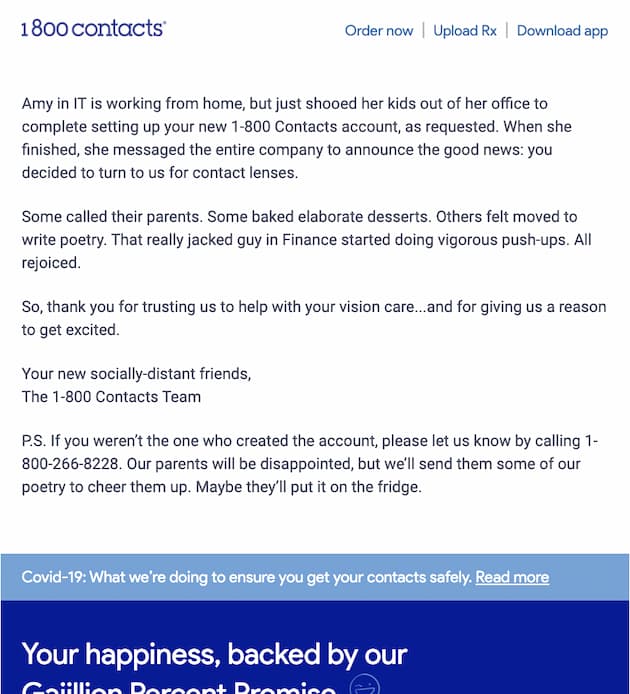
And if you want to experiment with your more creative and fun side, take a look at this welcome email from the online contact lens store 1800 Contacts.
It’s an email in English, and we like to use examples from Spain whenever we can, but this one deserves a standing ovation. Wouldn’t you feel good being their customer?
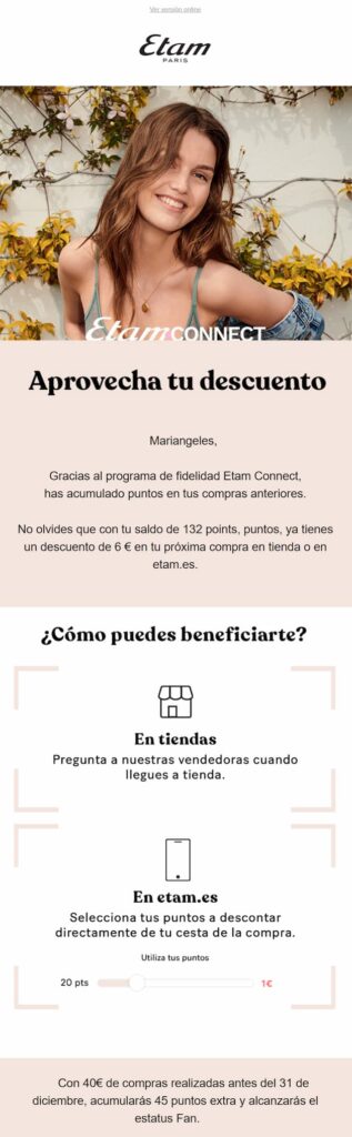
If we had to crown one strategy the queen of customer loyalty, it would be the club that gives you points for signing up for a service or buying a product (in other words, a good old-fashioned loyalty program). Points you can later spend on other purchases or redeem for gifts from a catalog.
So what emails should you send to your club members? Almost as many as you can think of, but here are the ones that shouldn’t be missing from your plan:
● Welcome them and offer a discount or small gift for joining
● Tell them the benefits of being one of your members
● Remind them from time to time how many points they’ve earned and what they can spend them on
● If they redeem a barcode that gives points, send them a confirmation
See how the lingerie brand Etam does it, reminding the customer of her balance.
Are you organizing an event? Do you have new content on your blog? Launching a product? Starting a promotion? Did someone mention you on social media? Releasing a new collection?
Then tell them! And while you’re at it, ask them to tell others. These are touchpoints to remind your customers that they’re part of a living project worth belonging to.
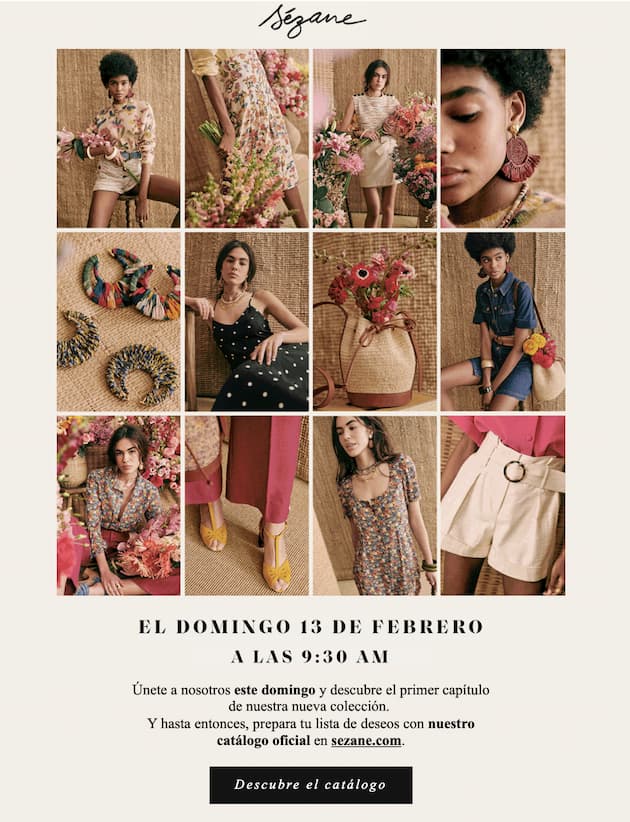
The French fashion brand Sézane does this every time it launches one of its new collections (which its community eagerly awaits, as an exclusive event).
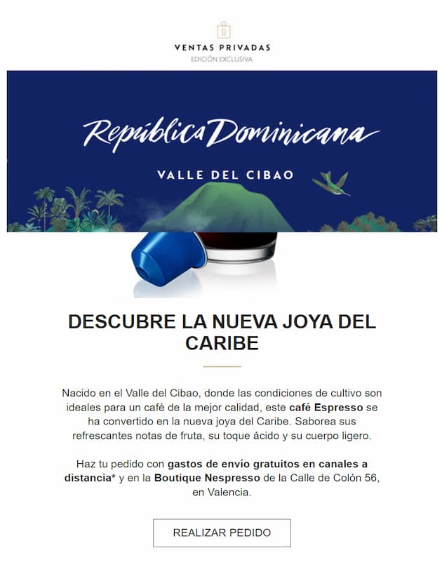
Nespresso does it differently when it launches new coffee varieties, while still making the most of the commercial opportunity with its private sales.
And we close this catalog of loyalty strategies with the ultimate in loyalty, the greatest act of satisfaction a consumer can perform: recommending us.
Yes, really: one of the most effective ways to attract new customers is to have your current ones invite them to buy from you. Don’t you pay more attention to the opinion of a friend who has tried something than to a product description on a website?
It’s good old, highly effective word of mouth, but digital. And email is the perfect channel to encourage it faster and at a lower cost than other offline actions.
And since this is about encouraging our loyal buyers, most brands pair their referral request with a reward to motivate customers to think of people who might be interested. That’s the case with the three examples we’re going to look at.
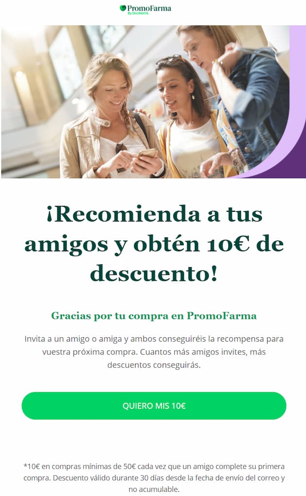
Let’s start with Promofarma, the pharmacy and drugstore ecommerce, which uses the purchase confirmation to offer a discount to you and to everyone you invite, with no limit.
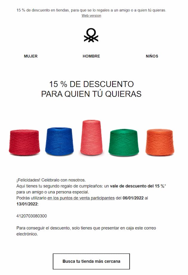
The fashion brand Benetton, for its part, sends you its congratulations and, along with them, a discount for you and another for whoever you choose. We like the design, with its subtle nod to the diversity that is part of its brand identity.
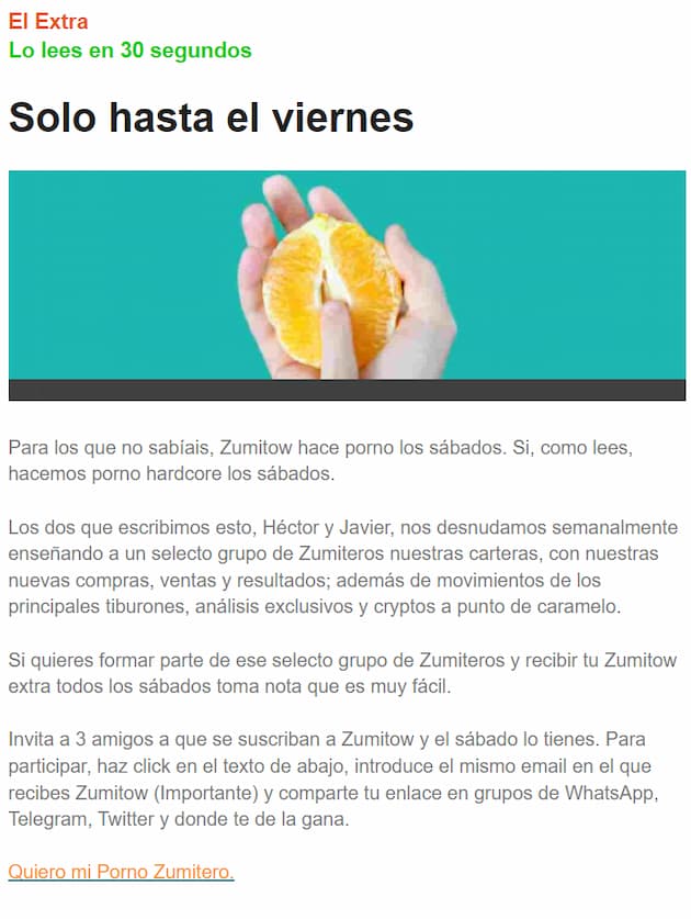
And we finish with a very unusual example: Zumitow, the finance website, which rewards those who bring in subscribers with extra content.
Special mention goes to this company’s casual tone, a style we don’t usually associate with the sector but that works very well. We think it’s a clear example of studying your buyer persona and adapting to it.
These templates don’t copy any specific brand. They’re structures that work in each industry, with the subject line, the blocks and what you can learn from each one.
Subject line: “3 regulatory changes affecting your business this quarter”
1. A paragraph of context, signed by a member of the team.
2. Three industry news items or key points, with two lines each and a link to the article.
3. A short customer case with one result figure.
4. A soft call to action: webinar, downloadable guide or demo.
What to learn: in B2B, readers want to save time. Summarize, link and leave a single sales action. You’ll find more ideas in this B2B email marketing checklist.
Subject line: “What’s new this week (and 10% off just for you)”
1. Main image with the featured product or collection.
2. A grid of 4 to 6 products with price and button.
3. A trust block: free shipping, returns or reviews.
4. Discount code with an expiry date.
What to learn: the shop window works, but urgency and trust are what close the sale. If you have an online store, follow this ecommerce newsletter guide.
Subject line: “Enrollment is open: limited places for the October course”
1. Main news: course, start date and places.
2. A free resource: recorded class, template or article.
3. A student testimonial.
4. Calendar of upcoming intakes.
What to learn: combine useful free content with the announcement. That way the email adds value even if the reader doesn’t sign up yet.
Subject line: “Thanks to you, we reached 300 families this month”
1. An impact figure with a real photo.
2. The story of a person or project.
3. Upcoming activities or events.
4. A call to get involved: donate, become a member or share.
What to learn: members want to see the results of their support. Open with the impact and ask for support at the end. And before choosing a tool, check out the question many NGOs forget when choosing mailing software.
Subject line: “New: you can now schedule your reports”
1. The new feature in one sentence, with a screenshot or GIF.
2. Three steps to start using it.
3. An advanced usage tip.
4. Link to the help center or a webinar.
What to learn: one new feature per send. If you announce five features at once, users won’t try any of them.
Subject line: “This Friday: seasonal menu (and book without the wait)”
1. Photo of the dish or product of the week.
2. Special opening hours, an event or news from the venue.
3. Booking or order button.
4. Address, map and phone number.
What to learn: for a local business, practical details sell: date, time and a button to book.
A creative newsletter doesn’t need a complicated design. It needs an idea that surprises in the inbox.
Watch out: creativity shouldn’t hide the message. If readers can’t tell what you’re offering them within 3 seconds, the idea doesn’t work. Here are more ideas for creating creative newsletters with the Mailrelay editor.
A corporate newsletter keeps customers, partners or employees informed about how the company is doing. Here’s a basic structure you can adapt:
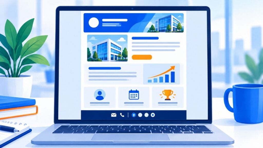
Subject line: “[Company name] · October news”
Preview text: “A new service, a customer who doubled their results and what’s coming this quarter.”
1. Greeting and summary. Two or three lines signed by management with the highlights of the month.
2. Main story. A launch, a partnership or a milestone, with an image and a link.
3. Success story. A customer, their challenge and the result in one figure.
4. News in brief. Three points: new hires, events or awards.
5. Calendar. Upcoming dates: trade fairs, webinars or deadlines.
6. Closing and contact. Signature, contact details and links to social media.
Keys to a corporate newsletter:
Plus, if your contact list has fewer than 20,000 contacts, you could send your newsletter for free.
Yes, with Mailrelay’s free account you can send up to 80,000 emails a month to up to 20,000 contacts.
So there’s no excuse not to do email marketing: design an advertising email following the examples we’ve seen in this article and send it to your contact list at no cost.
The results can only benefit your business.
Here’s a short video example:
The newsletters we’ve seen are simple, uncomplicated, with a clear and concise goal.
They aren’t designed or made to entertain; they’re made to sell, to drive traffic to a website or landing page, or to stay in touch with customers.
They aren’t made to look pretty; they’re made to get results
And that’s what you should think about when you prepare your newsletter design
What do you want to achieve with your mass mailing?
From there, create a simple design with as few elements as possible, but with convincing copy that calls to action. Don’t beat around the bush or distract your contacts. If you need to sell, sell; if you need to drive traffic to your website, do it. But remember that an overly elaborate design may add nothing and can even confuse the contact.
Let’s keep it simple! In most cases, it works.
Use the Mailrelay free account to build your subscriber lists and start selling with email marketing. Sign up now!
Turn these examples into your next campaign
Visual editor, real-time reports and expert support on every account. Start for free with up to 20,000 contacts.
A clear subject line, main content that’s useful to the reader, a simple mobile-friendly design and a single, prominent call to action. Always include the unsubscribe link and your company details.
It depends on the type. Informational newsletters are usually sent weekly or every two weeks, and corporate ones once a month. What matters is sticking to the frequency you promise your subscribers. We explain it in detail in what is the ideal sending frequency.
Just long enough to achieve its goal. A promotional newsletter can fit in a single block; an editorial one can be longer if the content deserves it. If you find it hard to summarize, split the content across several sends.
Start from a template, swap the colors and images for your brand’s and apply one of the creative ideas in this article. With a drag-and-drop editor, you don’t need to code.
Yes. With the Mailrelay free account you can send up to 80,000 emails a month to up to 20,000 contacts.

Jose Argudo
CMO at Mailrelay. Writes about email marketing, copywriting, and conversion for small businesses and entrepreneurs.