When users open an email, they spend most of their time looking at the top portion of the newsletter, and not everyone scrolls down to read the rest, which is why some senders place the most important information near the header.
However, there are some methods to motivate users to scroll all the way to the end of the newsletter, and they work by arousing their curiosity. In this article I want to show you some very interesting examples.
· Encouraging scrolling in emails can be useful for several reasons
# More interaction time:
When a user scrolls through an email, they are engaging with your content for a longer period of time.
This can increase the chance that the message is absorbed and remembered.
# Greater exposure to content:
Encouraging scrolling can ensure that users see more of your content.
If you have important or useful information at the bottom of your email, encouraging scrolling can increase the chance that it gets seen.
# Conversion opportunities:
Every time a user scrolls, there is an opportunity for them to interact with a call to action (CTA).
Therefore, encouraging scrolling can increase conversion opportunities.
# Improves the user experience:
A well-designed email that encourages scrolling can improve the user experience.
It can make the email more enjoyable to read and make the user feel more engaged with the content.
# Detailed presentation of the product or service:
In the case of marketing emails, encouraging scrolling can allow you to provide a more detailed description of a product or service, which could increase the chances of conversion.
It is important to remember that, although encouraging scrolling can be useful, the content of the email must be relevant and engaging.
If a user feels overwhelmed by the amount of information or if the content is not of interest to them, they may not feel motivated to scroll, regardless of the email’s design.
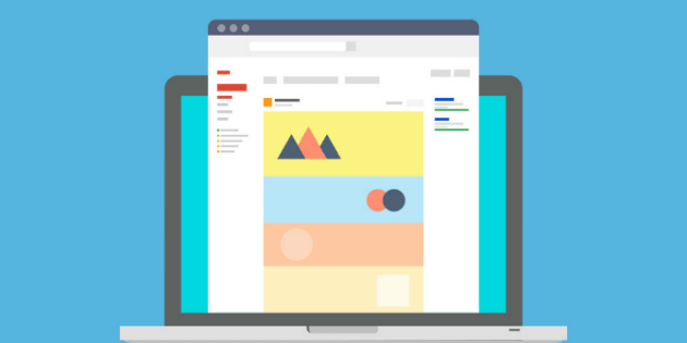
Using a single, very long image to encourage scrolling
In the search for innovative techniques to capture the attention of email recipients, one strategy that has emerged is the use of a single long image to encourage scrolling.
This approach, although visually appealing and potentially able to offer a unique user experience, comes with its own set of challenges and considerations.
In this section, we will explore both the advantages and the disadvantages of this technique, to help you decide whether it is the right strategy for your email campaigns.
Advantages:
- Cohesive design: A single image can result in a more cohesive and visually appealing design.
- Design control: Using a single image gives you total control over how your email looks, since you don’t have to worry about how different elements will render in different email clients.
- Unique user experience: An email with a single long image can offer a unique user experience that may be memorable for recipients.
Disadvantages:
- Rendering issues: Not all email clients handle large images well. Some may crop the image or not display it correctly.
- Loading issues: Large images can take longer to load, especially on slower internet connections. This could lead to a poor user experience if recipients have to wait for the image to load.
- Accessibility issues: Images are not accessible to people who use screen readers or other assistive technologies. If you decide to use a long image, it is important to provide alt text that describes the content of the image.
- Lack of interactivity: Images don’t allow the same interactivity as a traditional email design. For example, you can’t have clickable buttons or text links inside an image.
In short, although using a single long image can be an interesting strategy, it is important to consider the possible drawbacks and make sure it is implemented in a way that does not harm the user experience or accessibility.

Are these emails more likely to be flagged as spam?
Using a single large image in your email can potentially affect deliverability and increase the chance of your email being flagged as spam. Here’s why:
📌 Text-to-image ratio:
Spam filters often analyze the ratio between text and images in an email.
If there is very little text compared to the size of the image, the email may be considered suspicious and flagged as spam.
📌 Lack of text content:
Spam filters also read the text content of emails to look for common spam words and phrases.
If your email is mostly an image, the filter won’t be able to read much text content, which can make the email look suspicious.
📌 File size:
Emails with large attachments (such as a large image) can be flagged as spam because spammers often send large files or malicious attachments.
📌 Image loading:
Some email services automatically block images until the recipient chooses to view them.
If your message depends entirely on an image, and it gets blocked, your recipient may see nothing, which can result in a poor user experience and hurt your domain’s reputation in the long run.
Therefore, if you decide to use a single large image in your emails, it is important to take steps to minimize the risk of your emails being flagged as spam.
This could include things like maintaining a good sender reputation, making sure you send emails to recipients who have opted in to receive them, and providing alternative text content for your image.
Let’s look at some examples of emails that encourage scrolling
💡 IKEA
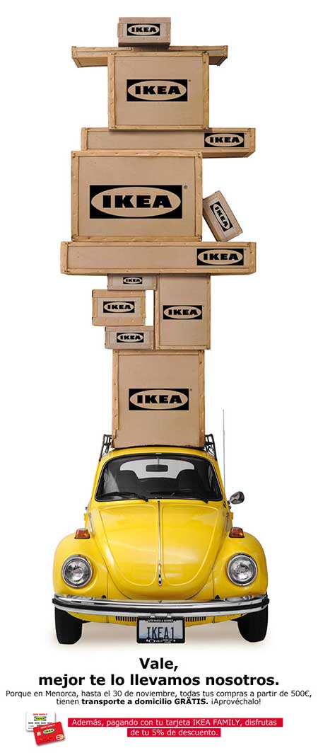
In this newsletter, we don’t see a header telling us the company’s name, but we know it belongs to IKEA because we can see its logo on the boxes, which are stacked up.
The only thing we see at first glance is a pile of boxes, which invites us to scroll down to find out what message they want to convey.
Finally, we see that they are stacked on a small car that can barely support their weight, let alone keep its balance.
The punchline is: “Okay, we’d better bring it to you ourselves.”
Something very positive about this email is that it doesn’t ask you to click to get more information or start buying IKEA products; it simply informs you in a different way about free shipping and credit card discounts.
The promotion is delivered in a very charming way, and it takes us very little time to read the information they send us. Brief, concise, and at the same time motivating.
💡 Uncommongoods
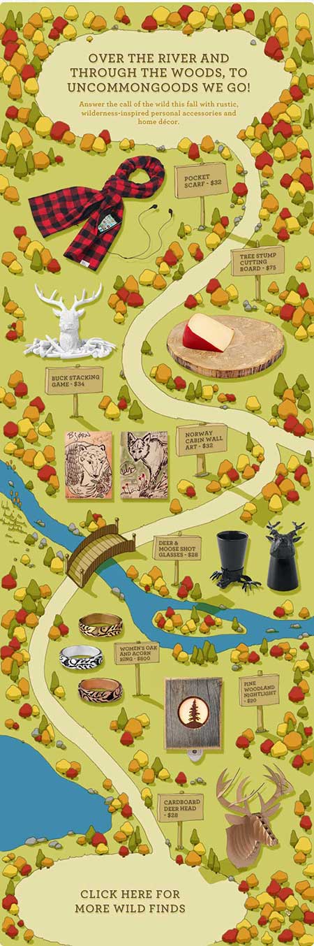
In this case we see seasonal offers, with rustic autumn-style accessories. The technique it uses is very interesting: adopting a storybook style, it “takes us on an adventure” to discover the latest offers.
We follow a path through a forest, and along it we find the offers, one by one.
Perhaps it appeals to our inner child, and through this charming premise it motivates us to scroll down, following the path. After seeing some of its main offers and reaching the end, it encourages us to keep browsing its catalog on its website, with a call to action that matches the design.
💡 Beach Park

This newsletter shows us a photo in which, at first glance, we can see the sky, and in front of it a message that says: “Feel the experience of sliding down a 14-story building”.
We realize that under the phrase is the top of a water slide, which invites us to slide down it by scrolling down. This way we can experience “the thrill and the fun” from the comfort of home or the office.
As we scroll, we can really appreciate the length of this slide, it looks endless! Even if you scroll through the image quickly, you can still feel a bit dizzy… Finally we reach the end of the slide, where we see a vacationer landing in the water, and the phrase “can you imagine it LIVE at 105 km/h in the best water park in Latin America at the lowest prices?”. Note that this phrase also motivates us to keep scrolling to continue reading and finally learn the name of the park.
Frankly, it looks very exciting. If you love thrills, you will really want to visit this park after seeing the flyer.
💡 Anthropologie
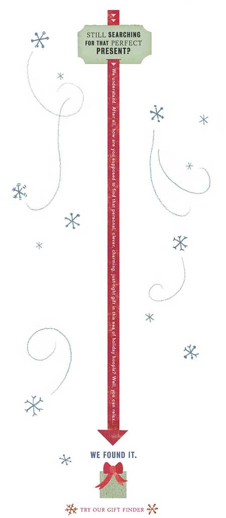
This image is fairly simple and more focused on text; it presents us with a label that says “Still looking for that perfect gift?“
The image is not very attractive in itself, but the red vertical line is very strong and leads us to follow it, reinforcing the message with sideways text that forces us to scroll if we want to finish reading the sentence.
At the end of the red arrow we find a gift box and the message “We’ve found it.“
Continuing with the email’s minimalist style, we have a very discreet button with the message “try our gift finder”, which falls a bit short when it comes to motivating the user to click it, but the email, with a descending vertical line carrying a sentence, is worth including as an example, since it invites the user to read the whole message — despite how awkward it can be for the user to read text rotated 90 degrees!
💡 Craftsy
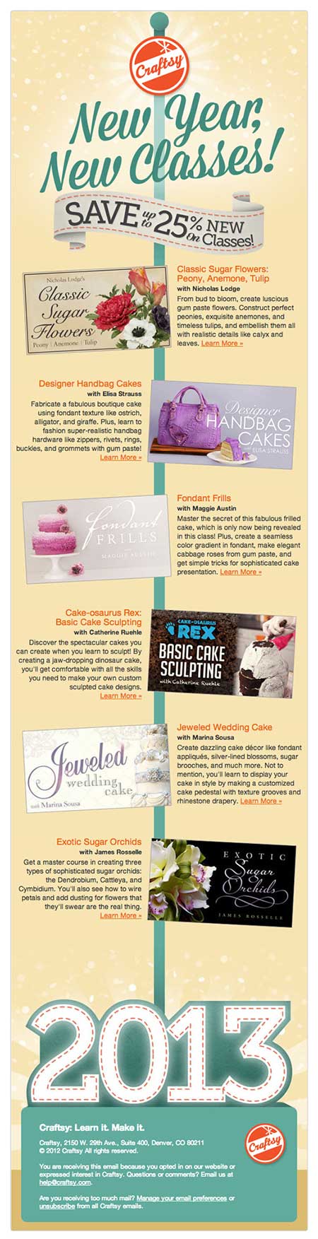
This email is about New Year offers, and as in the previous example we have a vertical line that suggests scrolling to keep seeing the content.
The difference is that here we can see the different offers along the line, with information on both sides, in a style similar to example 2 but with more information.
At the end of the line we see the year and the footer info, with no call to action to take us to the site (apart from the “see more” links at the end of the product descriptions).
This is an example of how we can use the vertical line method with more information, although it could have been used to better effect.
💡 Sephora
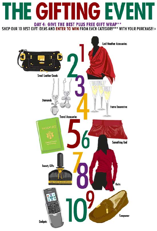
The last case takes us through the email, this time not with a line but with a numbered list.
In the center of the image we have the numbers 1 to 10, one above the other, and next to each number an image of a product with its name.
Since the numbers are so close to one another, we can see that the list continues, which invites us to view the email through to the end, where it forms one large unified image. After seeing the products, users can decide whether they liked them and whether they want to click to see the rest.
In conclusion
There are several ways to keep users interested from the start to the end of an email campaign. The ones shown in this article are just a few examples, but many other methods can be used to hold our subscribers’ attention, combining one or several of the ideas presented here with new ones (or a completely original method), with the sole aim of informing them about our services or attracting customers to our site.
We hope you enjoyed the article!
This type of image-based modular email design must be used with care, since too much image and too little text can affect your spam rate in email marketing.