A common mistake is thinking that simply adding a popup to your site means you’ve already won, but in reality there are certain ways to squeeze out its full potential, something few people achieve.
The popup dilemma
● Some people claim that these plugins do nothing but harm the User Experience, for the simple reason that they are very annoying, appear without warning and only interrupt the visit.
● On the other hand, some say they are one of the best ways to generate conversions on a website and that, on the contrary, they add value for users.
So who’s right?—let’s look at the data.
1. 98% of visitors leave an average website without taking any valuable action
Source: Privy
It’s fine to get visitors, but it’s not much use if they only come in to look around. Without a tool like a form or a popup, you won’t be able to convert them the way you expect.
2. More than 23 million visitors became subscribers in just 2 years, thanks to Sumo’s popups
Source: Sumo
That’s a good sign, considering that the numbers come from just one tool.
This confirms that popups work, so why doesn’t Google like finding them when crawling a website? Later I’ll explain the thin line between a useful popup and a useless one.
3. The average conversion rate of popups is 3.09%, but it can reach up to 40%
Source: Sumo
The first number isn’t that bad, but we’re not here to be part of the average, and later on you’ll learn how to reach that 40%.
As Sean Bestor explains, HTML popups work; the problem/opportunity is that many people don’t know how to make them work.
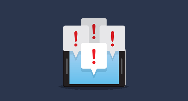
Tips to improve the conversion of an HTML popup
1. The highest-converting popups don’t appear immediately
Imagine you want to walk into a physical store, you can’t really see what’s inside yet, you don’t even know whether you need anything, and as you approach the door one of those pushy salespeople shows up.
How do you expect users to convert when they haven’t even had a good look at what you offer?
At best, most people will ignore the message and desperately look for the close button.
Sumo’s research found that among the best-performing popups, only 8% appeared before the 4-second mark.
This also applies to push notifications: most sites offer to send you notifications when you haven’t even read a little about what the page is about.
So when is a good time? The answer we all hate: it depends.
It has to be long enough for the user to see that your content is worth it.
For example, the following HTML popup appears on a book website 15 seconds after the user arrives:
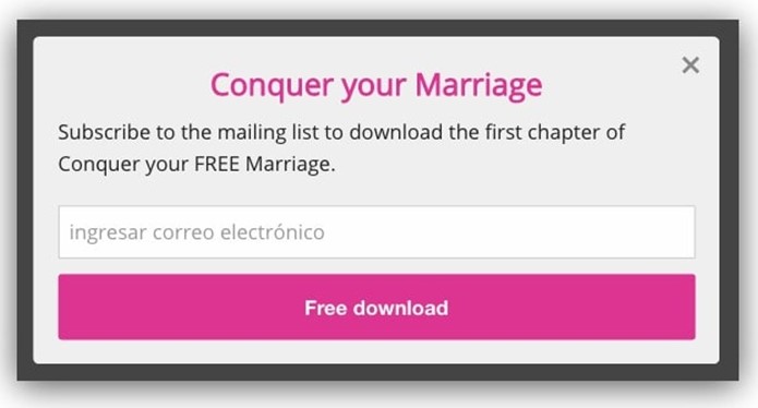
That’s enough time for the user to look over the information a little, but the key here is that the popup offers the first chapter of the book the user is interested in, completely free.
In other words, it appears at the best moment, offering something of value to the visitor, and if they’re interested in the book, they won’t let the opportunity pass.
This gives that popup a conversion rate of 38.4%.
That’s the magic of context and timing. Keep reading, because I’ll soon explain what context has to do with it.
Now, you’ve surely seen popups that appear immediately on big sites like NeilPatel or DolceGabbana. Do they contradict our data?
No. The explanation is simple: these have become high-value brands more than mere sites, so many of the users who visit them already know the person or brand and trust them so much that they have no problem subscribing right from the start.
2. The best popups contain impactful text
The internet is so saturated with information and content that it’s all starting to blur together, which is why capturing users’ attention is increasingly difficult.
But there are ways to grab attention by using certain unexpected words.
To do that, you can’t make the same old popup as always. It’s like walking up to a pretty girl: of course you can’t open with the typical line she has surely heard thousands of times.
Let’s look at an example:
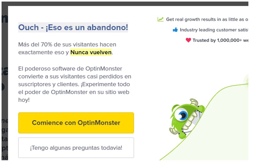
This popup is on the OptinMonster site (another HTML popup creation tool) and appears when you try to leave.
The key to this example is telling the user what they’ll have to face if they don’t stay on the site. Wow, that sounded worse than I thought.
But it’s real: studies show that human beings pay much more attention when we’re about to lose something. And this is something big brands use to do marketing, not just with popups.
On the other hand. Get to the point: if you have little time to captivate someone in person, online you have even less.
There’s no time for filler text, like “Subscribe to our blog and you’ll receive…”.
If you have a discount, say you have a discount, and if, for example, you have a marketing or business book or course, don’t just say that you have it: mention what results the visitor can get if they buy or take it.
Users are overwhelmed by so much content; in fact, according to Nielsen NG, the average person reads only 28% of a blog post even if it looks very thorough.
Don’t clutter the interface with a complex popup; remember that less is more. Of course, as with other types of ads or promotions, message clarity also matters.
In conclusion, show an impactful message using as few words as possible.
3. Should you use an image and a deadline?
You may be wondering whether adding an image or a countdown to create a sense of urgency inside a popup really works or not.
We have data that gives us a solid answer.
In a study by Sleeknote, it was found that popups with an image had a higher conversion rate than those without one. Specifically, a rate of 3.8% vs. 2.07%.
The neuroscientific hypothesis behind this is that, as many know, human beings are visual, and of course we’re going to be more attracted to graphics than to text alone.
Of course, before you rush off to add an image, it’s advisable to run an A/B test to compare the results on your own site, since not every popup needs an image, and not all images have the same impact.
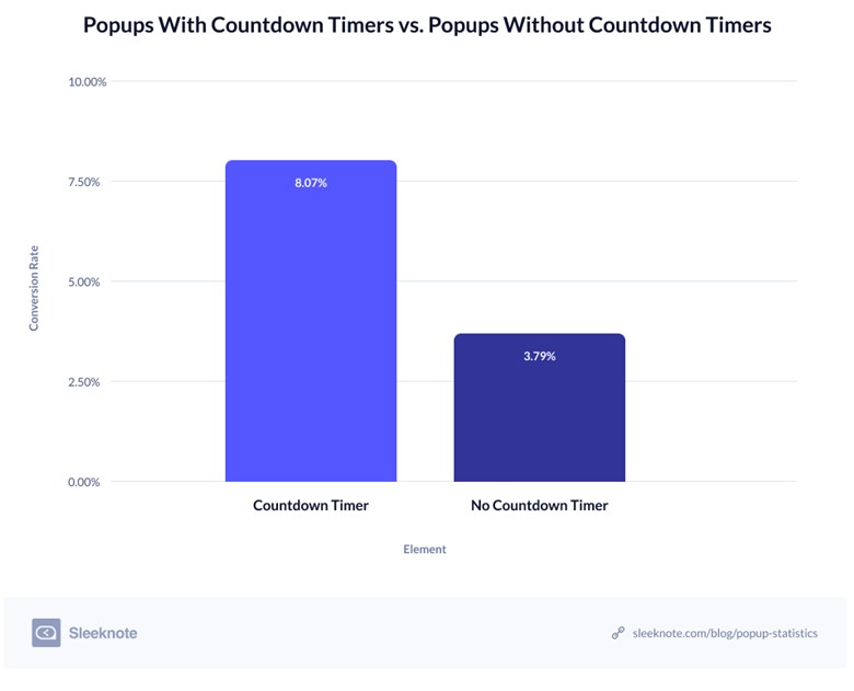
On the other hand, there are countdowns, elements that make it clear to the user that your offer is limited and will soon disappear.
As I mentioned before, it’s an old technique that sharpens a person’s attention, because of the feeling of soon losing something.
The same study found that popups with a limited time to act converted far more than those that didn’t create a sense of urgency. Specifically, 8.07% vs. 3.79%.
4. The best popups offer something extremely valuable
Unless you’re a big international brand, asking people to subscribe just to receive offers or content won’t be very appealing to users.
You may get the emails of loyal customers or people who already know you, but nothing with a big impact. And that’s because instead of asking, you have to give.
Remember the popup that offered the first chapter of the book the user was interested in?
I’m sure many people think the most logical thing is to offer a free mini trial or a discount, and they’re right.
The consultancy Nielsen NG says that popups become conversion machines when they offer a discount, especially when the user tries to leave, a tip that the Sumo team also endorses.
But what happens when you can’t afford to offer a discount or a free trial?
This is a very competitive game, and of course big companies can afford to give away a bit of money in order to win customers.
And if you want to be competitive, you should try to offer a discount. However, you can use strategies so you don’t take as big a hit, such as raising the price slightly, offering the discount only from a certain number of orders, or selling the user add-ons to the initial product.
But even so, there are other benefits that also achieve huge conversion rates.
Offering ebooks or research reports is what many bloggers use to get emails, but be careful: for them to really work, they must be epic content. For example, information about how a company went from 0 to being worth 50 million dollars can grab attention.
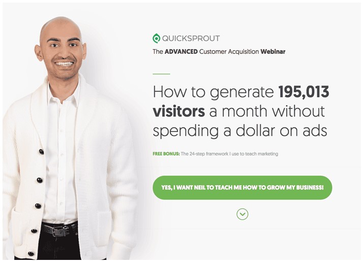
For example, here a webinar is offered that explains how to get a large volume of traffic without spending any money on ads. Very good.
Unfortunately, many bloggers offer content that always looks alike, so much so that even if they didn’t ask for your email, you wouldn’t download it.
Nobody wants to receive ads in their inbox, so you should make an offer that’s practically irresistible.
5. The highest-converting popups are the ones that fit the context
It’s no secret that an ad for bed sheets works better in a mattress store than in a grocery store.
That seems very obvious, but the problem with popups that get mediocre results is that they aren’t related to the specific page where they’re shown.
Maybe they’re related in a general way, i.e., if it’s a cooking blog, an HTML popup offering a guide with the best cooking tips should work, right?
Yes, but it will still be mediocre. What I’m talking about is unmatched context.
Let’s remember that a large part of the user experience success on sites like YouTube, Facebook or Amazon is how impressive their algorithms are at recommending content or products based on what you’re viewing or on your interests.
Let’s go back to the cooking blog case, and imagine that the business behind it is selling appliances, utensils and cooking ingredients from other companies.
And that the content the user is currently viewing is about how to prepare a turkey for Christmas dinner.
Beyond a popup that just invites the user to subscribe to the blog, you can offer the following:
Other content:
– The most in-demand dishes for Christmas dinner
– Tips for a memorable Christmas dinner
Even if the blog is local:
– The best places to buy everything for Christmas dinner in Mexico City
I put this first because not every user is open to subscribing right away, but they are open to seeing what else you offer, if it complements their need.
As Nielsen NG says, recommendation systems can work very well, as long as they make use of context.
But if we wanted to win a subscriber, we could offer a guide in both text and video on how to prepare the perfect Christmas dinner.
This is an offer that fully complements the user’s current need.
According to Sumo’s research, maintaining context is what lets a few popups achieve conversion rates above 40%.
Let’s look at this great example:
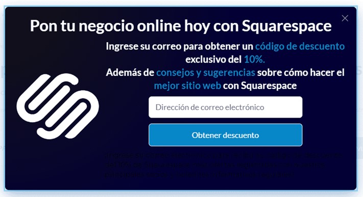
It doesn’t have the best design, but it appears right on a review of the Squarespace software, and the whole popup relates to that tool. Excellent context.
The problem is that too many sites create the typical subscription popup and set it to appear on as many pages of their site as possible. Why do they do it?
By now anyone can see that a Facebook ad can be up to 15 times more efficient than one on national TV, thanks to segmentation.
To improve context even further, nowadays popups can be segmented not only by page, but by factors such as:
– Which page the visitor comes from
– Their geographic location
– The device they use
– Whether the user is new or returning
And many more
With this you can create a special popup for a specific audience, which can dramatically increase the conversion rate.
Now, if most sites don’t do this, it’s mainly because it takes more time and effort than automating a single general popup for an entire website. It’s time to take advantage of their negligence.
Which tool should you use to create HTML popups?
If you want to take action, this is a good question. Although we’ve mentioned some throughout this content, there’s something better.
Here’s the top list of the best popup creation tools in the world, based not on one person’s opinion but on an algorithm that considers a series of factors to rate them as efficiently as possible. Click to go there.
You’ll not only learn the name of each tool, you’ll be able to see live examples of popups created with them, learn their pros and cons and their prices, and learn from scratch how to use them.
Finally, to make the most of the list of prospects you generate thanks to your popups, you’ll need an email marketing tool, and this is where Mailrelay comes in: create your free account in a few steps.
Well, I sincerely hope this content has been very useful to you, and I’d be very happy if you shared it. Remember that you can leave your questions and opinions in the comments. Until next time.
If you’re looking for less intrusive alternatives, you can also rely on push notifications, and in both cases take good care of your call to action (CTA).