Call to action (CTA): what it is, what it is for and examples
What makes someone go from reading to clicking, explained with real examples
**A CTA (short for call to action; «llamada a la acción» in Spanish) is a button, link or phrase that invites the user to do something specific**, such as buying, subscribing, downloading a resource or requesting information.
You will find it on websites, ads, social media and email marketing campaigns. Its goal is for whoever sees it to take the next step and, over time, become a customer.
Normally, the CTA leads to a landing page where a value proposition is presented or content of interest is offered. There the user buys or leaves their contact details to become a customer later on.
The most common request is an email address, so you can then send campaigns and build loyalty.
What does CTA mean in marketing?
CTA stands for call to action. In Spanish it is called llamada a la acción, although in marketing the acronym is used far more often.
In Spanish it is usually used in the masculine, «el CTA», and without an -s in the plural: «los CTA». You will also see «la CTA», short for «la llamada».
When talking about CTAs, three different things are often mixed up:
| Term | What it is | Example |
|---|---|---|
| Call to action | The message that asks for the action | “Download the free template” |
| Button or link | The element that gets clicked | A blue button with that text |
| Landing page | Where the user ends up after the click | A landing page with a form |
The importance of CTAs in digital marketing
CTAs connect the content the user reads with the action we want them to take.
They serve to guide users through their journey as customers, from discovering the brand to buying and buying again.
From a commercial point of view, an effective CTA can turn a casual visitor into a potential customer and, ultimately, a buyer.
It also lets you drive traffic from the website to the pages where the conversion happens, making better use of the sales funnel.
On the other hand, CTAs also serve to measure the effectiveness of a digital marketing campaign.
By analyzing data such as click-through rate (CTR) and the conversion rate of different calls to action, you can see what works and adjust your strategy to improve results.
What is a CTA for? Their most common goals
The goal of a CTA is for the user to do something we are interested in. These are the most common uses:
- Capture emails: offer a newsletter to people who have already shown interest in the company or its products, to build loyalty and move them through the sales funnel to purchase.
- Improve SEO: drive traffic to another page of the website or to a blog article, and strengthen on-page SEO that way.
- Lead to a landing page: widely used to shorten the path through the sales funnel and turn the visitor into a customer faster.
- Grow on social media: get content shared, receive likes and comments, and gain followers.
- Offer downloads: exclusive content, such as ebooks, templates, podcasts or reports, that builds loyalty and makes you a go-to reference.
- Event access: add attendees to webinars and online events.
- Surveys: with the right incentive, gather your target audience’s opinion and make decisions based on it.
- Video marketing: drive people to a video, a widely accepted format that is often used for branding.
CTA examples
These are examples of calls to action by goal and channel:
| Goal | Channel | CTA example |
|---|---|---|
| Capture subscribers | Website form | “Get our best ideas every week” |
| Download a resource | Landing page | “Download the free template” |
| Try a product | Software website | “Start free, no card required” |
| Sell | Product page | “Add to cart” |
| Recover a cart | Automated email | “Complete my purchase” |
| Read content | Newsletter | “Read the full article” |
| Sign up for an event | Email or social media | “Reserve your spot at the webinar” |
| Request information | Services website | “Get a no-obligation quote” |
| Gain followers | Social media | “Follow us so you don’t miss the next live stream” |
Almost all of them start with a verb and say what the user gets. “Submit” or “Click here” say very little about what lies behind them.
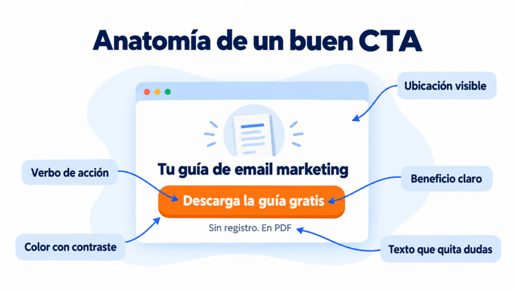
If you want to see how they combine on a complete page, our blog has examples of the perfect landing page.
Want your emails to get more clicks?
Create newsletters with call-to-action buttons and measure which links work best.
How to create a good CTA?
A CTA that converts takes into account who it is aimed at, what it offers them and at what point in the sales funnel it appears.
You can follow these tips to get there:
- Define your audience: segment and focus on your target audience. The better you segment, the more conversions you will get.
- Design smartly: create call-to-action visuals that work for different parts of the website (mainly banners in different formats) and make sure they all stay consistent with your brand (images, typography and colors).
- Copy is everything: work on the message and make sure the user understands it the first time.
- Choose the right placement: put the CTA where the user is most likely to look, such as the top of the page or the middle of an article.
- Use numbers: numbers show at a glance what the user will get by clicking, such as a discount or a premium access period.
Finding a CTA that works is not easy: you have to test different versions until you find the one that converts best.
And when a CTA loses effectiveness, test alternatives again.
Basic principles of effective calls to action
A good call to action turns a passing visit into a conversion.
For your CTAs to work and guide the user toward the action you want, rely on these principles:
Clarity of message
A CTA that converts is, above all, clear.
Users need to understand without doubt what they are expected to do and what they will receive in return.
A clear and direct message removes confusion and makes decision-making easier for the user.
A clear CTA should:
- Be direct: Use simple language, without frills
- Avoid jargon: Limit the use of technical or industry jargon unless your audience is familiar with it.
- State the expected action: Make sure the user knows exactly what step to take.
For example, a CTA like “Download your free ebook” is clear and concise, stating the action (download) and what the user will get (a free ebook).
Using action verbs
Active language creates a sense of urgency and motivation.
Action verbs take center stage here, since they are what prompt users to take a specific action.
Make sure your CTAs:
- Start with a verb: Such as “Download”, “Subscribe”, “Buy” or “Sign up”.
- Include motivating words: Such as “Now”, “Today” or “Right away” to add urgency.
A good example of this would be “Start your free trial today”, where “Start” is an action verb and “today” adds a sense of urgency.
Value proposition
Your CTAs must go beyond simply asking for an action: they must clearly communicate the advantage or benefit the user will get by clicking.
Why should they click on your CTA? What makes them different from or better than your competitors’ offers?
An effective value proposition in your calls to action should:
- Be specific: Give concrete details about what they will get.
- Be appealing: It must solve a need or problem the user has.
- Be credible: Make sure you can deliver on what you promise, and that the customer sees it that way.
An example of a CTA with a strong value proposition could be: “Save 50% on your first order: buy now”.
Here, a specific saving is highlighted, inviting immediate action with an attractive offer.

User psychology for your marketing CTAs
User psychology helps you create more persuasive CTAs.
Understanding the psychological triggers that motivate user actions can make a significant difference.
Here are some psychological principles you can apply to your CTAs.
Urgency and immediacy
Building a sense of urgency into your CTAs can be the spark users need to go from contemplation to action.
Urgency creates gentle time pressure: if you don’t act now, you lose the benefit.
- Use of limited time: Phrases such as “Limited-time offer” or “Today only”.
- Urgent action words: “Act now”, “Last chance” or “Don’t miss out”.
- Example CTA: “Sign up now and save 20% before the offer ends!”
Clear and direct benefit
Users want to know exactly what is in it for them.
A message that communicates a clear and direct benefit resonates more and motivates action.
- Spell out the gains: What users will gain, save or learn.
- Highlight the solution: How your offer solves a problem or need.
- Example CTA: “Download your free guide to invest better”.
The scarcity principle
The perception of scarcity can make an offer seem more valuable.
People tend to assign more value to items they perceive as rare or hard to obtain.
- Limited quantity: “Only [X] spots left”.
- Exclusive access: “Join our exclusive club”.
- Example CTA: “Buy now: only 5 units left”.
Reciprocity
Reciprocity is based on the idea of giving to receive.
Offering something of value (such as a discount, a guide, or a free webinar) can encourage users to return the favor.
Usually through a purchase, subscription, or by sharing the information.
- Free offers: “Get a gift with your purchase”.
- Valuable content: “Download our free ebook”.
- Example CTA: “Sign up and get a free digital marketing course”.

Design and placement
A CTA’s message matters, but design and placement matter just as much.
They must ensure that users notice and act upon these calls to action.
A CTA can be flawless in terms of copywriting, but if it gets lost in the visual noise of the page or is poorly placed, its effectiveness will suffer.
Some things you should consider:
Colors and contrast
The color of your CTA must stand out from the background and other page elements to grab the user’s attention.
- Vibrant colors: Use colors that stand out and create a focal point.
- High contrast: Make sure the text inside the CTA is legible against the background color.
- Example CTA: A bright orange button on a website with a blue and white color scheme, making the CTA a visual focal point.
Size and shape
The shape and size of the CTA button must be large enough to be easily noticed.
But not so large as to be intrusive or aesthetically unpleasing.
- Visible dimensions: It must be large enough to be seen easily.
- Conventional shape: Rectangles with rounded corners are common and recognizable as clickable.
- Example CTA: A rectangular button with rounded edges, significantly larger than the surrounding text, but not overwhelmingly large.
Strategic placement
The placement of your CTA should be logical and located where users would expect to find it.
- High-visibility zone: Place it in areas where users usually look.
- After the value proposition: Put it where it can be a logical next step after reading your message.
- Example CTA: A “Buy now” button placed right below a product description and the price on an ecommerce product page.
A/B testing in CTA design
A/B testing allows you to compare two different versions of a CTA to see which is more effective in terms of conversion.
- Test variants: Change one element at a time (color, text, placement, etc.) to determine which is more effective.
- Data analysis: Use data and analytics to determine which version of the CTA performs better.
- Example CTA: Version A has the text “Start your free trial”, while version B says “Get access to your free trial now”.
Both are tested in the same location and with the same color to determine which one drives more clicks and conversions.

How to use CTAs in email marketing
In an email, the CTA is what turns an open into a visit to your website. These guidelines will help:
- One main goal per email. If the message asks for five different things, the reader won’t know where to start. You can repeat the same CTA at the top and at the end.
- Buttons built with HTML, not with images. Many email programs block images until the reader downloads them, and a button that is an image disappears along with them.
- A size that is comfortable for a finger. Many emails are opened on mobile. The WCAG accessibility guidelines recommend touch targets of at least 44 × 44 pixels.
- Text that anticipates what lies behind it. “See the winter collection” says more than “Click here”.
- Consistency with the subject line. The subject line and the preheader promise something, and the CTA has to deliver on it.
- Measure clicks. Check the CTR of each campaign and compare variants with an A/B test.
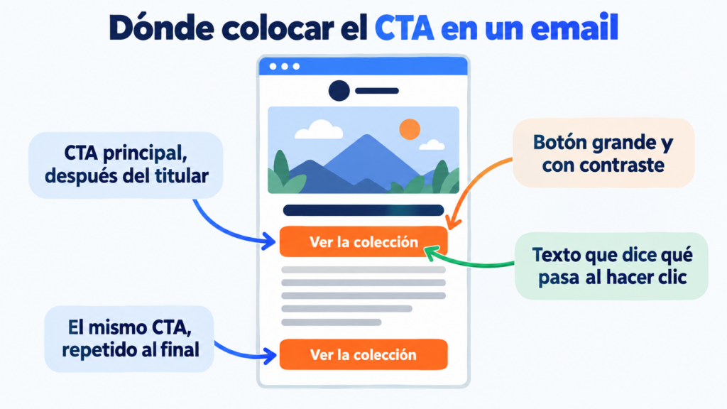
Copywriting tips for your CTAs
The copywriting of a CTA goes beyond asking for an action.
It is about prompting, persuading and motivating users to take a specific step in their customer journey.
The choice of words, tone and structure of the message decide whether a user will click a CTA or walk past it.
Let’s look at some practical tips:
Write attractive headlines
Titles or headlines are often the first interaction a user has with your CTA and, therefore, they must be captivating and promising.
- Spark curiosity: Use headlines that make users want to know more.
- Present benefits: Highlight a value or benefit users will receive.
- Example CTA: A headline that says “Discover the secrets of marketing” sparks curiosity and promises something of value.
Using power words
Power words are those that carry emotional or psychological weight.
And they can make a message more persuasive.
- Emotional words: Such as “Discover”, “Secrets” or “Exclusive”.
- Urgency words: Such as “Now”, “Immediate” or “Today”.
- Example CTA: “Get exclusive access now” combines both exclusivity and urgency to create a powerful message.
Short, direct messages
Brevity is key when it comes to CTAs.
Messages should be short enough to be read and understood quickly, and impactful enough to drive action.
- Be concise: Keep the message as short as possible.
- Avoid unnecessary words: Every word must serve a purpose in the message.
- Example CTA: “Download free” is brief and direct, and clearly communicates both the desired action and what the user will get in return.
How Mailrelay helps you
With Mailrelay’s drag-and-drop editor you can add buttons to your newsletters without writing HTML, with the text, color and size you choose. Then you save them in your email templates to reuse them.
After each send, the statistics show you clicks in real time, and the click map shows which areas of the email get the most interaction. You can also run A/B tests to compare two versions of a campaign.
The free account lets you send up to 80,000 emails a month to 20,000 contacts, with chat, ticket and phone support.
Launch your next campaign with Mailrelay
Up to 80,000 emails a month to 20,000 contacts with the free account, with chat, ticket and phone support.
Frequently asked questions about CTAs
What does CTA mean? It stands for call to action, «llamada a la acción» in Spanish: the button, link or phrase that invites the user to do something specific.
How do you say call to action in Spanish? Llamada a la acción. In marketing, the acronym CTA is also widely used.
What is a CTA on a web page? It is the button or link that takes the user to the next step: buying, signing up, downloading a resource or requesting information.
How many CTAs should an email have? The recommendation is one main goal. You can repeat the same CTA several times, but avoid asking for different actions that compete with each other.
What is a good example of a CTA? One that starts with a verb and says what the user gets, such as “Download the free template” or “Start free, no card required”.