We’re not going to focus on how visitors reach your landing page; we’re going to break down how to build a landing page so that nobody slips away, and show you a few examples.
Consider it done.
Because if a landing page is good for anything, it’s getting your visitors to interact, whatever the goal of your destination page is.
And speaking of goals: being clear about the goal of your landing page is essential for converting into a sale or a lead.
Let’s get down to business, because we have a lot to cover: what a landing page is and what it’s for, how to build one and what content to include. All of this is what will let us build the perfect landing page.
Let’s get to work.
What is a landing page: examples
Landing pages have a big advantage over the static pages of your website: the visitors who arrive are a warm audience, because they usually come from a funnel.
This lets you get straight to the point without any preamble.
In fact, it’s best not to distract visitors from your purpose with unnecessary content, which is why these pages usually have no navigation menu (and we recommend that from the start).
What’s clear is that, one way or another, every landing page serves the same purpose: turning visitors into customers.
Let’s be a bit more specific.
Landing pages can have two goals.
Yes, only two:
● The first, capturing leads who may become future sales.
● The second, selling directly.
Unlike a web design, a landing page focuses on creating a page built for conversion.
Shall we look at a landing page example for each of these goals?
We’ll start with one that could well illustrate the characteristics a landing page needs to be truly effective.
Here Maïder Tomasena puts on a real copywriting show: value proposition, a few benefits and pain points to win the lead.
She finishes with authority, which she certainly has.
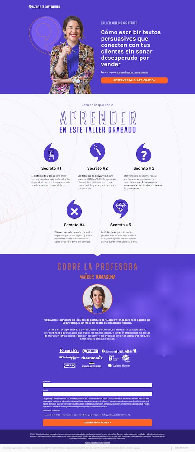
Landing page example by Maïder Tomasena
Now let’s look at an example of a landing page headline with the second goal: selling. It’s from the language company Babbel.
In its headline: few distractions, urgency, a clean design and a description of features with their always powerful benefits.
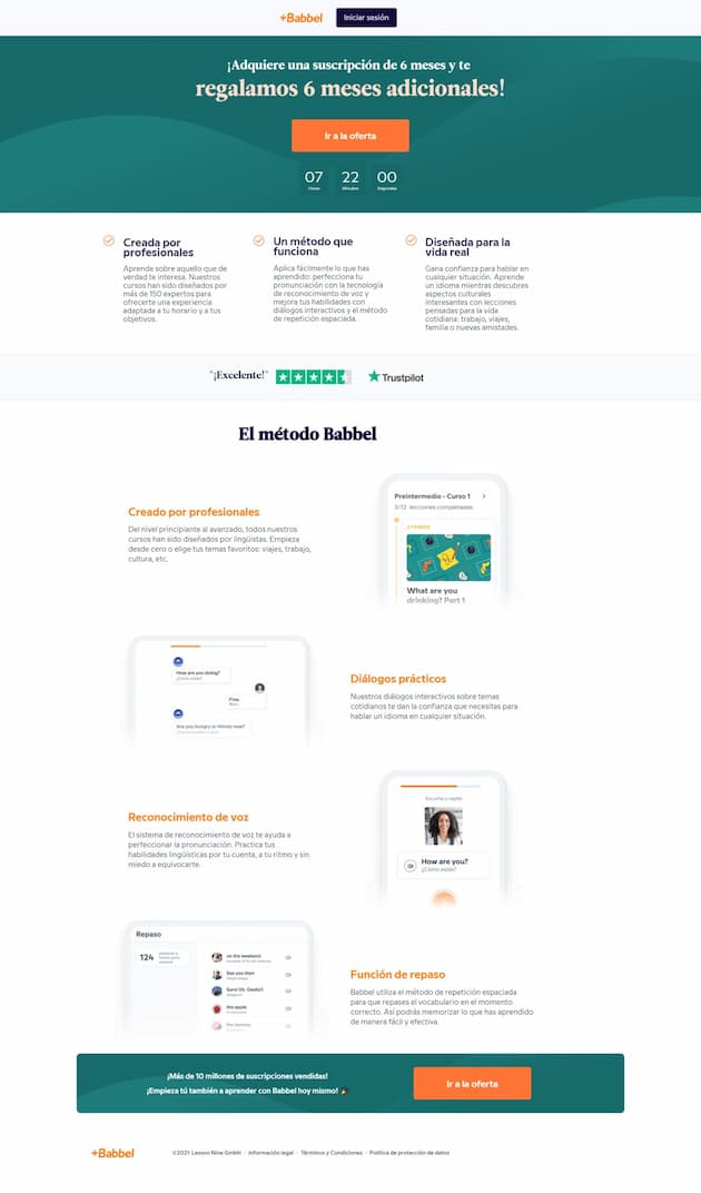
Landing page example by Babbel
From landing page to email, the perfect combination
Turn your landing page visitors into subscribers and nurture that relationship with Mailrelay’s email marketing.
Discover MailrelayHow to create a landing page: the structure of the perfect landing page
Right: now that we know what a landing page is and what it’s for, let’s see what structure it could have.
At this point it helps to have good tools for creating landing pages so you can build them with the elements that will help you turn visitors into leads or customers.
We suggest a basic structure, so you have a guide when building your landing page.
The skeleton of any landing page should be:
● Headline: where you present, clearly and concisely, how you’re going to help your customers so they keep reading.
● Body: to explain what the product or service is, how to get it and why they should buy.
● The call to action or CTA: the moment of truth, where we find out whether we’re reaching the conversion goal we set.
Of course, you need to complete and adapt this structure to your product or service depending on variables such as the complexity of what you sell, its price and your target audience.
Let’s look at each element more calmly:
#1 A top headline for your landing page
The ideal headline for your landing page should have a title and a subtitle.
The title is the first thing a person will read when they reach the landing page, so the copywriting has to be spot on.
It should contain the value proposition so that whoever reads it can decide within a few seconds whether to stay or leave.
To refine it or make it more interesting, we recommend adding a subtitle that makes it more complete.
Here’s an example we love because they apply copywriting right in the above the fold area (what we see before we scroll with the mouse). It’s the financial company eToro.
On the left, a short and concise value proposition, with a subtitle tied to the distinguishing features of their product.
Note the use of numbers, in this case as percentages. Using numbers and symbols is a good copy technique for grabbing the user’s attention.
With this title + subtitle, users already know what they sell and what to do to get the product, thanks to the “Join now” CTA.
We can’t overlook the right side of the page, with the logos of some of their clients. They use this prime space to show off their authority and build trust.
Who can beat that?
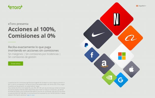
Landing page example by eToro
Another example of a conversion-oriented headline is Aplazame’s, a company that finances end customers’ purchases in online stores.
In fact, look closely at the phrase “conversion rate”. They use it in the main headline, we assume as a keyword.
So this is a good sample of on-page SEO through copywriting when creating a landing page: putting the main keyword in the title (or H1).
And in the subtitle (or H2) it plays with the semantic field using words from the same family: conversions, sell more, CRO…
If you want the landing page to rank organically because you expect to get more out of it than the visits you inject through paid campaigns, this practice will be almost essential.
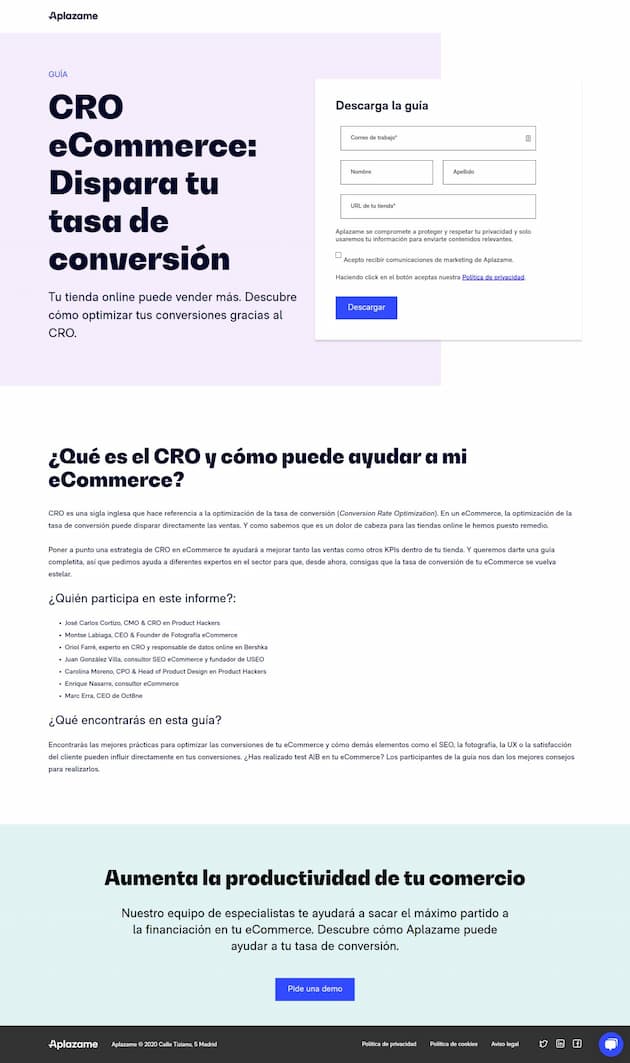
Landing page example by Aplazame
#2 Landing page body and its length
This part of the landing page anatomy is where a landing page for capturing leads differs most from one whose goal is to make a sale.
Likewise, the length of the landing page we’re creating will depend largely on the price of the product and its level of complexity.
Look, in general we see it like this.
● Low price and simple product: short landing page.
● High price and sophisticated product or service: long landing page.
Example of a short landing page
Here’s an example of a landing page whose goal is to capture leads by offering a lead magnet download. It’s from the web design agency Itserra:
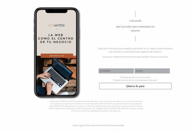
Landing page example by Itserra
Example of a long landing page
We said sophisticated product, didn’t we? Well, here’s the sales page for a training program that brings together Vilma Nuñez of Convierte Más and Maïder Tomasena of Escuela de Copywriting.
It gives plenty of detail about what they offer, since the price is high for the number of hours and the service is still relatively new:

Landing page example by Escuela de Copywriting
The body of the landing page is where we tell the potential customer everything they need to know to decide to buy, subscribe or download a lead magnet.
This is where we have to capture their attention and make everything clear to them. If they don’t understand what we sell and how they can get it, they’re unlikely to buy.
In this respect, copywriting is our best asset when building a landing page.
Capture leads directly from your landing page
Connect your forms to Mailrelay and grow your subscriber list automatically.
Get started with MailrelayBonus: copywriting for the body of your landing page
We couldn’t close a section on the body of the ideal landing page without talking about copywriting formulas that can help you create a powerful page.
Let’s be clear: there are many formulas and every one of them is a help, not an obligation.
That said, we especially recommend these two for landing pages focused on generating sales:
1. The AIDA formula: Attention, Interest, Desire and Action.
In this example from Escuela de Nuevos Negocios we can identify each of these points.
✔ It grabs your attention so you stop doing other things and focus on reading what it’s about to present. It reinforces this with a video.
✔ It generates interest with information and data that make you feel this looks good.
✔ It presents the product or service and arouses desire for it through social proof, as successful business owners already use the product.
✔ It ends by inviting you to take action with an imperative and by reinforcing what will happen if you don’t download it, with that “Don’t miss out on the 10 keys to detecting what’s going wrong in your business”.
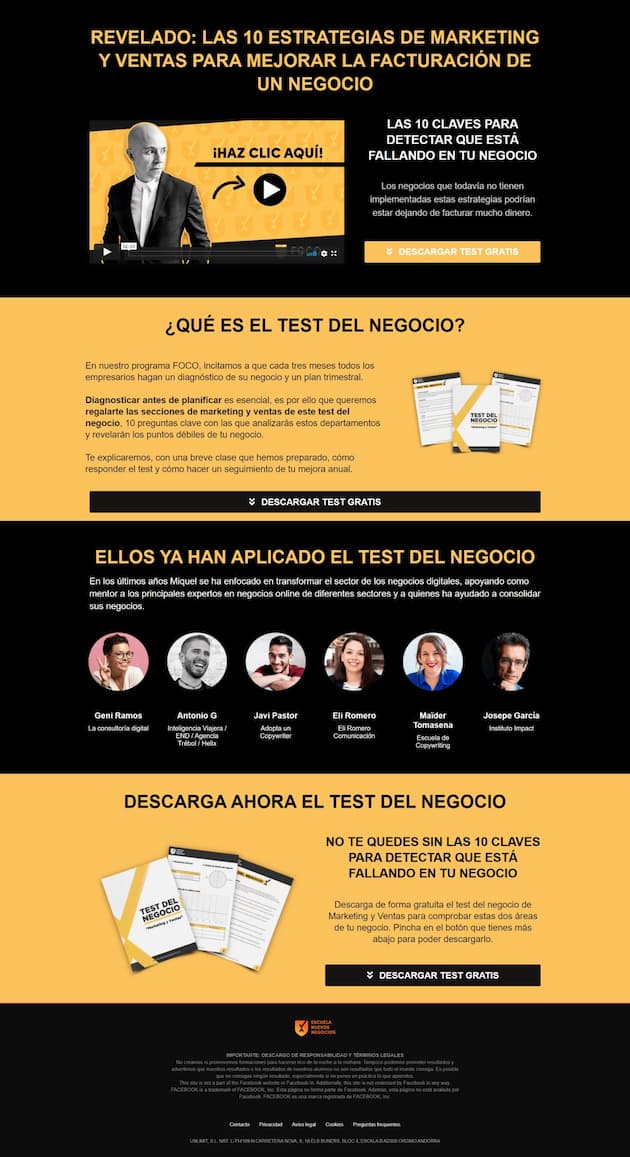
Landing page example by Escuela de Nuevos Negocios
2. The PASTOR formula: Problem, Agitation, Solution, Testimonials, Offer and Response
The sales page example using the PASTOR formula that we’ve chosen is from the nutritionist May Morón. In it we see all the elements of this formula, although not in the same order as the acronym.
This recipe is also very common and you can adjust it to suit you too: you should know the formulas, yes, but they are at our service and not the other way around.
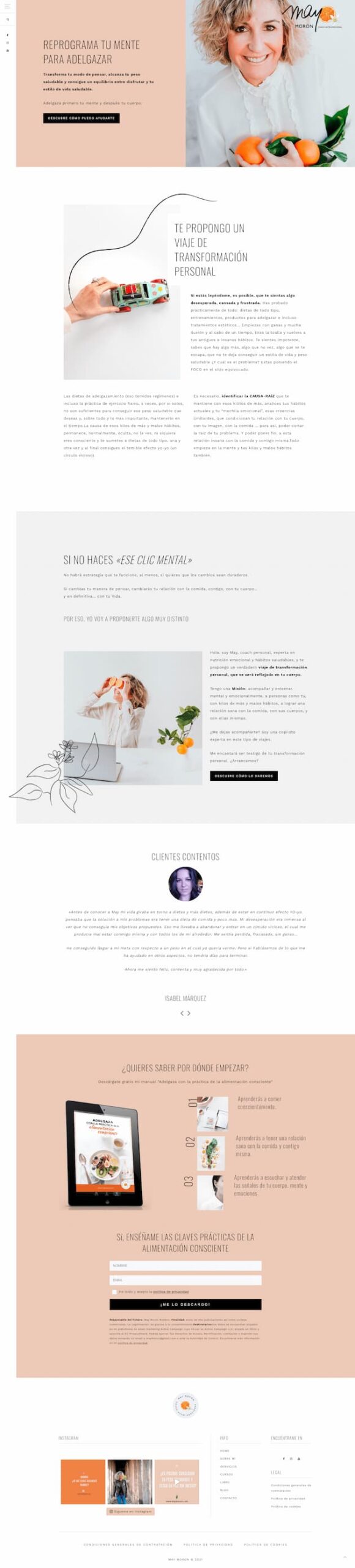
Landing page example by May Morón
Let’s analyze the example; it’s the best way to see it.
✔ It starts with the solution that will solve the target’s problem.
✔ Next it describes the problem in detail, touching on pain points.
✔ From there it agitates the issue by showing the consequences of not solving it. That “IF YOU DON’T MAKE THAT MENTAL CLICK” goes straight to the audience’s heart.
✔ It introduces the solution by explaining what she does and how she can help you.
✔ It continues with the call to action that invites you to discover more.
✔ It finishes with the testimonials. There’s nothing better for getting someone to consider us as an option than having the opinion of those who have already tried it.
Alright.
You’ll have noticed several things about the structure and copywriting of this sales page.
Perhaps you find it odd that it describes the problem in detail yet agitates it only a little.
This is one of the copywriting tips and tricks we can give you when writing your landing pages. Don’t overuse pain points or blow them out of proportion: we don’t want anyone leaving terrified.
If you’ve dug deep into what stirs the audience, go softer on the agitation.
You’ll also have noticed that there are three calls to action.
This is because on long landing pages it’s a good idea to include at least three CTAs throughout the page. That way we’ll get interaction from anyone who arrives, whatever their level of awareness of the product.
Imagine you already know what you want and have to scroll down looking for how to get in touch. You’re likely to leave before you do.
That’s why the AIDA formula example also has 3 Calls to Action.
In this case, the first two calls to action are aimed at the main goal: getting visitors to get in touch.
And the last one?
The last one is aimed at capturing the contact through the download of a lead magnet. Note that it’s at the bottom of the page. Whoever gets here and downloads the gift will be a highly qualified lead, which is also good even if it isn’t the main goal.
#3 Call to action
We could say that, on the menu of the perfect landing page, the dessert that rounds it off is the call to action or CTA.
The CTA is that landing page button that has to be irresistible so that users click on it.
As you know, we readers no longer read, we scan. That’s why it’s so important for CTAs to stand out in the design of landing pages. That way they won’t be overlooked by visitors.
In short, one of the characteristics a landing page needs to be effective is a well-written, well-designed button.
Burn these recommendations into your memory when you build your landing page:
✔ The button text should be clear, short and start with an action verb.
✔ If you can, accompany the button with microcopy that clarifies what happens after clicking.
✔ On short landing pages, a single CTA. Preferably on the right and eye-catching.
Here’s an example that meets these three characteristics. It’s very clear, isn’t it?
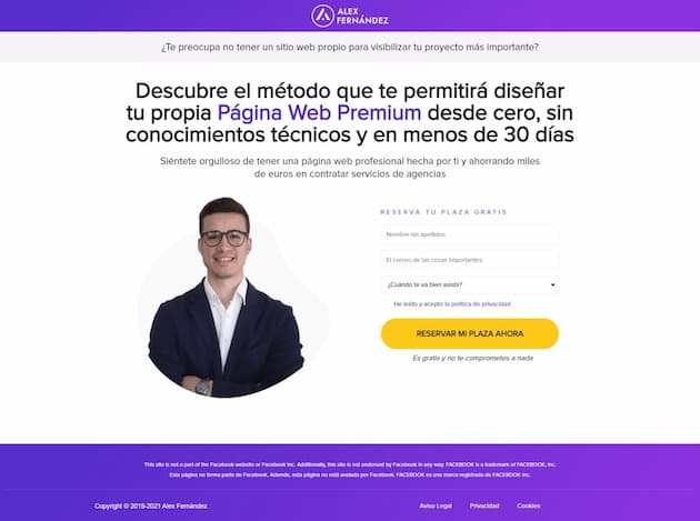
Landing page example by Álex Fernández
✔ On long landing pages, as we said before: placing three buttons throughout the page works well. Their design is best kept identical, and if you change the copy, keep the starting verb the same.
✔ Very important: never fill the landing page with different calls to action. All the ones you include must serve the page’s single goal.
Let’s see it in an example from the company Lookiero. In this case they insert two very clear CTAs in terms of copywriting and design, both aimed at the same purpose:

Landing page example by Lookiero
Some final words on the perfect landing page
We’ve seen how to build a textbook landing page, with examples. And now we’ll wrap up with a recap so you don’t forget the most important points.
That’s what will make sure the money you invest in driving traffic to the landing page isn’t lost in the far corners of the web.
If you want a landing page that converts, remember:
✔ Your landing page content must be designed with a single main goal. Don’t beat around the bush, so you don’t distract.
✔ A landing page usually has two main goals: capturing leads or selling (with the phone call as the exception).
✔ The basic parts of the page’s anatomy are three: headline, body and CTAs.
✔ Take care with the copy of the headline and, of course, of the buttons and the body of the landing page.
✔ To write the body content you can follow two very versatile copywriting formulas: AIDA and PASTOR.
✔ The placement and design of the call-to-action buttons depend on the size of the landing page.
With these characteristics you now have everything you need to create your perfect landing page. Even so, the best thing you can do is test two versions of copy and design and see which works better.
Launch an A/B test and track the main metrics for a while, which will vary according to your goals. Very important: wait until you receive a reasonable number of visits before measuring.
Generally the most revealing metrics are conversion rate, bounce rate and session duration, in case you need somewhere to start.
After the test period measuring these three variables, you’ll see which version people liked most and, above all, which one brings you closer to your conversion goal.
We hope you enjoyed this guide to building the perfect landing page, real examples included.
👀 If you have recommendations for other landing pages worth seeing, we’d love to see them. Tell us about them in the comments, and see you next time!
Before designing it, be very clear about who your ideal customer is, since all the copy and design must speak directly to them.
If you also need to rethink your home page, many of these same design and conversion principles apply there too.
Turn every visit into an opportunity
Design the whole flow, from landing page to welcome email, with Mailrelay.
Try Mailrelay for free