Landing page structure: the 7 parts, a template and examples to make it convert
What to put in each part, from top to bottom, with a template to copy and a checklist before you publish

What to put in each part, from top to bottom, with a template to copy and a checklist before you publish
What is the structure of a landing page?
Seven parts, from top to bottom: headline, subheadline, image or video, benefits, social proof, form or button and legal footer. They all revolve around a single goal.
That goal shapes everything. A landing page isn’t just another page on your website: it’s a page with a single mission, getting the visitor to leave their email address or buy.
That’s why it has no menu or distracting links.
In this guide you’ll find the 7 parts explained one by one, a copy template you can reuse, real examples and a checklist to review your landing page before you publish it.
This is the structure I recommend for almost any landing page. You can expand it or trim it, but the order works in most cases.
| Part | What to include | Tip |
|---|---|---|
| 1. Headline | The main promise: what the visitor gets | It should be understood in three seconds |
| 2. Subheadline | How they get it or who it’s for | One or two sentences, no more |
| 3. Image or video | The product, the lead magnet or the result | It should show, not decorate |
| 4. Benefits | Three to five specific advantages | Talk about what they gain, not about features |
| 5. Social proof | Testimonials, figures or customer logos | With a name and photo, better than anonymous |
| 6. Form or button | The action you want, with a verb | Only ask for the data you’re going to use |
| 7. Footer | Legal notice, privacy and contact | No menu or links that take visitors off the page |
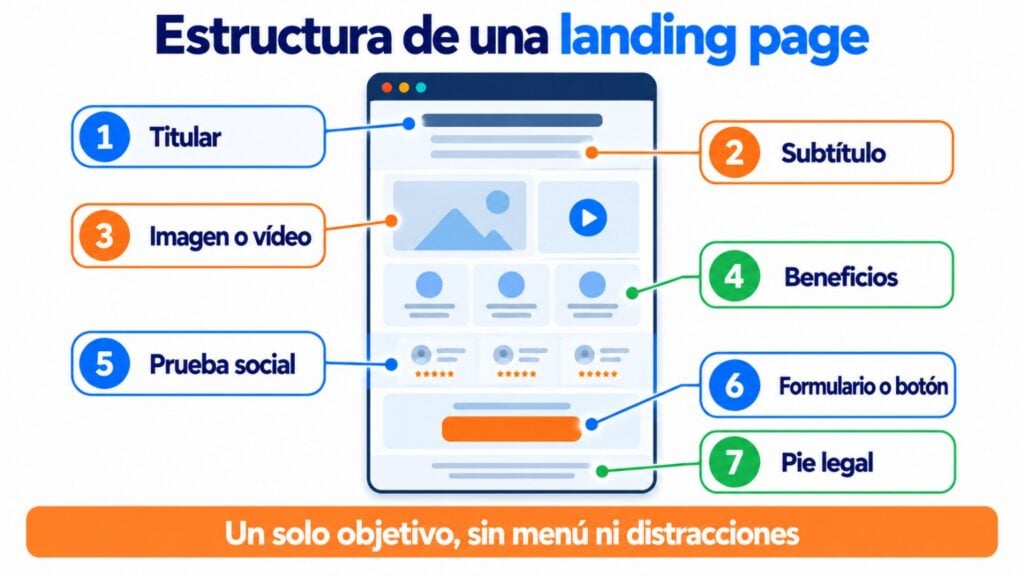
What visitors see without scrolling (headline, subheadline, image and button) carries the most weight.
If that first screen doesn’t convince them, they never get to read the rest.
A landing page is a page created so that the visitor does just one thing.
It has a big advantage over the rest of your website: whoever lands on it usually comes from an ad, an email or a specific post, so they already know what it’s about.
That lets you get straight to the point. That’s why it’s best to remove the navigation menu and any link that doesn’t lead to the goal.
Landing pages have two main goals. The first is to capture leads that may become future sales. The second is to sell directly.
Take a look at this lead capture example.
Maïder Tomasena puts on a copywriting showcase: value proposition, a few benefits and pain points to win the lead. And she rounds it off with authority.
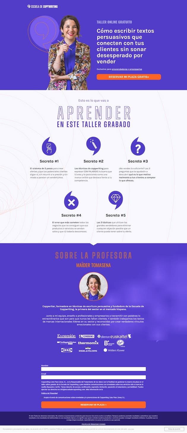
Landing page example by Maïder Tomasena (screenshot from 2021)
For the sales goal, look at Babbel. Its headline has few distractions, urgency, a very clear design and a description of its features with their benefits.
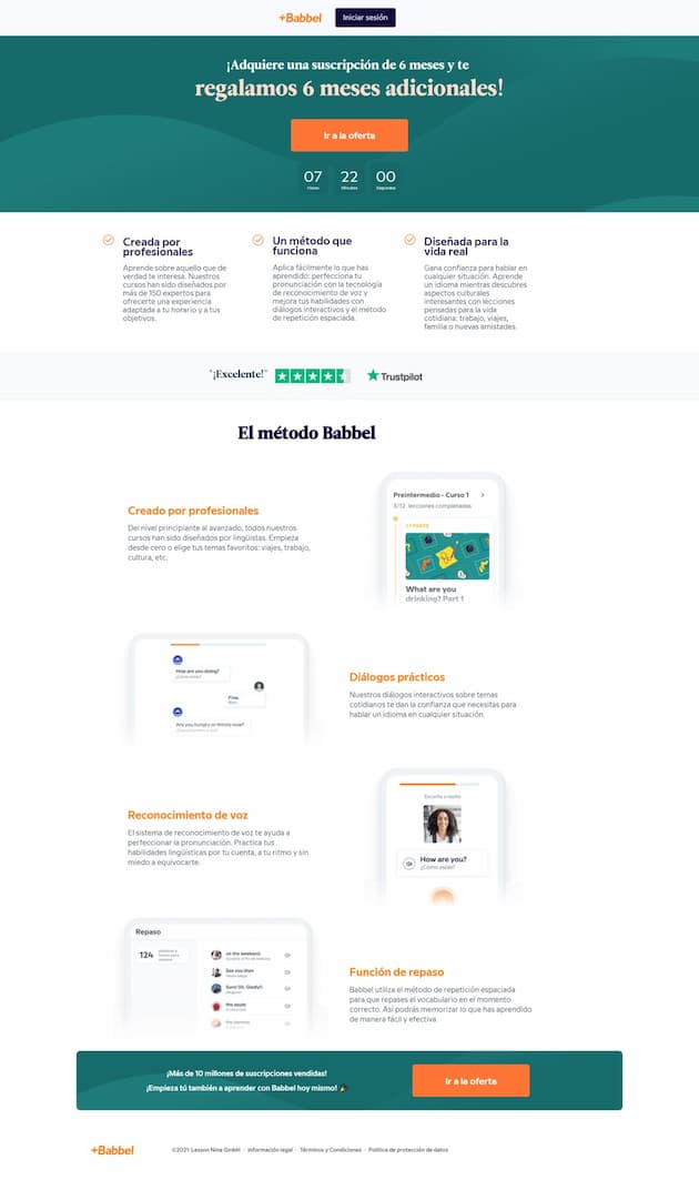
Landing page example by Babbel (screenshot from 2021)
From landing page to email, the perfect combination
Turn your landing page visitors into subscribers and nurture that relationship with Mailrelay’s email marketing.
Let’s look at each part more closely, with examples and what to avoid in each one.
The headline is the first thing people read, and it decides whether the visitor stays. It has to contain your value proposition: what the person who lands on the page gets.
eToro is a good example. On the left, a short value proposition, with a subheadline that explains what sets their product apart.
It uses numbers, which grab attention. And on the right it shows customer logos to build trust.
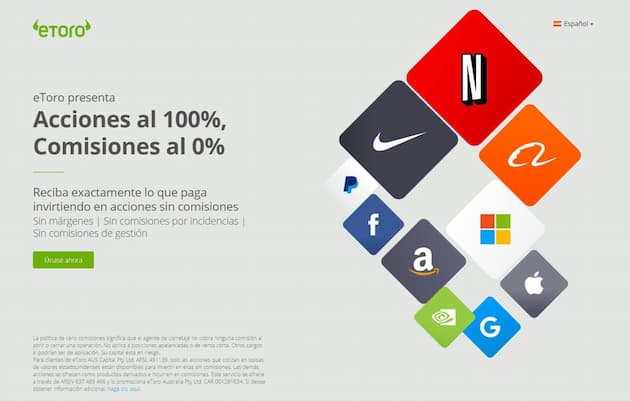
Landing page example by eToro (screenshot from 2021)
The subheadline completes the headline’s promise. It explains how you deliver it or who it’s for, in one or two sentences.
It also helps with SEO if you want the landing page to rank on Google.
Aplazame puts the keyword, “conversion rate”, in the headline, and in the subheadline it plays with words from the same family: conversions, selling more, CRO.
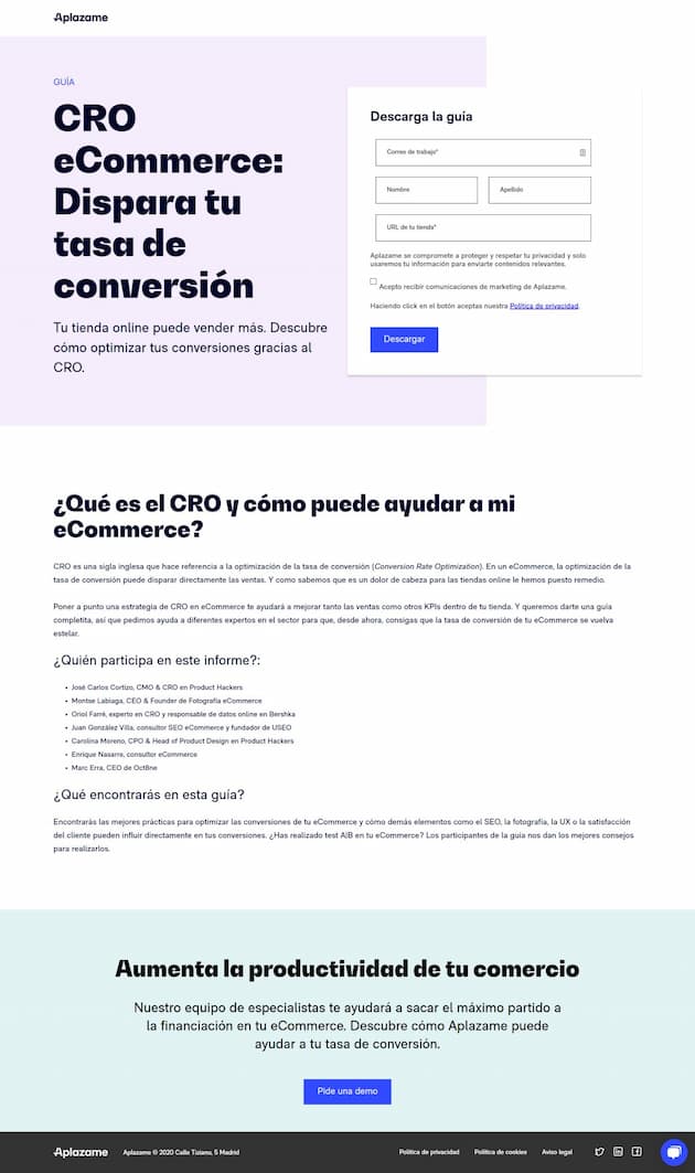
Landing page example by Aplazame (screenshot from 2021)
The image has to show what you’re offering. If you’re giving away a guide, show the cover.
If you sell a product, show it in use. If it’s a service, show the result.
Avoid generic stock photos.
A short video works well for products that are hard to explain, but don’t make it the only thing: lots of people never hit play.
Benefits answer the question “what’s in it for me?”. Choose three to five and write them from the visitor’s point of view.
“40-page report” is not the same as “Find out in 10 minutes what’s holding back your sales”. The first is a feature. The second, a benefit.
Social proof removes fears. Customer testimonials, number of users, ratings or logos of companies that already trust you.
Testimonials with a name, job title and photo are more convincing than anonymous ones. And place them near the form, right where doubts arise.
This is the moment of truth: here you find out whether the landing page achieves its goal. Keep these recommendations in mind:
| Element | Recommendation |
|---|---|
| Button text | Short, clear and with an action verb: “Download the guide”, “Book your spot” |
| Microcopy | A line under the button that explains what happens next: “We’ll send it to you right away” |
| Form fields | Only the ones you’re going to use: the email address and, at most, the name |
| Number of buttons | One on a short landing page. On a long one, the same button repeated about three times |
| Goal | All buttons lead to the same action, never to different actions |
This example by Álex Fernández meets the first three: a clear button, an action verb and a sentence that explains what you’ll get.
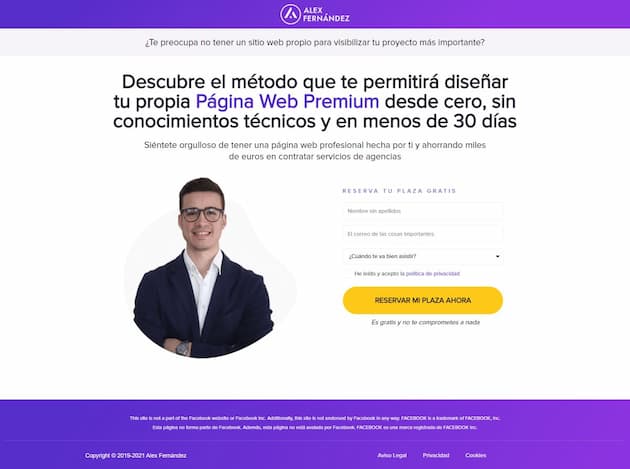
Landing page example by Álex Fernández (screenshot from 2021)
Lookiero includes two buttons that are very clear in both copy and design, and both lead to the same place.
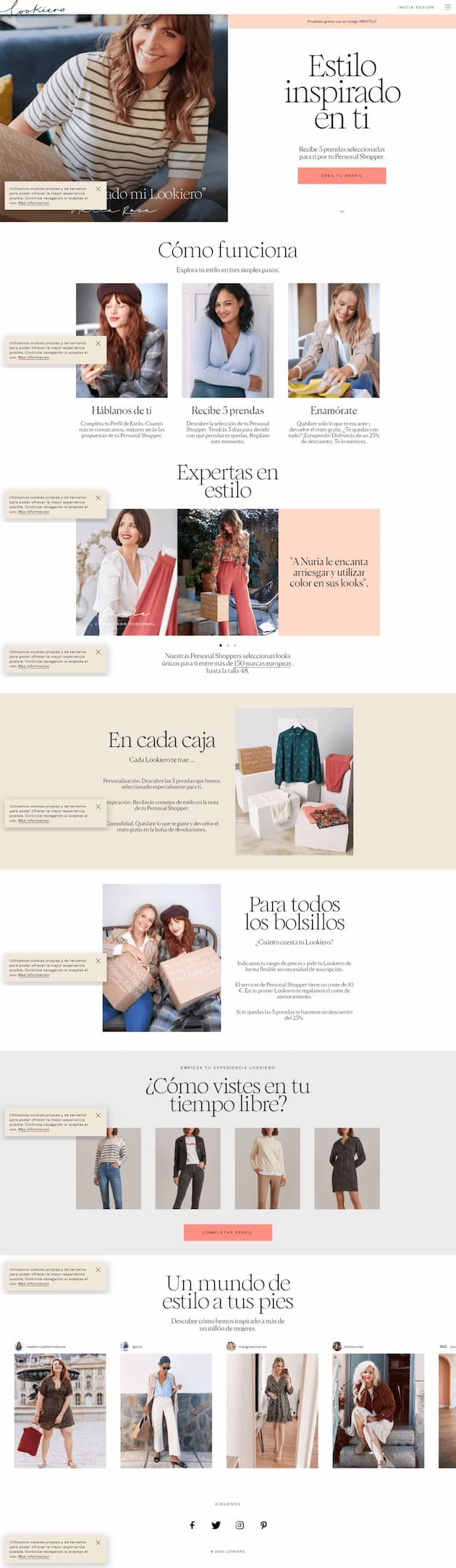
Landing page example by Lookiero (screenshot from 2021)
You can find out more about how to write the button in the glossary entry on call to action or CTA.
The footer builds trust and keeps you within the law. Include the legal notice, the privacy policy and a way to get in touch.
If you ask for personal data, the GDPR requires you to state who processes it and for what purpose.
The safest approach is to ask for consent clearly and confirm the sign-up with double opt-in. And no menus in the footer: every extra link is an exit.
Capture leads directly from your landing page
Connect your forms to Mailrelay and grow your subscriber list automatically.
The length depends on the price and on how complex your offer is. The harder the decision is for the visitor, the more information they need.
| What you offer | Recommended length | Example |
|---|---|---|
| Something free and easy to understand (guide, template, discount) | Short: one or two screens | Lead magnet download |
| An inexpensive, well-known product | Medium | A simple monthly subscription |
| An expensive product or a complex service | Long, with objections and testimonials | A training course or consulting service |
Here’s an example of a short landing page. It’s from the web design agency Itserra, and it captures leads with a lead magnet:
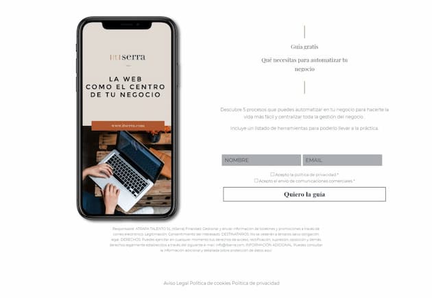
Landing page example by Itserra (screenshot from 2021)
And one of a long landing page: the sales page for a training course by Vilma Núñez and Maïder Tomasena.
Since it’s a new, high-priced product, it gives a lot of detail about what it offers.

Landing page example by Escuela de Copywriting (screenshot from 2021)
On long landing pages, repeat the button about three times throughout the page.
That way, visitors who have already decided don’t have to scroll all the way to the end.
This template works for a lead capture landing page with a lead magnet. Replace the text in square brackets and you have the basics.
Headline: [Get this result] without [this common problem]
Subheadline: Download [resource name] for free and discover [what they’ll learn] in [time].
Benefits: You’ll learn how to [benefit 1]. You’ll avoid [common mistake]. You’ll have [specific result] ready to use.
Social proof: “[Short customer testimonial]”. [Name], [job title or company].
Button: I want my free [resource]
Microcopy: We’ll send it to you right away. No spam: you can unsubscribe whenever you like.
For a sales landing page, swap the lead magnet for the product, add the price and an FAQ block that answers the typical objections: price, timeframes, guarantee.
Formulas are a help, not a requirement. But for sales pages, these two work very well.
You can see each step in this example from Escuela de Nuevos Negocios. It grabs attention with a video and builds interest with data.
Then it sparks desire with social proof from business owners who already use it. And it ends with a call to action: “Don’t miss out on the 10 keys to spotting what’s going wrong in your business”.
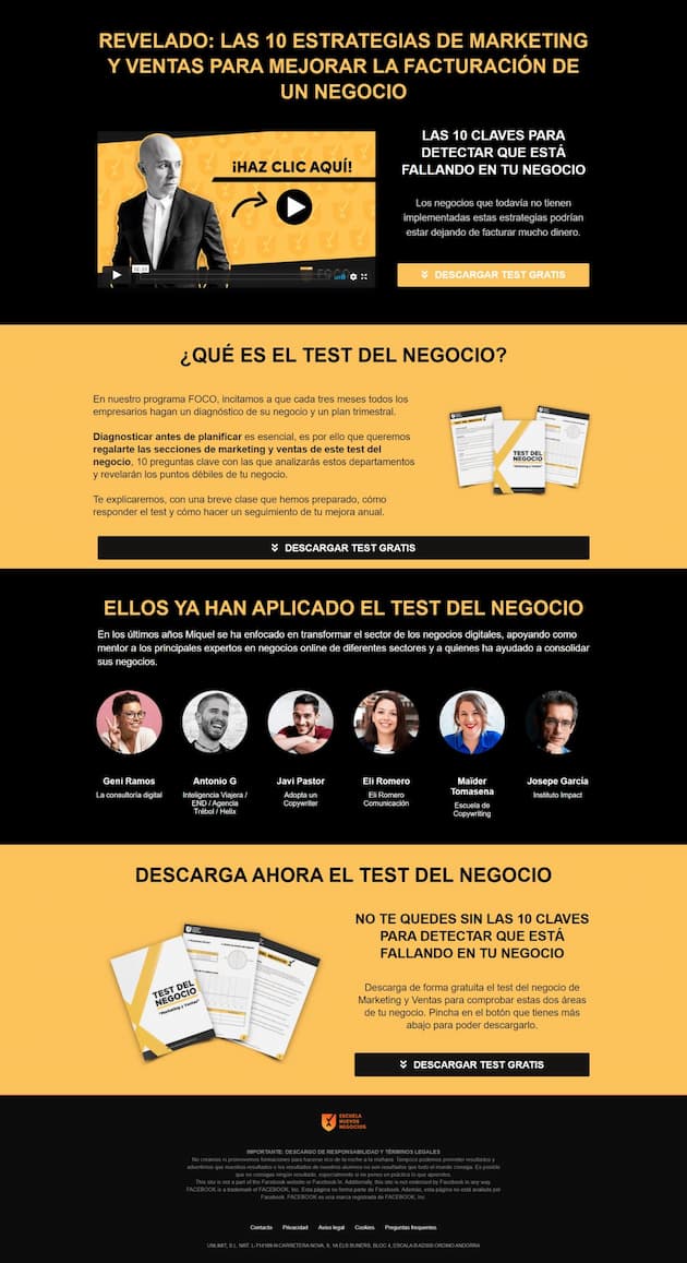
Landing page example by Escuela de Nuevos Negocios (screenshot from 2021)
This example is from nutritionist May Morón. It has every element of the formula, though not in the same order.
It starts with the solution, describes the problem and amplifies its consequences. Then it explains how she helps, invites action and ends with testimonials.
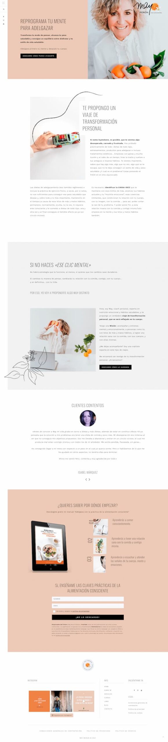
Landing page example by May Morón (screenshot from 2021)
A tip: don’t overdo the pain points. If you describe the problem in detail, go easy on amplifying it. We don’t want anyone leaving scared.
Not every landing page needs the same parts. This table helps you decide what’s a must depending on what you’re after.
| Goal | Must have | You can skip |
|---|---|---|
| Capturing subscribers with a lead magnet | Headline, image of the resource, 3 benefits, short form | Objections block |
| Registration for a webinar or event | Date and time, speaker, what they’ll learn, form | Long testimonials |
| Selling a product | Benefits, price, social proof, guarantee, objections | Nothing: the more complete, the better |
| Ad campaign | The same message as the ad in the headline, a visible button | Menu and external links |
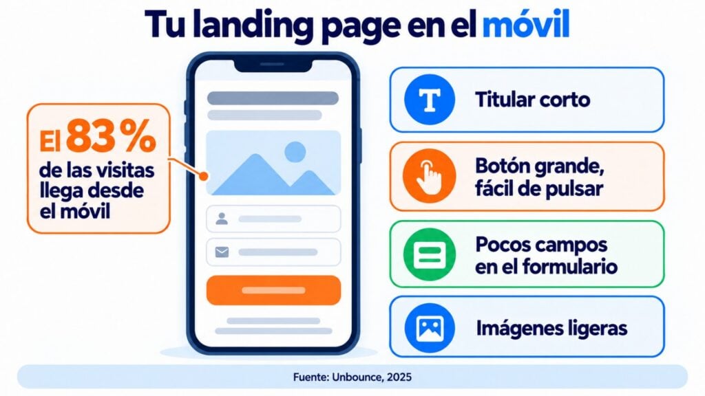
According to Unbounce’s conversion report (2025), which analyzed around 41,000 landing pages, 83% of visits come from mobile devices.
And the median conversion rate is 6.6%.
That’s why you should design for mobile first. Short headline, a big button that’s easy to tap with your thumb, a form with few fields and lightweight images so it loads quickly.
If you have to zoom in to read, something’s wrong.
Go through this list before you send traffic to your page:
The main metric is the conversion rate: the percentage of visits that do what you’re after.
The 6.6% median is a useful benchmark, but above all compare yourself with yourself.
Test two versions of the headline, the button or the image with an A/B test and keep the one that converts best.
That said, wait until you have a reasonable number of visits before deciding. With just a few dozen, any difference could be pure chance.
And add UTM parameters to the links that lead to the landing page. That way you’ll know which channel brings you the most sign-ups.
Before you design it, be very clear about who your ideal customer is, because all the copy and design should speak to them.
And if you also need to rethink your home page, many of these principles apply there too.
What if you don’t want to code? With the Mailrelay landing page builder you create your page from a template or from scratch, without touching any code.
You add a subscription form with the fields you need and publish it.
New contacts go straight into the subscriber group you choose.
With an automation you send them the welcome email as soon as they sign up, and you track the landing page’s performance in real time.
Landing pages, their templates, forms and conversion tracking are included in every plan, including the free account, with human support on all of them.
Turn every visit into an opportunity
Design the whole flow, from landing page to welcome email, with Mailrelay.
These are the questions we get most often about creating a landing page.
Seven parts, from top to bottom: headline, subheadline, image or video, benefits, social proof, form or button and legal footer. They all revolve around a single goal.
A single goal, a headline that’s understood in seconds, clear benefits, some kind of trust signal and a visible button. And no menus or distracting links.
It depends on what you’re offering. For something free and simple, one or two screens are enough.
For an expensive or complex product, a long landing page with objections, testimonials and the button repeated several times is the way to go.
A website has several sections and goals, with a menu to move around.
A landing page has a single goal and no menu, so the visitor doesn’t get distracted.
According to Unbounce, the median across industries is 6.6%, with big differences from one industry to another. What matters is that your landing page improves with every test.
Create your landing pages with Mailrelay
How to build a simple landing page to capture subscribers.
How to write your subscription form
What to write on your form so more visitors subscribe.
20 lead magnet ideas to get subscribers
What to offer in exchange for an email address depending on your business, and how to deliver it.
Tips for creating the perfect popup for your website
When and how to show a popup to capture contacts without being annoying.

Jose Argudo
CMO at Mailrelay. Writes about email marketing, copywriting and conversion for SMEs and entrepreneurs.