
Landing pages are very useful tools for boosting your online marketing campaigns, essential for capturing leads, new potential customers.
You can always drive traffic from Google Ads campaigns, social networks, or newsletters to your website, but there are distractions on your home page.
It is very easy for those people not to end up signing up. They could start clicking on other links or banners.
Sometimes you might be interested in that, but other times you just want them to sign up.
If you want to do that, you can use a registration page, which is commonly called a landing page.
There are many good tools out there for creating landing pages. Although most services have a rather important problem:
- They don’t offer integration with Mailrelay.
And that is a serious problem, because it generates many limitations.
That’s why at Mailrelay we have created our own landing page editor. It is very easy to use and fully integrated into your Mailrelay account. This way, you will be able to send a newsletter immediately to all your new leads.
In the first paragraphs, I will tell you a little about the definition and general concepts of registration landing pages. After that, I’ll show you how to create a new landing page in just a few clicks:
- 1 What is a registration landing page?
- 2 Key elements for creating a registration landing page
- 3 How to create a landing page with Mailrelay, first steps with the landing page editor
- 3.1 Select background color
- 3.2 Selecting the background color of the main container
- 3.3 The default structure we have as soon as we create the landing page is
- 3.4 Dragging itens to the registration landing page
- 3.5 Structuring the landing page contents
- 3.6 Adding images to the page
- 3.7 Adding a button to the landing page
- 4 In short, a useful tool for getting new leads
What is a registration landing page?
Although I will spend most of my time explaining how to create a landing page, I must first lay the foundations of this concept so that, later, you will understand the steps for creating your first landing page with our email marketing software.
The first thing to do is to define what a “registration landing page” is. The goal of this kind of page is to collect data from visitors (their name and email address, for instance).
In other words, you create a signup landing page to capture personal data from people who access it. So the goal of landing pages is to convert visitors into new leads.
A registration landing page is the gateway to your business. The number of leads or potential customers you can have will depend on its structure, elements and texts.
The idea of this type of page is to offer a clean, simple design, with no links or buttons other than the subscription button. It also has no navigation menu and barely contains a headline, a benefits section and a form.
The easiest way to create them is through a creator or visual editor such as the one offered by Mailrelay, which we will see today.
On the other hand, it is important to highlight that the offer promoted in this type of pages is usually of interest to the target audience and free. You have to offer something relevant to convince them to fill in their data.
Usually, this free gift is called a lead magnet. Depending on the nature of the business, it will be of one type or another. Some examples are:
● Ebooks.
● Courses.
● Software trial.
● Templates.
● First session for free.
● Other discounts.
A lead magnet is a valuable resource that companies can offer to convince visitors to exchange their personal data for the gift they will receive for free; if you know how to use this data, you will have many potential customers.

Key elements for creating a registration landing page
When we talk about conversion in a registration landing page, we are referring to the % of people who left us their data or, what is the same, the success rate of the page.
In order to encourage your visitors to leave their data in the form, this page must include certain elements. I will describe them all below.
But, first, I would also like to mention that a conversion can have different objectives depending on the type of offer and the type of business. For example, we could talk about:
● Subscriptions for an event.
● Registrations for a free session.
● Files for download.
● Software trial.
● Get discounts and bonuses.
Header
When creating a registration landing page, you must take into account that the first thing the user will see will be the header. It should be attractive enough for them to keep reading and, at the end, complete the subscription form.
The header consists of:
Title:
The title corresponds to the main promise of your offer or lead magnet. It should be powerful, but at the same time credible. To create it, I recommend you to base it on the main advantage of what you are offering.
That is, the number one reason why your visitors need your lead magnet. Another recommendation is to ask questions, for example “How” and “why”.
You can also create sentences that include an objection. For example “How to optimize the performance of your PC without any technical knowledge”.
Subtitle:
The information about the header can be expanded below. If it were an event, you could use the subtitle to show the most relevant information. In any other situation, it will serve to specify who the lead magnet is for.
Button:
Finally, the header should include a button that will take visitors directly to the form on this same page. It is essential that it stands out from the rest of the elements and that it has a copywriting text aligned with what you have promised.
If we are trying to promote a free event, the button could say something like “I want to register now”.
Advantages
After the header, the reader will need to find more reasons to access the download, event or promotion you are offering. Therefore, a section on the advantages of the offer should be added below.
You can show etween 3 and 5 advantages. If we add too many text, we may lose the attention of visitors. In this case, you should include only the vital information to convince visitors to access the form.
On the other hand, it is better to create the text in the form of bullet-pointed lists or some other visually appealing and easy-to-read layout.
Form
If we talk about creating a registration landing page, the form will be the key and fundamental piece. Through it, visitors will be converted into leads or commercial prospects. Therefore, we can’t forget about that.
As a main tip, I would say that it is best to keep the form short and to the point. So you should only request the most relevant information about your leads. A priori, the name and email address could be enough.
It is important to note that a form with only two fields has a higher success rate than one with five, seven or ten.
No matter how advantagious and attractive your offer is, if the form is too long and you ask for too much information, users may abandon the registration process.
Other aspects you should consider
So far we can say that we have described the key elements of a registration landing page, but there are other factors that should be considered. For instance:
● Images. If you are going to add images, choose good quality ones that are really related to what you are offering. That is, if the image adds value to your objective, yes, you should include it. Otherwise, it would be better to create a landing page without images.
● Fast loading speed. Another important factor is page loading speed. Remember that users abandon slow loading websites.
● Testimonials. Finally, if you have testimonials that you can share, it would be advisable to add one to add another reason to motivate visitors to register.

How to create a landing page with Mailrelay, first steps with the landing page editor
Now we are going to see the most common steps for creating a simple landing page with a registration form.
The first thing you should do is to create a new opt-in form, on “Subscribers” -> “Signup Forms“, because you will use this form when creating a new landing page.
If you don’t have a subscription form yet, you can create a basic one following the steps you can see here.
After that, you can click on Landing pages -> Add to create a new one.
After naming it you will get a screen like the following one:
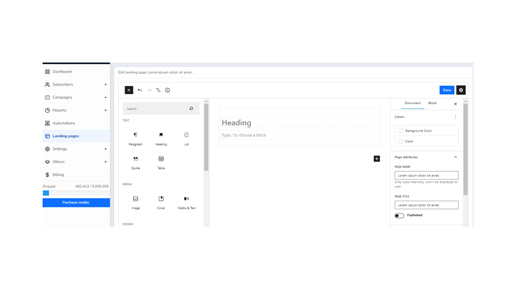
This page is divided into three main sections, from left to right:
- Elements section. These are the different blocks that you can add to the landing page. You only need to drag and drop them in the central area (content).
- Content. This would be a visualization and work area where we can add content to the landing page. We can start to see what it will look like.
- Options. The right column will show the different options for the selected item, or for the page as a whole if no item is selected.
We will now work through these options, step by step.
Select background color
One of the first options we can use is to select the background color of the entire registration landing page.
You can keep the default color (white), but sometimes you may decide to use another background color that fits better with your brand. This will be done from the options block:
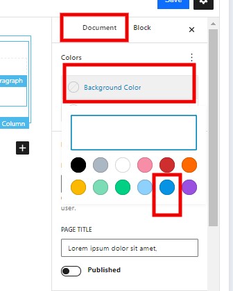
In this case, as I said, we will go to the right column, document section and then choose the “Background color” option.
This selection will change the background of the page to the chosen color.
Selecting the background color of the main container
To work with this task, we are going to look at another of the editor’s main tools, the list view.
This list view is a very useful tool, and is something you will constantly use to better edit your landing page, so let’s see:
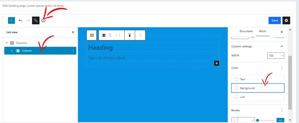
The list view is displayed by clicking on one of the icons in the upper left area, the fourth icon. When you click on it, the system will display a list of all itens of the landing page organized hierarchically.
That will allow you to display the block options for each of the itens, and even move them to different positions on the screen. Group them inside each other, etc.
Once a feature is selected, the right column shows the options for that particular block. For example we can select the background color, or modify the width.
In the image above you can see, on the right, how the arrow points to the “background” option.
The default structure we have as soon as we create the landing page is
- A larger main column
- With another, less wide inner column
Why are we using this structure with one column inside the other?
We use this layout so that the inner column always remains centered on the screen. It is possible to see two options in the right column:
- Content. This would be the width of the content.
- Width. This would be the maximum width of the column.
In this way, by setting the width of the content as smaller, we would have a margin between the border of the container and the content itself.
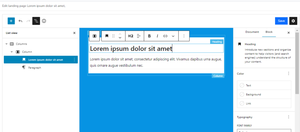
On the right of the image you can see how the maximum width of the column has been set to 900px, while the width of the content has been set to 850 px. Thus leaving a small margin.
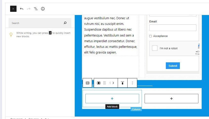
Dragging itens to the registration landing page
Now let’s see how to add new options to the work area in just a few clicks:
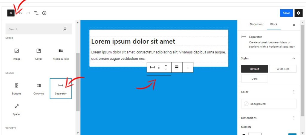
The first thing to do is to select the feature in the left area, a separator in this case, and drag it with the mouse to the desired location in the content area.
By moving the mouse over the content area, we can see a blue bar, indicating the intended location of the content.
Structuring the landing page contents
Even if you will use a clean design for your landing page, you will want to add a certain amount of content to it. One of the easiest ways to structure the landing page is through the use of columns:
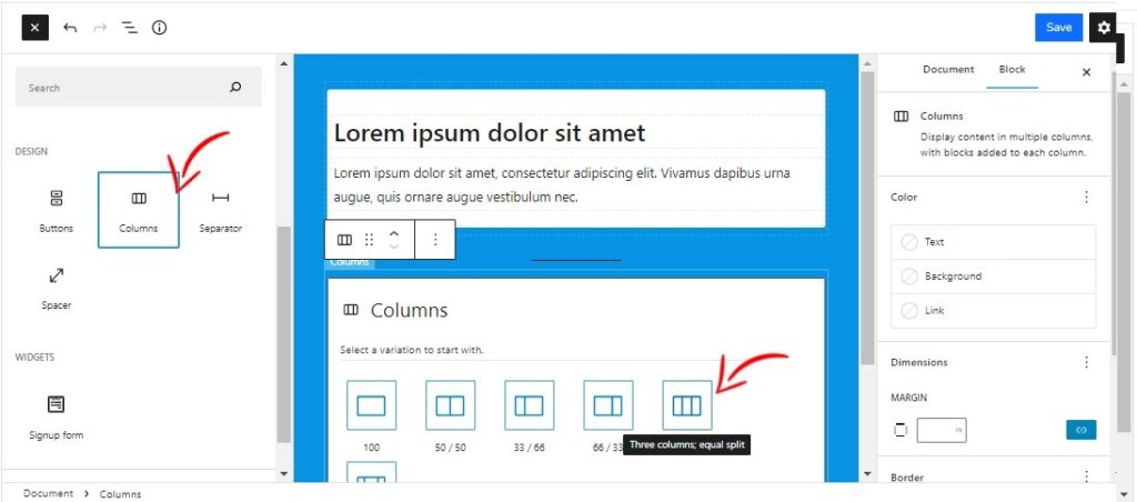
As you can see in the image, there are multiple column options. A very useful option is the three-column feature, because it will allow us to use the middle column as a content separator.
Now you will see what I mean:
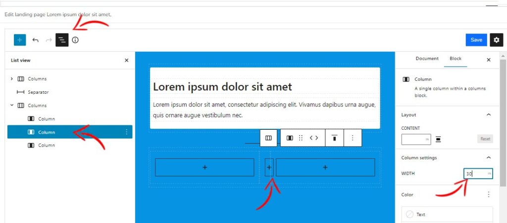
After adding the columns you can go to the “list view” and select the middle column, on the right in the block column, you will see that the “width” field is empty. But if we define here a width of 50px that column will be reduced and can act as a separator.
That way the columns will not be joined together, which could make reading difficult.
After that you only need to click on the “+” symbol. to add content to the columns.
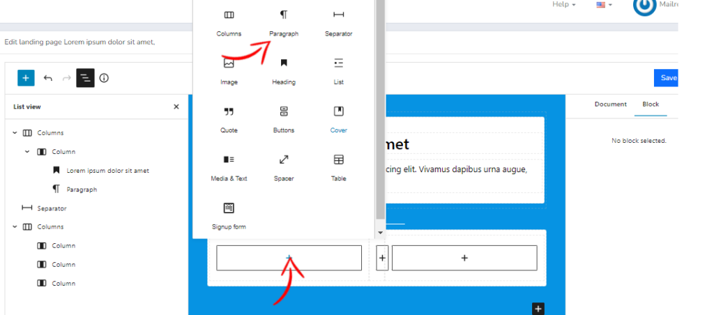
Notice that by clicking on the “+” symbol, the selection allows you to choose between the available blocks, in this case for example a paragraph.
And if we add content to it, the design would look like this:
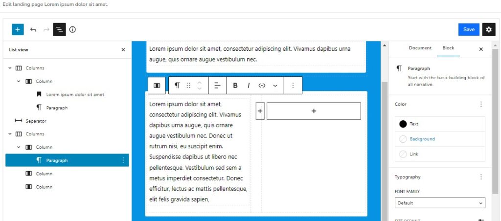
In the example we have also added a “List” block below the paragraph. It is possible to continue adding elements to this column by following the same steps. For example, more paragraphs, images, etc.
Now we will repeat the process, but with one change and add a form in the third column:
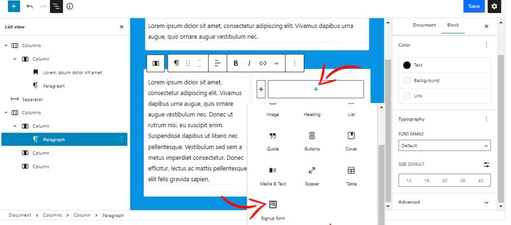
As I said at the beginning, we will only be able to choose among the existing forms. Therefore, it is necessary that you have previously created the forms that you will use:
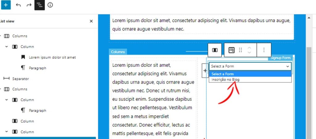
Once selected, the form will be embedded in your landing page:
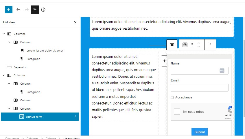
The configuration of the background color of the form, as well as the rest of the itens, is done in the forms section itself, it is not possible to make these changes in the creation of the landing page.
That is, the form will be displayed in this section as you have configured it.
If you change anything in the future, keep in mind that any changes made to the form will be reflected in the landing page.
Adding images to the page
Images are an essential part of any sales or registration page. Adding them is simple, now let’s add an image with a text next to it. To do this we will first add two more columns below the previous ones:
What we are going to do is to use the left column to add an image, and the right one to add a paragraph. This way the content will be correctly structured and legible.
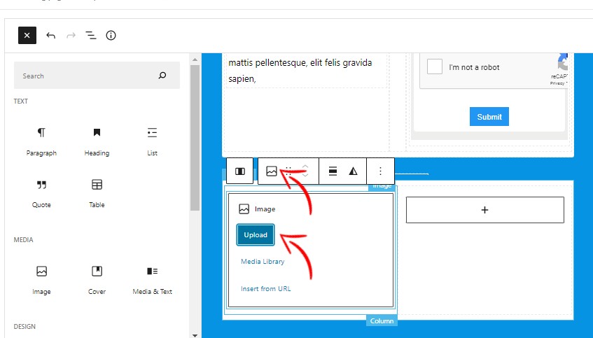
You can use an image that you have already uploaded to Mailrelay, or upload a new one from your computer.
However, keep in mind that the editing capabilities of the landing page editor are limited, so you should upload the images already optimized.
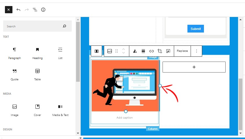
When you click on the image, you will see two circles. This option will allow you to stretch it to the size you want. Although, as I mentioned before, it is a very limited feature, so it is better to upload the image ready to use.
On the right, in the block options, we can also change the width or set an alternative text attribute for the image.
Although it is not recommended to add itens that may distract visitors from the main action, as this is an example article, we will see how to add a button.
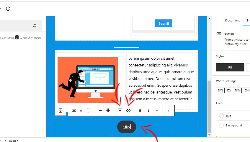
In the image we have highlighted the options that allow you to select the alignment of the button, for example to center it, and the option to add a link for a specific action.
Now I am going to show you an image with the final result:
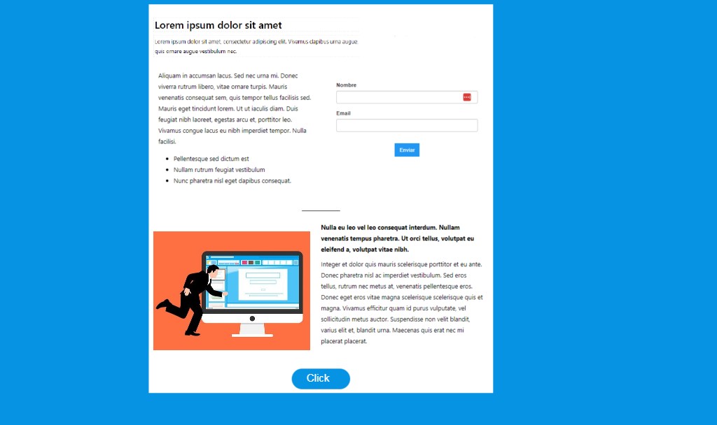
In short, a useful tool for getting new leads
We have created a simple registration landing page, but with the essential elements to fulfill its function.
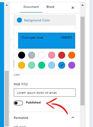
We recommend that you run several tests, but don’t forget to publish the page, so that it offers you a URL that you can share in your campaigns:
We hope that this feature will help you a lot in attracting new contacts.