A company’s corporate image: what it is, its elements, examples and how to create it step by step
The complete guide to defining, designing and maintaining your company’s image, with its corporate identity manual and real examples

The complete guide to defining, designing and maintaining your company’s image, with its corporate identity manual and real examples
Think of a brand you know well. A color, a logo or even a way of speaking probably comes to mind before any fact about what it sells.
That’s corporate image in action.
Corporate image is the idea the public has of your company. And it’s shaped by everything you do: your logo and your colors, yes, but also how you treat a customer, how you write your emails and what you do when something goes wrong.
In this guide I explain what a company’s corporate image is and how it differs from corporate identity. You’ll see which elements make it up and how to create it step by step. You’ll also see what a corporate identity manual includes, how to approach the project, some examples and how to measure and improve it.
Corporate image is the perception that customers, employees, suppliers and society in general have of a company. It’s what they think and feel when they hear its name or see its logo.
It’s also called business image, company image or institutional image, especially when we’re talking about public bodies or foundations.
The key thing to understand is that the company doesn’t decide its corporate image. The company can work on it, but it’s the public who shapes it, through every contact they have with the brand:
That’s why two companies with equally attractive logos can have opposite corporate images. Design helps, but it isn’t everything.
These three concepts are often confused, and that’s understandable, because they’re closely related. The simplest way to tell them apart is this:
| Concept | What it is | Who controls it | Examples |
|---|---|---|---|
| Corporate identity | Traits that define the company and how it presents itself | The company | Logo, colors, typography, values, tone |
| Corporate image | Overall perception of the company | The public | “It’s a serious company”, “they give good service” |
| Brand image | Perception of a specific brand or product | The public | “This sneaker brand is expensive but lasts” |
| Personal brand | Perception of a professional | The public | “She’s the go-to tax expert in her city” |
In other words: corporate identity is what you send out and corporate image is what the public receives. The more consistent your identity, the closer your image will be to what you want to convey.
If you’re interested in the brand side, there’s more detail in the glossary entries for brand image and branding. And if you work for yourself, in this guide to personal branding.
A good corporate image isn’t an aesthetic whim. It has a direct impact on the business:
Corporate image rests on intangible elements, which give the brand its meaning, and tangible elements, which make up its visual and verbal identity. Both have to tell the same story.
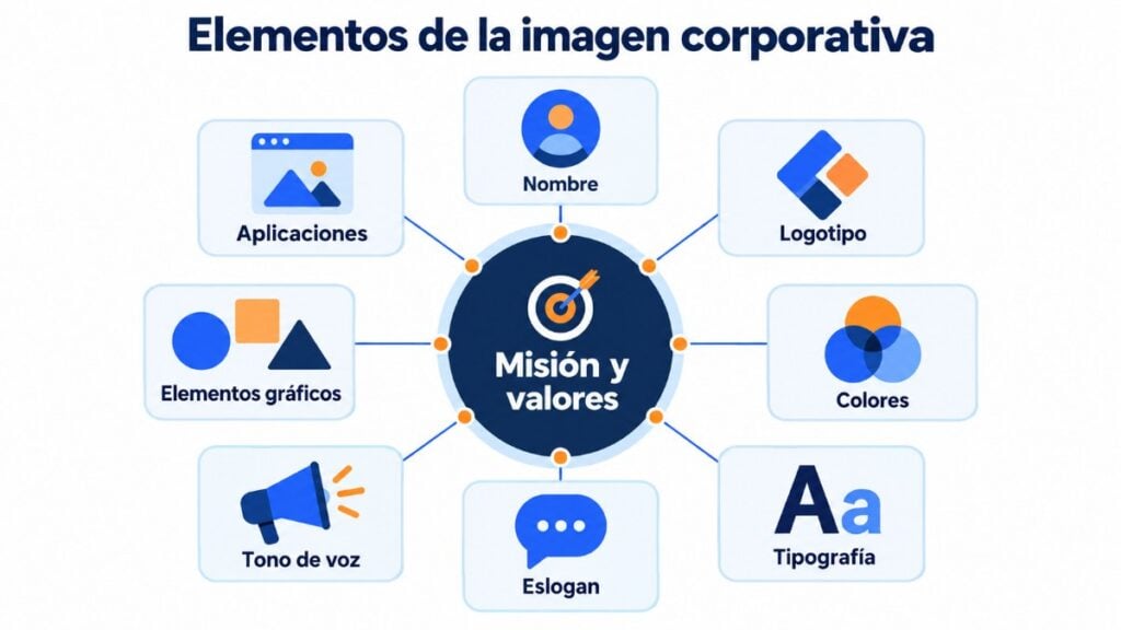
They’re the foundation for everything else. Before you think about colors, define:
If they’re not clear to you, start with this guide to a company’s mission, vision and values. Without them, design is just decoration.
Your name is the first thing the public learns about you. It should be short, easy to pronounce and remember, and have the domain available. Also check that it isn’t registered as a trademark in your industry.
You’ll find ideas and tools in this guide to naming and in these tips for creating business names.
The logo is the most visible element of corporate identity. Depending on how it combines text and image, it’s called:
A good logo is simple, is legible at small sizes and works in color, in black and white and on dark backgrounds. If you’re just starting out, you can create a logo for free and improve it later.
Colors are what people associate with a brand fastest. Choose a main color, one or two secondary colors and a few neutrals, and define their exact codes (HEX and RGB for screen, CMYK and Pantone for print).
Keep contrast in mind: light text on a light background is hard to read, and that affects the accessibility of your website and your emails.
Typography communicates too: a serif typeface conveys tradition, a sans-serif one feels more modern and a handwritten one feels friendlier.
The practical approach is to choose one or two typeface families: one for headings and another for long texts. Check that they’re easy to read on mobile and that you have a license to use them on the web.
A slogan sums up the promise of your brand or of a campaign in a single sentence. A tagline usually accompanies the logo and changes little over time.
You don’t have to have one, but it helps people remember what makes you different. You’ll find examples in this selection of famous slogans.
How you write and speak is as much a part of your image as your logo. Decide whether you address people formally or informally, whether you use humor, which words you avoid and how you respond to a complaint.
Then apply it everywhere: your website, social media, customer service and every email you send. A company’s personality shows even in a formal email.
Icons, illustrations, patterns and photography style complete the visual identity. If you always use the same kind of images, with the same lighting and framing, people recognize your content even without a logo.
These are the places where your brand appears: stationery, business cards, uniforms, packaging, vehicles, signage, website, social media profiles, favicon, presentations, email signature and email templates.
Designing a corporate image is a process. These are the steps I’d follow, whether you’re starting from scratch or refreshing the one you have.
Start from the inside. Review your mission, your values, your products and what sets you apart. A SWOT analysis will help you organize your strengths, weaknesses, opportunities and threats.
If you already have an image, ask your customers and employees how they see you. Perception often doesn’t match what the company believes it conveys.
You’re not designing for yourself, but for the people who will buy from you. Describe your buyer persona: how old they are, what worries them, which brands they use and what they expect from a company like yours.
An image designed for a young, digital audience looks nothing like one designed for executives at large companies.
Make a list of 5 to 10 competitors and analyze their logos, colors, tone and messages. The goal isn’t to copy, but to find a gap. If they all use blue and a serious tone, your opportunity may lie in another color and a friendlier tone.
Write down three or four adjectives you want the public to associate with your company: approachable, expert, innovative, sustainable, affordable… Those adjectives will be the filter for every design and communication decision.
Name, slogan, tone of voice and key messages. Write a sentence that explains what you do and for whom, and a list of words you would and wouldn’t use. Designing is easier when the message is clear.
Now it’s time for the logo, colors, typefaces, image style and icons. If you can, work with a designer or a corporate image agency. If not, tools like Canva or Figma let you create a simple, consistent identity.
Test each proposal in real situations: a social media profile, an email header, a business card, a phone screen.
The manual is the document that explains how to use each element so everyone applies it the same way. I’ll tell you what it should include in the next section.
Update your website, social profiles, stationery, email templates and email signature. Train your team so they know how to use the new image and why it matters.
Then measure how the public perceives you and adjust whatever is needed. Corporate image is never finished: it’s maintained.
Bring your corporate image to your emails
Create templates with your logo, colors and typefaces and use them in all your newsletters.
A corporate identity manual, or brand manual, is the document that sets out the rules for using the elements of a company’s identity. It ensures that designers, agencies, employees and partners always apply the brand the same way, on any medium.
A complete manual usually has these sections:
| Section | What it covers |
|---|---|
| Introduction | Mission, vision, values and brand personality |
| Logo | Versions, construction, clear space and minimum size |
| Incorrect uses | What you can’t do: distort it, change its colors, add shadows |
| Colors | HEX, RGB, CMYK and Pantone codes, and usage proportions |
| Typefaces | Families, weights, sizes and hierarchy of headings and body text |
| Graphic elements | Icons, patterns, illustrations and photographic style |
| Tone of voice | How the brand writes, with examples of dos and don’ts |
| Applications | Stationery, website, social media, email, signature, signage, uniforms |
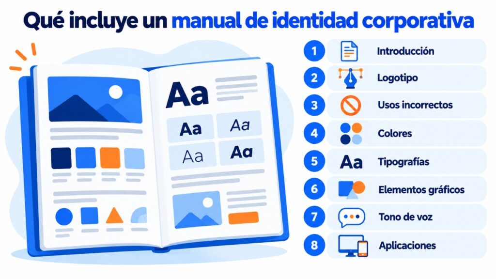
It doesn’t need to be 80 pages long. For a small business, a well-made 10- or 15-page manual is enough, as long as it’s used. What matters is that it’s within reach of everyone who communicates on behalf of the company.
Whether you do it yourself or hire someone, a corporate image project turns out better when it starts with a good brief. It’s the document that explains what you need and why, and it avoids endless rounds of changes.
A useful brief answers these questions:
With this, the project usually follows four phases: research, creative proposals, development of the chosen identity and delivery of the manual with all the applications. Set aside time to test the image with some customers before finalizing it.
It depends on where you are and on your budget. This table can help you decide:
| Option | When it fits | Pros | Cons |
|---|---|---|---|
| Doing it yourself | You’re just starting out and need to validate the business | Minimal cost and speed | A less professional result that’s harder to keep consistent |
| Freelance designer | Small business or freelancer with a clear idea of what they want | Direct contact and a reasonable price | Depends on a single person; check their portfolio carefully |
| Corporate image agency | Established company, rebranding or several business lines | Strategy, research and a full team | Higher investment and longer timelines |
My advice if you’re just starting out: don’t spend a lot on image before you have customers. A simple, well-applied identity works better than an expensive logo used without criteria. Once the business is validated, that’s the time to invest in a full project. If you’re at that stage, this guide to starting a business from scratch will help.
Some brands are a good example of how a consistent identity ends up creating a highly recognizable image:
What they have in common isn’t budget, but consistency: they do and say the same thing across all channels for years.
You can also learn a lot from what goes wrong. In the most disastrous rebrandings in history you’ll find several cases of brands that changed their image without taking their audience into account.
Today, the first impression of almost any company happens on a screen. That’s why corporate image has to be designed for digital from the start, not adapted afterwards.
Your website is your main shop window. Use your colors, typefaces and tone, and take care of speed and the mobile version: a slow or neglected website sends the same message as a dirty store.
On social media, use the same profile photo and the same description on every platform. Adapt the format to each network, but not your personality. It helps to choose the right social networks for your business.
Every company sends hundreds of emails a month and many go out without any care: a different signature for each employee, unclear senders, newsletters in colors that aren’t the brand’s.
Email is one of the most frequent touchpoints with your customers, so it also builds image. These are the points I’d review:
If you’ve never designed a newsletter with your identity, this guide to creating a newsletter takes you through it step by step. With Mailrelay you can save templates with your logo and colors so your whole team sends with the same image.
Send emails that are instantly recognizable
Save your brand templates in Mailrelay so your whole team sends with the same image.
Corporate social responsibility (CSR) is a company’s commitment to society and the environment beyond what the law requires. And today it carries a lot of weight in corporate image.
Designing and maintaining a corporate image based on social responsibility rests on three ideas:
You’ll find real cases in these corporate social responsibility examples.
Since corporate image lives in the public’s mind, you have to ask and listen to find out what it is. These are the most useful ways:
You’ll find a complete method in this guide to measuring your brand’s reputation.
If measuring shows that your image isn’t the one you were aiming for, these are the levers that work best:
If a negative perception has already taken hold, this guide to changing negative perceptions of your brand can help. And when the change has to run deep, it’s called rebranding.
A company’s corporate image is the sum of everything the public sees, reads and experiences of it. Good design helps, but what consolidates it is consistency between what you say and what you do, across all channels and over years.
If I had to keep three ideas, they would be these:
What do you find hardest to keep consistent in your brand? Tell me in the comments.
Send your newsletters with Mailrelay
Up to 80,000 emails a month and 20,000 contacts for free, with human support on every plan.
These are the most common questions about a company’s corporate image.
It’s the perception the public has of a company. It’s shaped by its visual elements, such as the logo and colors, but also by its behavior, its customer service and what others say about it.
Corporate identity is what the company chooses to show: logo, colors, typography, values and tone. Corporate image is how the public perceives it. The company controls the first; the second, not entirely.
The intangible ones (mission, vision, values and culture) and the tangible ones: name, logo, colors, typography, slogan, tone of voice, graphic elements and their applications in stationery, website, social media and email.
It’s the document that sets out the rules for using the company’s identity: logo versions, incorrect uses, colors, typefaces, tone of voice and applications. It ensures everyone applies the brand the same way.
The identity design can be ready in a few weeks. The corporate image, on the other hand, is consolidated through years of consistent communication, because it depends on the public’s accumulated experience.
More and more. Customers value a company acting responsibly toward society and the environment, as long as what it communicates matches what it does. If it doesn’t, the effect is the opposite.

Jose Argudo
CMO at Mailrelay. Writes about email marketing, copywriting and conversion for SMEs and entrepreneurs.