
Did you know that users take just 8 seconds to decide whether to stay on your website or go to a competitor?
Given this short window, you need to make the best possible impression to get them to stay, and this is where your home page has a lot to say.
In many cases it will be your “calling card” for new visitors, so you need to take special care of it.
In this article, we explain why it matters and describe its main elements so they can win over your readers.
What is a website’s home page and why is it so important?
First of all… what is a home page? We can describe it as the main page (also known as the “home”) your potential customer will land on. In other words, it’s the place that will serve as the first impression of what you want to sell or offer.
For example
To compare it with real life, think of it as the hall or entryway of your house once you open the front door.
Above all, it should be able to meet your goals:
- Attract and win over your visitors.
- Inform visitors about the brand and educate them.
- Encourage them to visit other pages on the platform.
As an example, in our case it would be Mailrelay.com and everything you find when you open that page.
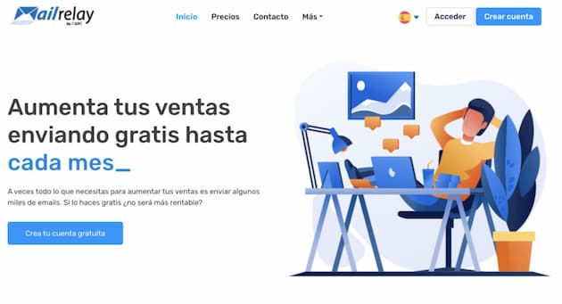
Imagine a visitor who arrives at your website and doesn’t like what they see, or simply can’t find what they need.
They won’t give you a single chance: they’ll leave and keep looking through the next Google results.
This is where we understand the real importance of your platform’s home page. If you don’t make an effort to give your customer what they’re looking for, it won’t matter if you have the best product or services or incredible prices, because you’ll lose them.
Are a home page and a landing page the same thing?
At first glance, a home page and a landing page might seem the same, because both are the first place your visitors arrive at after clicking a link that takes them there.
However, keep in mind that each one works in its own way and has its own goals and characteristics.
- The main purpose of the home page is to inspire visitors to go to another page on the platform and meet the needs they have. In other words, it acts as a gateway that in some way pushes the user to browse other pages so they find the relevant CTA and complete the conversion.
- This conversion takes place on the landing page, a kind of response page, which adds another difference: it removes every kind of distraction that doesn’t lead where we want to guide the user, which is the final conversion. For example, landing pages usually remove (or should remove) links such as the ones in the footer to our corporate social media, or the typical logo link that takes you to the home page.
It’s very important to understand the difference between these two resources, although it’s true that a website has so many pages that people commonly confuse them.
However, we shouldn’t see it only as a battle between home page and landing page, since there’s also confusion with content pages.
The 9 home page elements your website can’t do without
To better understand what a home page is and create one that really persuades your customers, here’s a list of the elements it can’t do without:
✅ Title and subtitle
In the little time you have to catch the user’s attention, you need to make clear what you’re going to offer them, and for that you’ll use the title.
Keep in mind that they won’t read anything too long, so try to use as few words as possible.
Forget about coming up with a title that meets the needs of all your visitors, because no such thing exists. Instead, focus on the potential customers who are really interested in your products or services, or on your satisfied customers.
Don’t forget the subtitle either: it should complement the headline, giving a short description of what your project offers. Make sure the subtitle reflects the needs your product/service can meet.
Our recommendation is to choose a title and subtitle that are direct and very easy to understand, to avoid any confusion that might drive away potential customers.
✅ Benefits of the product or service
Another key element that needs to be well crafted on the home page is the benefits the customer will get if they decide to buy your product or sign up for your service.
If customers know about them, they’ll be more curious to learn more, and this can be a big step toward finally choosing it.
A resource that works very well here is to opt for messages that are easy to read and not too long. You’ll also need to find the best way to communicate with the customer, and you can do that by speaking their language.
Practice empathy and get inside your customer’s head. That way you’ll surely know how to talk to them.
✅ Structure
The next element that needs to be well defined on the home page is its structure, since it will have a big influence on the navigation the user finds.
A good structure helps users find what they need. If it isn’t well optimized, users will enter the website and leave shortly after; this will raise the page’s bounce rate, which is deadly for your Google rankings.
Our recommendation is to place the menu at the top of the home page, where it can be seen easily and nothing hides it. In addition, links should be organized in a logical structure that helps users get to what they need, showing them the way.
✅ CTAs (calls to action)
CTAs, or calls to action, are the goal of any website. They’re used to get users to do what we need them to do.
That could be:
- Buying a product
- Signing up for a service
- Requesting more information
- Downloading some kind of resource
- Etc.
As we’ve seen, one of the main goals of the home page is to make users curious to explore what we’re offering them. That’s why it’s so important to add several CTAs as soon as they arrive on the platform, on the home page itself.
You can also follow these quick tips to be more successful with the calls to action on your main page:
- Don’t create CTAs that are too long or complicated. Experts recommend using ones that are easy to read and as short as possible.
- They also need to stand out to the human eye. This means finding a way to make them stand out from the rest of the elements. For example, we can put them in a button with a different color from the rest of the home page elements.
- Visual resources, such as images and videos, make information easier to digest. With these resources, it will be easier to show what your business sells so they end up clicking on the CTAs.
- Large images work quite well, since they really catch people’s attention. But be careful, because a large image isn’t the same as a heavy image. The idea is to reduce their file size so the website’s loading time doesn’t increase.
Keep in mind that your potential customer is used to seeing everything on the internet and may be tired of the classic calls to action. The more creative you are, the more you’ll catch their attention.
✅ Content
You can try integrating some of your content directly on the home page, although we recommend steering clear of purely promotional resources.
What really pays off is content designed to make users’ daily lives much easier. You can try the following:
- Buying guide: to make it easier for them to choose the type of product or service they’re looking for from the ones you have available.
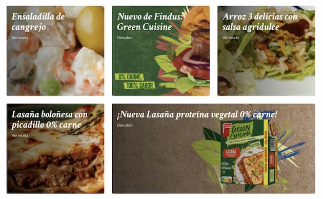
- Recipe book: very interesting if you have a platform specialized in selling food.
- An eBook related to your industry: another good idea is to offer a free ebook they may find interesting. Obviously you can’t include just any ebook; you’ll need to create one related to the industry you work in.
✅Testimonials
Testimonials are one of the most powerful resources you can include on a home page. Some webmasters choose to put them in a section dedicated entirely to them, although we recommend placing them on the home page.
Important
Remember that you have to win the customer’s trust in the first 8 seconds. What better way to do that than to offer them reliable testimonials about what you sell?
They’ll only believe in the benefits of that product/service if they read positive reviews of it written by other people (and not by the brand).
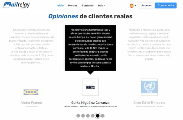
Although simply adding testimonials can work, plain text could be seen by users as a trick, as text anyone could have written.
It’s better to add the name, photo and other details to make each review more credible. Remind each customer that it would help you a lot if they left their own review once they’d tried what you sell.
✅ Product and service features
While it’s true that the benefits section is very important, your customer also needs to know the features to make their final decision.
However, they’re not looking for long paragraphs detailing the technical features one by one. On the contrary, they want short, easy-to-understand messages that help them see why your product or service stands out from what the competition offers.
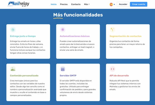
This doesn’t mean we should forget about the other features, but it’s better to leave them for another section of the website. We can create a link that goes straight to a page with the full product features, so we don’t overload the home page.
✅ Additional resources
With the home page elements we’ve already described, you have plenty of material to get users to decide to buy or sign up, but something more might be missing.
It doesn’t hurt to add a section of additional resources to your home page. These could be downloadable resources, manuals on how to use a product, or even a blog where you answer the most common questions directly or indirectly related to your products or services and offer practical solutions.
These resources are very handy for answering their questions, and they also help them spend more time on the page and reduce the bounce rate.
✅ Awards and recognition
If what you’re selling has won some kind of award or recognition… why not include it on the home page? Along the same lines as testimonials, recognition helps increase credibility.
Nor do you need an award issued by a particular organization. For example, if one of our company’s differentiating values is our experience or the number of customers we’ve won over the last year, we can also include that data on the home page.
Home page examples to inspire you
Here are some examples that can inspire you when creating your home page:
- Ttandem: the excellent CTA on its main page, combined with the features of the app they offer, stands out.
- Findus: on its main page, you can find a complete recipe book with lots of cooking ideas.
- Snovit: it uses short, very attractive messages to show the advantages of the product it sells and its differentiating values.
- Meler: this page is a good example of excellent structure. The navigation menu is visible at the top of the page, and its architecture is intuitive and very easy to use.
You have the tools… what will your home page look like?
Now that you know the key elements of a good home page, it’s time to shape your own.
Take note of all these tips and adapt them to your field, your style and the essence of your service or product, to create a page visitors “can’t escape” without buying from you or signing up for your services.
Each of these elements should be backed by a good call to action (CTA) that guides visitors toward conversion.