UX writing: what it is, what a UX writer does and 13 real examples
The small bits of text that decide whether your user completes the purchase or gets lost along the way

The small bits of text that decide whether your user completes the purchase or gets lost along the way
UX writing is the writing of the text that guides users through a website, an app or an email: buttons, forms, error messages and notices.
It isn’t about persuading with a big headline, but about making every step clear the first time. Here you’ll find what it is, what a UX writer does, real examples and how to apply it to your emails.
UX stands for “user experience”. UX writing is, therefore, writing designed for the user experience.
It’s the small pieces of text that help your customers complete a purchase, a subscription or a booking without doubts or extra steps.
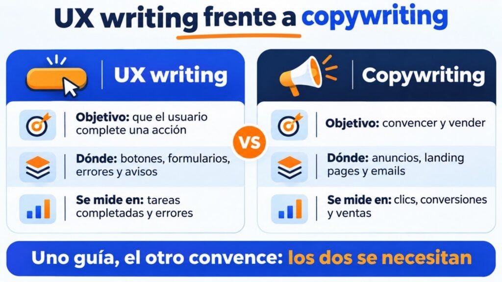
It’s often confused with microcopy or with copywriting. They’re related, but they’re not the same thing:
| UX writing | Copywriting | |
|---|---|---|
| Goal | Help the user complete an action without getting lost | Persuade and sell |
| Where it’s used | Buttons, forms, errors, notices, menus | Ads, landing pages, emails, slogans |
| Length | Very short: a word or a sentence | From one line to a page |
| How it’s measured | Completed tasks, errors, drop-offs | Clicks, conversions, sales |
Microcopy is the smallest text in an interface, such as a field label. UX writing includes it, but also decides the tone, the order and what to say at each step.
Anywhere the user has to do something or understand what’s going on:
A UX writer writes and reviews all of that text together with the design and product teams. Their job is to make sure the user always knows where they are, what they can do and what will happen next.
They master copywriting, but their priority is clarity. They usually work with prototypes, user testing and a brand style guide.
These are the factors they take into account:
They need to know the user well: what they’re looking for, what worries them and what words they use. That’s why they rely on research and a buyer persona.
If the user says “unsubscribe” and the website says “manage communication preferences”, they get lost.
The text has to make navigation easy, but it also has to sound like the brand.
A friendly tone usually works well, because the text is having a conversation with the user. But if your brand is serious and professional, the text shouldn’t pretend otherwise.
Every piece of text serves a business goal. If the priority is getting people to try a new product, the buttons and notices have to lead them towards that trial.
A UX writer needs to know where the user is coming from and where they’re going next. That way the text at each step fits together and nobody is left halfway.
These examples are screenshots from 2021. Some websites have changed since then, but the principles are still the same.
Buttons like “buy” or “subscribe” work, but they don’t say what the user gets. Nor should you go to the other extreme with phrases so clever that nobody understands them.
The balance lies in a clear button that says what will happen and what the user gets.
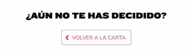
Goiko keeps the user on the page with a tone true to the brand and a clear action: order.

On the Marketing and Web website, the two buttons make it clear what each one does. The user knows where they’re going before they click.
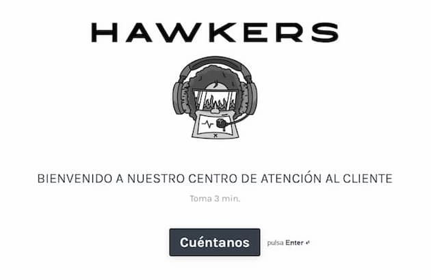
Hawkers invites users to ask questions with a friendly button and explains how to send the message and how long it takes to get a reply.
Forms are one of the places where users get lost the most: when signing up, logging in or subscribing to a newsletter.
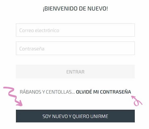
Wetaca’s form combines clarity with a culinary sense of humor that fits the brand. Existing customers can log in or recover their password without hesitation, and those who aren’t customers yet know how to sign up.

Uber separates drivers and riders from the start, with a different button for each.
Subscription forms that make sense the first time
Create your forms with Mailrelay and adapt the text of every field and the button.
The cookie notice is mandatory, but it’s also an opportunity to sound like your brand and clearly explain what the user is accepting.

Wetaca’s cookie banner keeps the tone of the whole website without hiding what matters.
In an online store, every unanswered question on the product page is a cart that might be abandoned.
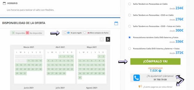
On Yumping, the page for a skydive answers questions before they come up. It offers dates, a gift option, several prices and a phone number to ask for help.
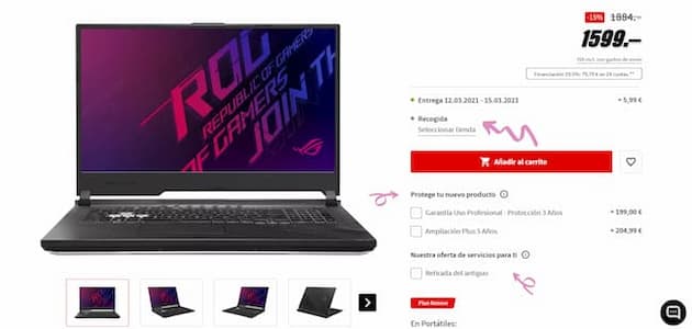
Mediamarkt sets out each purchase decision in order: warranty, delivery and payment method.
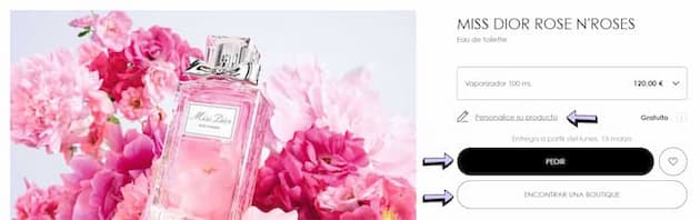
Dior addresses the user formally, in line with its brand and audience. It also makes the size, personalization and in-store purchase options clear.
A well-written 404 error page stops the user from leaving: it explains what happened and offers them a way forward.
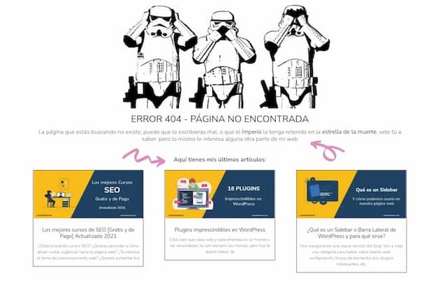
Designer Jonathan Vélez turns his 404 page into a nod to Star Wars and takes the user to his blog posts.
A search box has to be clear and fast: the user wants something specific and has no time to waste.
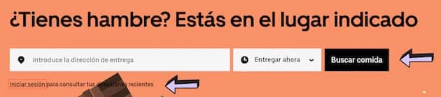
On Uber Eats, all you have to do is enter your address, choose the time and pick your food. Each field says exactly what you need to do.

Wetaca lets you find out, with your zip code, how long your order will take to arrive.
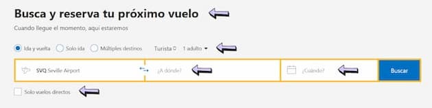
Booking’s search box uses direct questions and keeps all the options in view.
| Element | Before | After |
|---|---|---|
| Button | Send | Get my free guide |
| Form error | Invalid field | Your email is missing the @ |
| 404 page | Error 404 | We can’t find this page. Were you looking for the blog? |
| Empty cart | No products | Your cart is empty. Check out this week’s new arrivals |
| Confirmation | Operation completed | Done: we’ve sent your order to your email |
| Unsubscribe | Manage preferences | Unsubscribe from the newsletter |
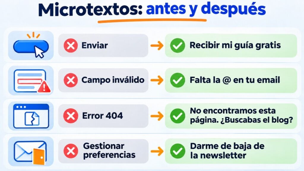
Email has UX writing too, even if it’s rarely thought of that way. This is the text that has the most influence on whether your subscribers do what you expect:
Emails that guide the reader, not confuse them
Templates with editable buttons and subject line A/B testing to find out which text works best.
With Mailrelay you can apply UX writing across the entire subscriber journey:
The free account lets you send up to 80,000 emails a month to 20,000 contacts.
Put your UX writing into practice by email
Free account: up to 80,000 emails a month to 20,000 contacts, with human support.
It’s the writing of the text in an interface, such as buttons or error messages. Its goal is for the user to complete what they want to do without getting lost.
Copywriting aims to persuade and sell. UX writing aims to help the user understand each step and complete it. Many professionals do both.
They write and review the text of a website or an app together with the design and product teams. They also test it with users and maintain a style guide.
It’s the smallest text in an interface, such as a field label or the text on a button. It’s part of UX writing.
Yes. The subscription form, the confirmation, the subject line, the buttons and the unsubscribe link are pieces of microcopy that decide whether the subscriber takes action or gets lost.
Copywriting
What it is and how to write to persuade and sell.
Eye-catching email subject lines
20 formulas with examples to get your newsletters opened.
How to write your subscription form
What text to put in each field and on the button to get more sign-ups.
Double opt-in
What subscription confirmation is and why it improves your list.

Jose Argudo
CMO at Mailrelay. Writes about email marketing, copywriting and conversion for small businesses and entrepreneurs.