Accessible email: what it is and how to create emails everyone can read
Guidelines so your emails can be read with a screen reader, without images and on any mobile device
An accessible email is an email designed so that anyone can read and use it, including people who use a screen reader, have low vision or can’t see the images. Accessibility affects the text, the design and the code of the message.
It’s not a minor technical detail. When an email isn’t accessible, part of your list can’t read the offer or tap the button, even though the message has reached their inbox.
Why does email accessibility matter?
For three reasons.
The first is reach. According to the World Health Organization, about 1.3 billion people live with a significant disability, around 16% of the world’s population. Then there are people who read in a hurry on their phone, with the sun in their eyes or with images blocked.
The second is results. A clear email with good contrast and a large button works better for all readers, not just for those who use assistive technologies.
The third is the law.
What does the law say about accessible emails?
Since 28 June 2025, Law 11/2023 has applied in Spain. It transposes Directive (EU) 2019/882, known as the European Accessibility Act.
The law requires certain products and services to be accessible, including e-commerce services and consumer banking.
The law doesn’t mention email marketing as such.
But if you sell online, the emails that are part of the service (order confirmations, invoices, shipping notifications) are part of the shopping experience. The sensible approach is for them to meet the same criteria as your website.
The Directive exempts microenterprises that provide services, although applying these guidelines is still good practice.
The usual technical reference is the W3C’s WCAG (Web Content Accessibility Guidelines), at level AA.
How do you make an accessible email? 10-point checklist
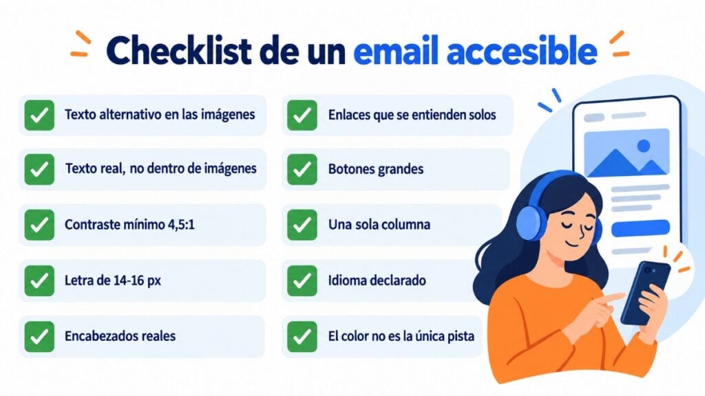
- Alternative text on images. Describe what each image adds; leave the alt empty on decorative ones.
- No important text inside an image. If the image doesn’t load, the message disappears.
- Sufficient contrast. WCAG AA requires at least 4.5:1 between text and background for normal text, and 3:1 for large text.
- Readable font size: 14-16 px in the email body and a simple typeface.
- Structure with real headings, so the screen reader can jump from one section to another.
- Links that make sense on their own. “Download the pricing guide” instead of “click here”.
- Large buttons that are easy to tap on mobile, with real text, not drawn into an image.
- A single column and a logical reading order.
- Message language declared in the code, so the screen reader uses the correct pronunciation.
- Color isn’t the only cue. If you mark something in red, also add a word or an icon.
Before sending, try reading the email with images turned off. If it makes sense, you’re on the right track.
Design clear emails with Mailrelay
Templates and a drag-and-drop editor to create emails with real text and large buttons. Free up to 80,000 emails a month.
Common mistakes that make an email inaccessible
The most common is the email made from a single image: it looks nice on screen, but it’s empty for a screen reader and for anyone who blocks images.
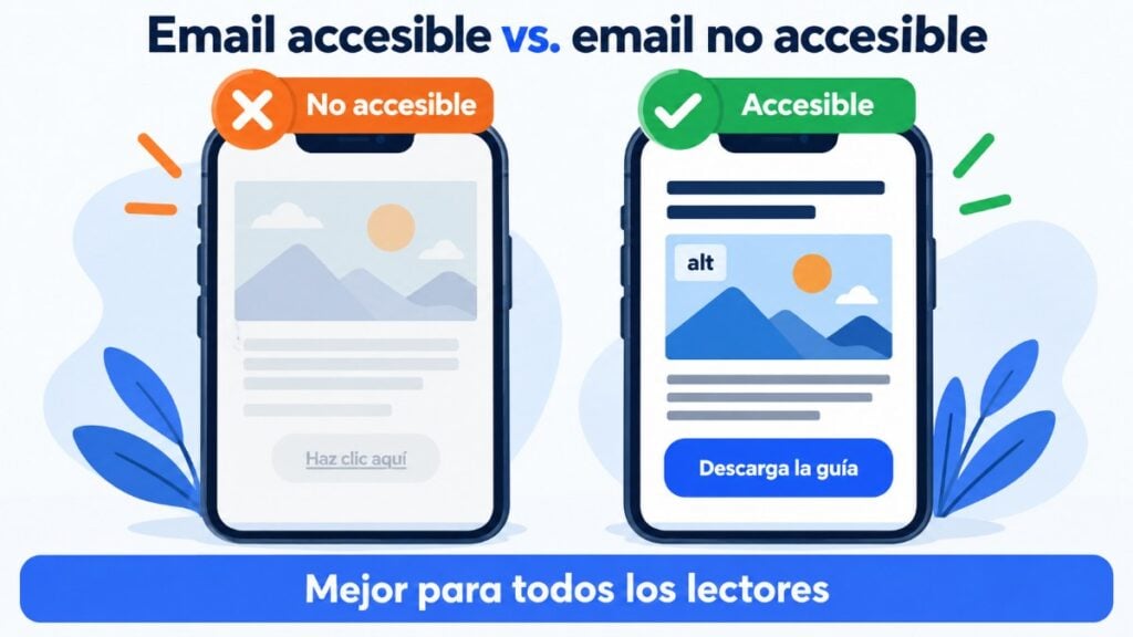
Next come light gray text on a white background, emojis used instead of words, and links that say “here” or “more”.
Subject lines full of symbols don’t help either: the screen reader reads them out one by one.
How to create accessible emails with Mailrelay
With Mailrelay’s drag-and-drop editor, you lay out the email with text, image and button blocks, without writing code. This makes it easier to keep text as real text rather than an image.
Start from a simple email template. Adjust your brand colors while checking the contrast, and send yourself a test before each campaign.
If you’re torn between two designs, an A/B test will tell you which one works better.
With the free account, you get up to 80,000 emails a month and support via chat, ticket and phone.
Send newsletters that everyone can read
Visual editor, A/B testing and real-time reports, with expert support on every account. Start free with 20,000 contacts.
Frequently asked questions about accessible email
These are the most common questions about email accessibility.
Is it mandatory for emails to be accessible?
Since 28 June 2025, Law 11/2023 has required certain services, such as e-commerce, to be accessible. There’s no explicit obligation for marketing emails, but applying the WCAG guidelines is recommended.
What is an image’s alternative text?
It’s a short description that the screen reader reads aloud and that appears when the image doesn’t load. In HTML, it’s the alt attribute.
How do I check color contrast?
With a free WCAG contrast checker: you enter the text color and the background color, and it tells you whether it meets level AA (4.5:1).
Does an accessible email have less design?
No. It can include images, colors and icons. The difference is that the information and the buttons don’t depend on them.