Newsletter dimensions: size, width and 10 keys to a good layout
The dimensions table, how it looks in each email client and a checklist so nothing goes wrong
The dimensions table, how it looks in each email client and a checklist so nothing goes wrong
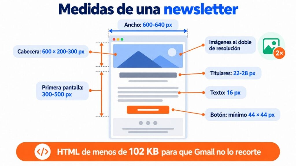
What size should a newsletter be? Between 600 and 640 pixels wide, images at double resolution and under 102 KB of HTML so Gmail doesn’t clip it.
There’s no height limit, but what matters has to be visible on the first screen.
With those three measurements you can start building your layout. But a newsletter that looks fine on your computer can break on mobile, in Outlook or in dark mode.
In this guide you’ll find the full dimensions table, how your email looks in each email client and the 10 keys to laying it out without surprises.
These are the email dimensions I recommend in 2026. They apply whether you code the HTML by hand or use a visual editor.
| Element | Recommended size | Why |
|---|---|---|
| Email width | 600-640 px | It fits entirely in the reading pane of desktop email clients and adapts well to mobile |
| Email height | No fixed limit | What decides whether they keep reading is the first screen: about 300-500 px |
| Header image | 600 × 200-300 px (uploaded at 1,200 px wide) | At double resolution it looks sharp on retina screens |
| Body images | The width of their column, uploaded at double size | A 300 px image is uploaded at 600 px |
| Size of each image | Under 200 KB, as a guideline | Loads quickly even on mobile data |
| HTML size | Under 102 KB | Above that, Gmail clips the message and shows “[Message clipped]” |
| Body text font size | 16 px (minimum 14 px) | Below 13 px, the iPhone enlarges it and throws the design off |
| Headline size | 22-28 px | A clear hierarchy without taking up half the screen |
| Buttons | At least 44 × 44 px | It’s the minimum touch target Apple recommends for tapping with a finger |
| Preheader (preview text) | 40-100 characters | It’s what people read next to the subject line in the inbox |
If you only remember one thing, make it this: 600 px wide and under 102 KB of HTML.
That alone avoids most problems. The other measurements fine-tune the result.
Why do you need to lay out an email so carefully when a website looks fine in any browser? Because each email client interprets the code in its own way. And not always the way you expect.
According to Litmus’s September 2026 market share report, Apple Mail accounts for 76.56% of opens.
It’s followed by Gmail, with 16.10%, and desktop Outlook, with 3.48%.
Be careful with the Apple figure: Apple Mail Privacy Protection opens emails automatically and inflates it. Even so, it gives you an idea of where you need to test.
| Email client | What to keep in mind when building the layout |
|---|---|
| Apple Mail (iPhone and Mac) | Good HTML and CSS support. Applies dark mode and enlarges small text |
| Gmail (web and app) | Clips messages with more than 102 KB of HTML and may invert colors in dark mode |
| Classic Outlook for Windows | Uses the Word engine: ignores many CSS properties and needs tables |
| New Outlook and Outlook.com | Web engine, much closer to a browser |
| Yahoo Mail | Decent support, but it’s worth testing buttons and dark mode |
The trickiest case is still classic Outlook.
Microsoft is moving its users to the new Outlook, but it hasn’t set an end date for the classic version.
As long as it’s still used in so many companies, laying out with tables is the safe choice.
Email dimensions are the technical foundation. But before you open the editor, it’s worth being clear about three design decisions.
Images are heavy. A newsletter with five uncompressed photos can take several seconds to load on mobile data.
And if it’s slow, the reader leaves.
Compress each image before uploading it, and don’t use a 3,000 px photo where it will be displayed at 600.
There’s more detail in key 8.
An image should say the same thing as the text. If you’re selling a mountain getaway, a photo of a valley does part of the work.
If you’re promoting clothes, show the garments.
What doesn’t work is filler images. They take up space, add weight and give the reader nothing.
Not every email needs images. In a promotional send, the email should be visual because you’re after a purchase, a sign-up or a booking.
But if you want to feel close to your readers or share an opinion, an almost text-only email works just as well.
When designing an email, whether in HTML or with a visual editor, my advice is always the same: the simpler, the better. We’re not creating a work of art, but an email with a clear, specific goal: to sell, drive traffic to the website or get replies. Yes, it has to look good, but it’s not there to distract the reader with its beauty; it’s there to get them to do what you want. Even in a promotional email, a good product photo and a clear button are worth more than ten decorations. Simple and clear: it’s almost always the best advice.
Jose Argudo, CMO at Mailrelay
The structure decides whether the reader understands your message in the first few seconds. This is the one I recommend, from top to bottom:
| Area | What to include | Guideline size |
|---|---|---|
| Preheader | A sentence that completes the subject line | 40-100 characters |
| Header | Logo and, if needed, a main image | 600 × 200-300 px |
| First screen | Headline, a line of context and the main button | The first 300-500 px |
| Body | Short blocks of text and image, one at a time | One 600 px column or two 300 px columns |
| Call to action | A clear button with a verb | Minimum 44 × 44 px |
| Footer | Company details, unsubscribe link and legal notice | 12-14 px text |
A rule that always works: one email, one goal. If you have three things to say, prioritize one and save the others for the next send.
And a good structure is useless if you then send the same thing to your whole list: segment your subscribers so each one gets what interests them.
Lay out your newsletters without coding
With Mailrelay’s visual editor, you can create newsletters that look great on mobile without writing a single line of HTML.
These are the 10 keys I check in every newsletter before sending it.
Some are about design and others are technical, but they all prevent real problems.
A simple design looks good in more places. Use standard fonts (Arial, Helvetica, Georgia or Verdana), flat color backgrounds and a single column on mobile.
Most of your subscribers will open the email on their phone.
That’s why the design has to be responsive: it adapts automatically to the screen width.
If two columns don’t fit, they become one. And if a button ends up too small, it grows.
The simpler the code, the fewer the surprises. No JavaScript, forms or effects that depend on scripts: email clients block them for security reasons.
Always send an HTML version and a plain text version. If someone can’t view the HTML, they’ll read the text.
In Mailrelay, the text version is generated automatically from the HTML.
That way both say the same thing, and filters don’t become suspicious of a message with two different contents.
Tables are still the most reliable way to lay out an email. On a website you’d use layers (divs) and modern CSS.
Not in email, because classic Outlook for Windows uses the Word engine and doesn’t understand much of that CSS.
With tables you control the width, columns and spacing in every email client. A tip: don’t nest tables more than three levels deep.
Beyond that, the code becomes hard to maintain and gets heavier.
It’s the email width that works best on desktop and mobile. Desktop email clients show the email in a reading pane that’s narrower than the screen.
At 600-640 px the email fits entirely, with no horizontal scroll bar.
On mobile, a responsive design shrinks that width to the screen’s.
What you should avoid is the opposite: designing at 800 or 1,000 px and hoping it adapts.
The text would be tiny on a phone.
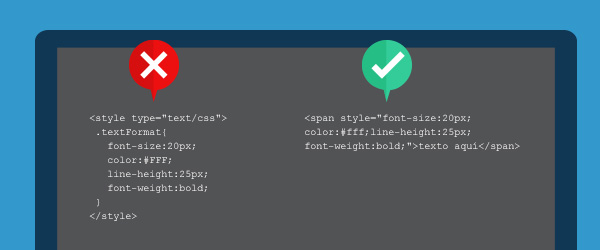
Some email clients ignore the styles in the email’s head. That’s why important styles (color, font size, margins) go inside each tag with the “style” attribute.
That way you make sure the text looks the same in Gmail, Outlook and Apple Mail.
Visual editors, like Mailrelay’s, do it for you when you save the design.
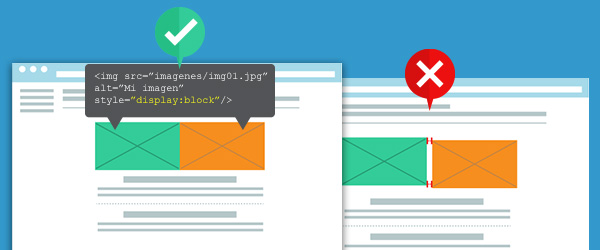
Images are what breaks most often in an email. Always check these four points:
| What to check | Why |
|---|---|
| “display:block” style on every image | Gmail adds white space between images placed next to each other |
| Width and height set in the code | Keeps them from distorting while they load |
| Alternative text (alt) | If images are blocked, the reader knows what’s there |
| JPG, PNG or GIF format | They’re the ones every email client understands. Not WebP yet |
And don’t put important text inside an image. If it doesn’t load, the message disappears.
Animated GIFs do work, with one caveat: classic Outlook only shows the first frame.
Attachments make delivery harder. Spam filters scrutinize doc, exe and zip files closely, and they also greatly increase the size of the message.
Upload the file to your website, Google Drive or Dropbox and add a button that links to it.
That way the email is lighter and, on top of that, you know how many people download it thanks to the click statistics.
Compressing an image can cut its size in half without anyone noticing. You can use free tools like TinyPNG or Squoosh, or export from your editing program at 70-80% quality.
Use JPG for photos and PNG for logos or images with a transparent background.
And upload them at double the size they’ll be displayed at: a 600 px wide image is uploaded at 1,200 px.
It’ll look sharp on retina screens and, well compressed, it will still be light.
The footer isn’t optional. In Spain, the LSSI requires you to identify the sender and offer a simple, free way to unsubscribe in every commercial communication.
The GDPR also requires you to explain how you process data.
Include your company’s name and address, the unsubscribe link and a link to your privacy policy in the footer.
Since 2024 Gmail and Yahoo, and since 2025 Outlook, also require one-click unsubscribe from bulk senders.
You’ll find the details in the glossary entry on the List-Unsubscribe header.
Never send a newsletter without testing it. Send yourself a test email and open it on your phone and on your computer, in Gmail and in Outlook if you can.
Check that the images load, that the links go where they should and that the text can be read without zooming.
If you send to large lists, tools like Litmus or Email on Acid show you how it looks in dozens of email clients at once.
Test your newsletter before sending it
Send yourself a test email from Mailrelay and check how it looks before sending it to your list.
More and more people read their email in dark mode.
And each email client applies it in its own way: some only change the background, others invert all the colors.
A black logo on a transparent background can disappear.
To make your newsletter hold up to the switch:
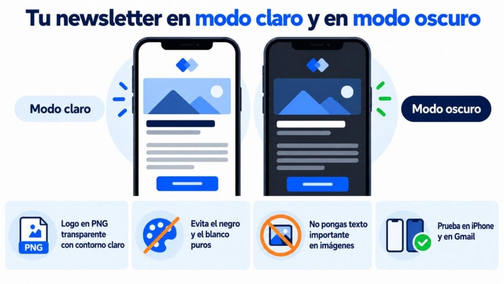
Another option is to start from a design that’s already dark.
The Mailrelay editor has ready-to-use dark templates, available in the free account too.
Before you click “Send”, go through this list. It’ll take you two minutes.
What if you don’t want to touch code? With Mailrelay’s visual editor you lay out your newsletter by dragging blocks, and the email adapts to mobile automatically.
You don’t have to worry about tables or inline styles: the editor generates them for you.
You can start from hundreds of email templates, including dark mode ones, and the AI editor helps you create designs and improve your copy.
The plain text version is generated automatically and you can send yourself tests before sending the campaign.
All of this is also available in the free account, with up to 80,000 emails a month and 20,000 contacts, and with human support on every plan.
Send your campaigns for free with Mailrelay
Up to 80,000 emails per month and 20,000 contacts, with human support on all plans.
These are the questions about email size we get asked most often.
Between 600 and 640 px wide, with no fixed height.
What matters is that the headline and main button are visible in the first 300-500 px and that the HTML is under 102 KB.
The usual size is 600 × 200-300 px as displayed.
Upload it at double resolution (1,200 px wide) so it looks sharp on retina screens, and compress it so it’s under 200 KB.
The HTML code should be under 102 KB, because Gmail clips heavier messages.
Images don’t count toward that limit, but each one should ideally be under 200 KB so the email loads quickly.
16 px for body text, with a minimum of 14 px, and between 22 and 28 px for headlines.
Below 13 px, the iPhone enlarges the text on its own and can throw the design off.
Because the HTML is larger than 102 KB. Gmail shows only the first part and a link to view the full message.
Whatever stays hidden, like the unsubscribe link, many people never get to see.
To avoid it, clean up the code and remove blocks that don’t add anything.
How to create a newsletter step by step
A guide with a template and examples for creating your own newsletter.
Newsletter examples to inspire you
13 real cases and models to copy in your next newsletter.
Emojis in emails and newsletters: how to add them
How to use emojis in the subject line and body without them looking wrong in any email client.
What’s the best time and day to send newsletters
What the studies say and how to find the time when your list opens the most.

Jose Argudo
CMO at Mailrelay. Writes about email marketing, copywriting and conversion for SMEs and entrepreneurs.