Creative email ideas: 20 ways to make your email stand out (with examples)
From the sender to the signature: ideas to get your emails opened, read and looking like nobody else’s
From the sender to the signature: ideas to get your emails opened, read and looking like nobody else’s
How many emails do you get a day? Probably more than you read.
That’s why the best creative email isn’t the flashiest one. It’s the one that stands out from the rest at every step: the sender, the subject line, the first line, the design and the button.
In this article you’ll find 20 creative email ideas, examples from brands that get it right and three templates to copy.
Looking for name ideas for your email address? Then our article on how to choose an email address is more what you need.
Here we talk about how to make the emails you send stand out.
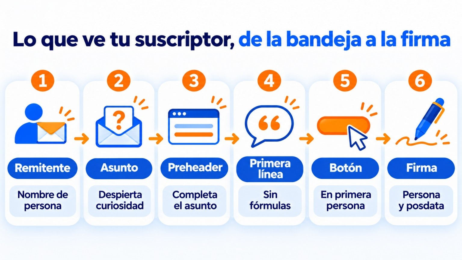
These are the 20 ideas for creating original emails, in the order your subscriber sees things from the moment the email arrives.
| Idea | How to apply it | When it works best |
|---|---|---|
| 1. A person’s name as the sender | “Laura from Green Shop” instead of “Green Shop” | Newsletters and relationship emails |
| 2. A subject line that sparks curiosity | A question or an unexpected fact | Content and launches |
| 3. A preheader that completes the subject line | Add what the subject line doesn’t say | In every email |
| 4. A first line without stock phrases | Start with the interesting part, not with “We are writing to…” | In every email |
| 5. A clean single-column design | Plenty of white space, little text and a single focus | Promotions and news |
| 6. One idea per email | One message and one goal | Sales campaigns |
| 7. Your customer’s vocabulary | Benefits instead of features | Product pages and offers |
| 8. A story | A real case, an anecdote from the team | Newsletters and personal brands |
| 9. Your own brand language | A name for your newsletter and expressions of your own | Brands with a community |
| 10. A GIF that makes sense | One per email, related to the message | Launches and light-hearted emails |
| 11. Real photos | Your team, your workshop, your product in use | Small businesses and approachable brands |
| 12. A first-person button | “I want mine” instead of “Buy” | Promotions |
| 13. Links within the text | The call to action built into a sentence | Letter-style emails |
| 14. Real urgency | An end date that actually exists | Offers and events |
| 15. Personalization beyond the name | Content based on interests or purchases | Segmented lists |
| 16. An unexpected format | A letter, a short list or a single question | To break the routine |
| 17. Ask for a reply | “Reply with one word” | Welcome and re-engagement |
| 18. Humor, used carefully | A joke that fits your brand | Laid-back brands |
| 19. A personal signature and a P.S. | Name, job title and a P.S. with one last hook | Newsletters |
| 20. Designed for mobile and dark mode | Readable text and logos with a transparent background | In every email |
Below you’ll find each idea explained, grouped by the part of the email where it applies.
Before opening an email, your subscriber only sees three things: who sent it, the subject line and the preheader. That’s where almost everything is decided.
An email from “Laura from Green Shop” feels like a conversation. One from “Green Shop” feels like advertising.
You don’t need to change it in every email. Try it in your newsletter and compare the open rate with an A/B test.
The subject line is your email’s headline. It works best when it asks a question, hints at a fact or breaks what the reader expects.
You’ll find plenty of examples in our article on original newsletter subject lines. If you feel like something bolder, try wordplay.
The preheader is the text that appears next to the subject line in the inbox.
If you don’t write one, the email client will show the first line of the email, sometimes a “View in browser”.
Use it to complete the subject line. If the subject line asks a question, the preheader can hint at the answer.
Once opened, the email has a few seconds to convince the reader it’s worth reading on.
“We are writing to inform you that…” is the quickest way to get someone to close your email.
Start with the interesting part: the news, the question or the story.
The easiest emails to read tend to be the simplest. Keep these points in mind when designing yours:
If your email talks about three products, a survey and an event, the reader won’t know what to do.
Choose one message and one goal, and save the rest for the next email.
Compare these two sentences selling shoe insoles:
“Should you wish to walk in greater comfort, our active gel insoles are the solution for you. Thanks to materials such as latex foam and rubber sponge, you will walk without any discomfort whatsoever.”
“You’re one click away from long walks without worrying about sore feet. Like walking on a cloud.”
The first one talks about materials and addresses the reader in a formal, distant tone.
The second one talks about what the reader gains, uses an everyday comparison and speaks to them casually. It’s much easier to remember.
Stories get content read to the end.
It could be a customer’s case, how a product came about or something that happened to your team this week.
For it to work, the story has to be believable, carry an emotion and lead naturally to what you’re offering.
You’ll find ideas in our article on types of storytelling stories.
Some brands have expressions their community recognizes and even repeats. Giving your newsletter its own name is an easy way to start.
That language creates a sense of belonging. Subscribers look forward to your emails because they feel part of something.
A well-chosen GIF adds movement and humor to your email.
You can use one from a library like Giphy or create your own, for example with your team at work.
That said, one per email is enough. And keep in mind that some versions of Outlook for Windows only show the first frame.
A photo of your workshop, your team or a customer using your product says more than any stock image.
Especially if you’re a small business and being close to your customers is your advantage.
Create original emails without design skills
With Mailrelay’s visual editor, you add images, GIFs and buttons by dragging blocks.
The button is the email’s moment of truth. And it’s usually the most neglected part.
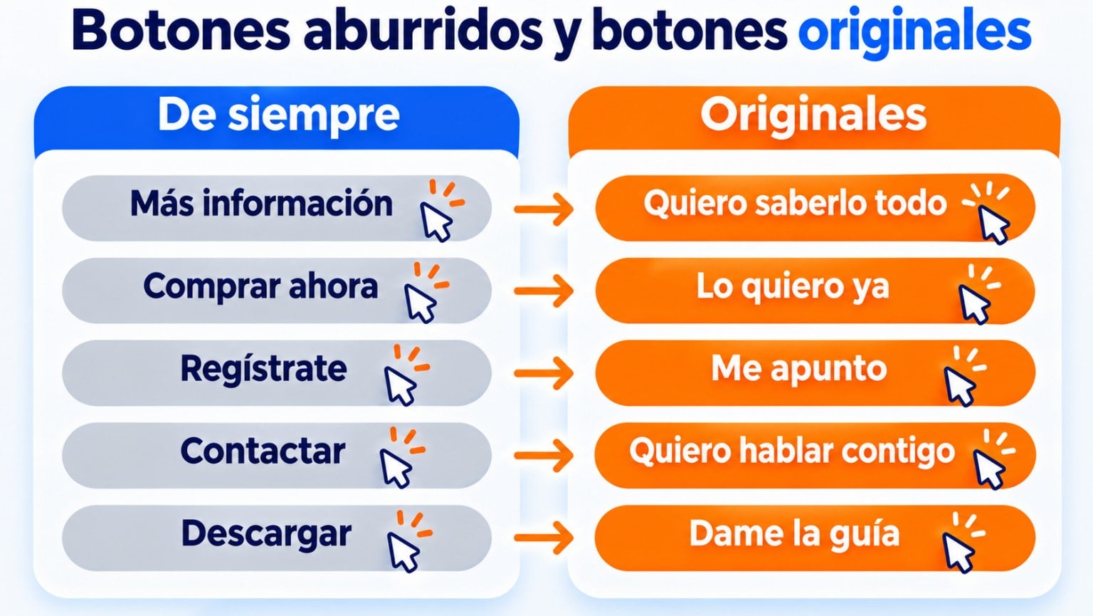
The usual buttons work, but they don’t stand out. Try writing them as if the reader were saying them:
| Usual button | Creative button |
|---|---|
| Learn more | I want to know everything |
| Buy now | I want it now |
| Sign up | Count me in |
| Contact us | I want to talk to you |
| Download | Give me the guide |
In letter-style emails, the call to action can go in a sentence of the text instead of a button.
It feels more natural and more like an email between people.
An end date or limited places encourage people to act. But only if they’re true.
If you announce “last few hours” every week, your subscribers will stop believing you.
And fake urgency can be considered a deceptive practice, as we explain when discussing FOMO.
These ideas are for breaking the routine every now and then. You don’t need to use them in every email.
Including the subscriber’s name doesn’t surprise anyone anymore.
What does surprise is receiving content tailored to you: based on what you bought, what you’re interested in or where you live.
For that, you need to segment your list.
If you always send a newsletter with several sections, one day send a short letter with no images. Or an email with a single question.
The change grabs attention.
“Reply with one word: what would you like to learn this month?” Asking for a reply turns a mass email into a conversation.
And the replies give you ideas for your next emails.
A well-placed joke makes your email memorable. But it has to fit your brand and the moment.
You’ll find examples in our article on funny emails.
Sign off with the writer’s name and job title, not just the logo. And add a [P.
S.](https://mailrelay.com/es/glosario/p-d/): it’s one of the most-read parts of an email.
If you want to rethink yours, take a look at these email signature ideas.
A creative email that can’t be read on mobile is useless.
Check that the text is a good size and that the buttons can be tapped with a finger.
Also check how it looks in dark mode. A black logo on a transparent background can disappear.
These are creative emails we received in 2022 and 2023. Each one applies several of the ideas above.
An email from their Christmas campaign inviting subscribers to a live stream showcasing their products.

It stands out for its simplicity: colors that don’t clash, few elements and a direct message. The invitation is clear at a glance.
An informational email introducing a new feature, a link shortener.

The header sums up the message and the image fits the brand.
The product screenshots help explain the new feature without reading all the text.
A Christmas email inviting readers to try their products.

Instead of starting with the promotion, it gets the reader to picture themselves in a Christmas scene.
It’s a technique that grabs attention from the very first line.
Genially is a brand with a lot of personality, and it shows in its emails.

Its newsletter has its own name, “woow”, which already tells you it will be a fun email you’ll learn something from.
It starts with their news and continues with useful content for their users.

Charuca is a stationery brand that also talks about mindset. In this email, it sells one of its courses.

It uses storytelling to lead the reader by the hand to the call to action.
It has no images, but it’s easy to read thanks to short sentences and the space between paragraphs. The links are built into the text.

It also ends with a handwritten signature that reinforces its brand image.
If you want more inspiration, check out 20 email marketing examples to copy and newsletter examples.
Put these ideas into practice today
Create your free account, choose a template and adapt it to your brand in a few minutes.
Adapt these texts to your brand. They’re designed to apply several of the ideas in this article at once.
Welcome email that asks for a reply
Subject: One question before we start
Hi [name],
I’m Laura, the one who writes these emails. Thanks for signing up.
Before I send you anything else, I’d like to know one thing: what would you like to learn about [topic]? Reply to this email with one sentence. I read every reply.
Laura from [brand]
P.S.: If you don’t know what to say, just reply with an emoji. That works too.
Launch email with a story
Subject: This took us eight months
Hi [name],
Eight months ago, a customer told us our [product] was great, but it was missing [what she asked for]. We made a note of it.
Today we can finally tell you it’s here.
[I want to see it]
Laura from [brand]
Re-engagement email with humor
Subject: Are we still friends?
Hi [name],
You haven’t opened our emails in a while. That’s OK, it happens to all of us with some WhatsApp group.
We just want to know whether to keep writing to you. If you’d like, click here and we’ll carry on. If not, you can unsubscribe below, no hard feelings.
[Yes, let’s carry on]
Creating original emails isn’t the same as being weird. These are the most common mistakes.
The first is putting surprise ahead of the message.
If the reader doesn’t understand what you’re offering, the email has been useless, however creative it is.
The second is overloading the design. Too many images, colors or GIFs make the email heavier, harder to read and more likely to end up in spam.
Repeating the same trick every time doesn’t help either. A subject line with a question works the first time, but not the tenth time in a row.
And finally, forgetting to measure.
The only way to know whether an idea works is to measure it with an A/B test or with each campaign’s statistics.
With Mailrelay’s editor, you can create original emails without design skills. You drag blocks of text, images, GIFs and buttons, and the email adapts to mobile automatically.
You can start from a template, personalize the content with each subscriber’s data and test two subject lines with an A/B test.
The free account lets you send up to 80,000 emails a month to 20,000 contacts, with human support on every plan.
These are the most common questions about making your emails more original.
Standing out from the rest at every step. A friendly sender, a catchy subject line, an interesting first line, a clean design and a button that invites action.
Avoid stock phrases like “We are writing to inform you”. Start with the interesting part: a question, a surprising fact or a short story.
It depends on the message. Designed emails work well for promotions and news. Plain-text ones, for personal newsletters and emails looking for a reply.
The best thing is to test both with your list.
One is usually enough. More GIFs make the email heavier, slower to load and distracting from the main message.
If you’re looking for a name for your email address, you’ll find tips and examples in our glossary entry on the email address.
Send your campaigns for free with Mailrelay
Up to 80,000 emails per month and 20,000 contacts, with human support on all plans.
20 email marketing examples to copy
Examples with subject line, preheader, copy and button to adapt to your business.
Funny and fun emails to inspire you
How to use humor in your emails without losing sight of the email’s goal.
20 original and eye-catching subject lines for your emails
Examples of subject lines that get your emails opened.
Newsletter examples to inspire you
13 real cases and models to copy in your next newsletter.

Jose Argudo
CMO at Mailrelay. Writes about email marketing, copywriting and conversion for small businesses and entrepreneurs.