Email rendering: why your email doesn't look the same in every email client
Why your email looks perfect in Gmail and broken in Outlook, and what you can do so it reads well everywhere
Email rendering is the way each email client interprets your email’s code and draws it on the subscriber’s screen. That’s why the same newsletter can look perfect in Gmail and broken in Outlook.
Rendering isn’t entirely up to you. It depends on the email client, the device and even the color mode used by whoever opens it.
What you can do is design it so it looks good in almost all of them.
What is email rendering?
Short answer: it’s how an email gets rendered, the step where the email client turns the code into what you see.
A marketing email is written in HTML and CSS, just like a web page.
When the subscriber opens it, their email client reads that code and decides how to display text, images, colors and buttons.
The difference from the web is that email rendering doesn’t follow a common standard.
Each client supports some tags and styles and discards others, and that split changes from one version to the next.
Why the same email looks different in each email client
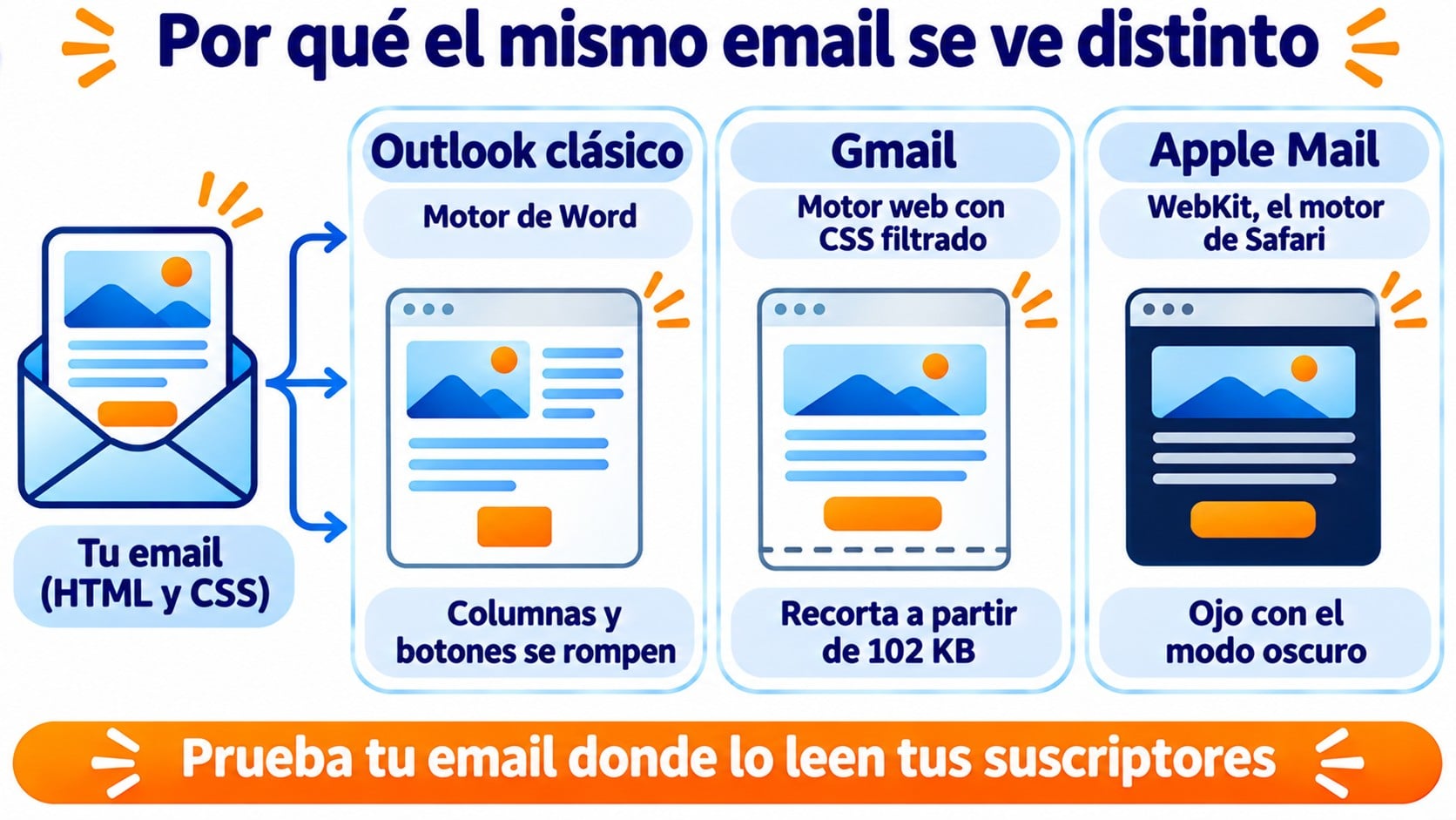
Each email client uses its own rendering engine. Some are similar to a modern browser and others have limitations that go back years.
| Email client | How it renders the email | What usually breaks |
|---|---|---|
| Classic Outlook for Windows | With the Word engine | Columns, margins, background images and rounded buttons |
| New Outlook and Outlook.com | With a web engine | Much less than the classic version |
| Gmail | Web engine that filters out part of the CSS | Custom fonts and emails over 102 KB |
| Apple Mail and iCloud Mail | WebKit, Safari’s engine | Almost nothing, except dark mode |
| Yahoo Mail | Web engine | Some advanced styles |
The best-known case is classic Outlook.
Microsoft has been moving its users to the new Outlook for years, but many companies still use the old one, and that’s where the most designs break.
Emails that look good in any inbox
Mobile-friendly templates, preview and test sends. Free for up to 80,000 emails a month.
The most common rendering issues
These are the issues that come up most often when checking a campaign in several email clients.
The layout breaks
Columns that sit side by side in Gmail can stack badly in classic Outlook, or show up with extra margins.
This usually happens when the design relies on styles that engine doesn’t understand.
Images don’t load
It’s the most noticeable rendering issue. Some email clients block external images until the reader allows them. If the whole message is in a single image, the subscriber sees an empty box.
Good alt text keeps the email from going silent, and it also makes it more accessible.
Dark mode changes the colors
With dark mode, some email clients respect your design, others invert only the background and others invert everything. A dark logo on a transparent background can disappear.
Fonts get replaced
Apple Mail displays web fonts such as Google Fonts, but Gmail and classic Outlook swap them for a system font. If you don’t specify a fallback, the email client chooses for you and the typography changes.
Buttons lose their shape
Classic Outlook ignores rounded corners and part of the padding. A call to action designed as a styled link can end up as underlined text.
Gmail clips the message
If the code is larger than 102 KB, Gmail cuts off the email and shows a link to view the rest.
This is known as Gmail clipping, and it can hide your unsubscribe link or your signature.
How to check rendering before you send
The only way to know how an email really renders is to look at it where your subscribers are going to read it.
Start with your tool’s preview, on desktop and on mobile.
Then send test emails to real accounts. With a Gmail account, an Outlook account and an iPhone, you cover a good part of what a list in Spain uses.
Check each test with images turned off and with dark mode turned on. These are the two scenarios that bring the most surprises.
If you send to large lists or to lists with many different email clients, there are rendering testing services such as Litmus or Email on Acid.
They generate screenshots of your email in dozens of email clients and devices at once.
Best practices to make your email look good everywhere
The general rule is simple: the simpler the code, the fewer things can go wrong in rendering.
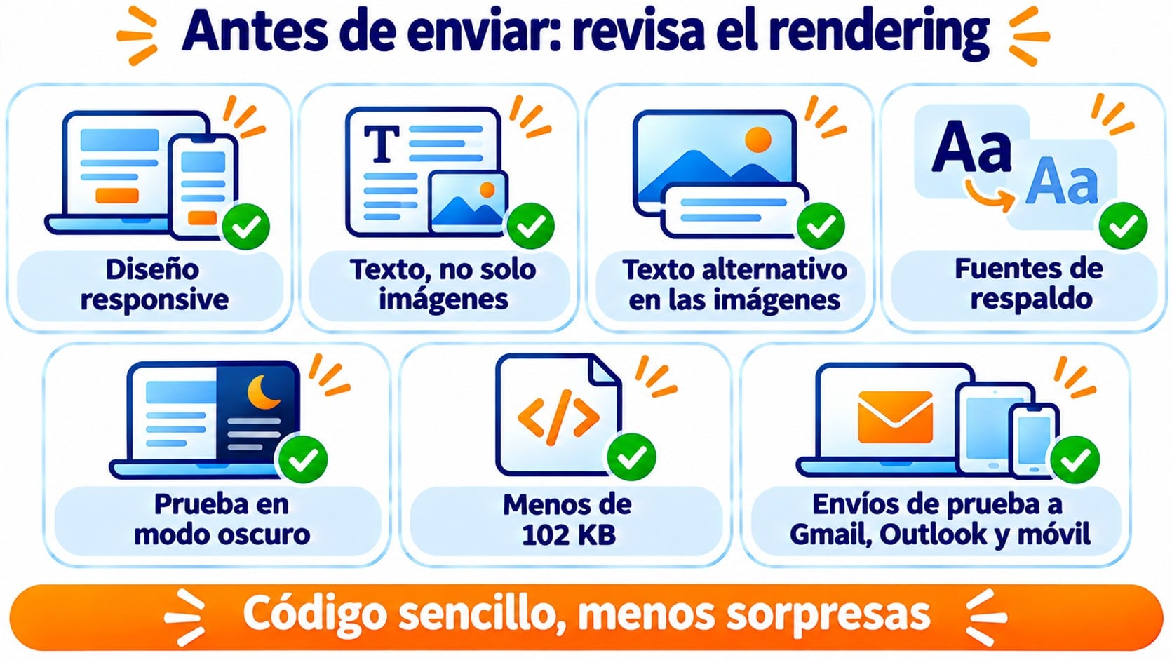
These guidelines work as a checklist before each send.
- Use a responsive design with a single column on mobile and a width of 600 to 640 pixels on desktop.
- Write the main message as text, not inside an image.
- Add alt text to every image.
- Specify system fonts as a fallback for web fonts.
- Test your logo and your colors on light and dark backgrounds.
- Keep the code under 102 KB.
- Avoid JavaScript, forms and embedded video, because email clients don’t display them.
A modular design, built from blocks that have already been tested, reduces errors.
Each block is checked once and reused in every campaign.
How Mailrelay helps you
With Mailrelay, you don’t have to write code for your emails to look good. The templates you create with the drag-and-drop editor adapt to mobile on their own.
Before sending, you get a preview and can send yourself tests to check the design in Gmail, Outlook or on mobile.
You can start from more than 190 free email templates or save your own blocks to reuse them.
If you prefer your own code, you can also use HTML made with Stripo, Beefree or MJML. We explain how in the article about the Mailrelay newsletter editor.
It’s all included in the free account, with up to 80,000 emails a month to 20,000 contacts and human support on every plan.
Design your campaigns without touching code
Drag-and-drop editor, more than 190 templates and human support on every plan.
Frequently asked questions
These are the most common questions about email rendering.
What does rendering an email mean?
Rendering is turning the email’s code into the image that appears on the screen. The recipient’s email client does it every time they open the message.
Why does my email look bad in Outlook?
Most likely your subscriber uses classic Outlook for Windows, which renders the email with the Word engine.
Simplify the design, avoid background images and use buttons built for Outlook.
What’s the difference between email rendering and responsive email?
Rendering is how each email client draws your email. Responsive design is a technique that makes that email adapt to the screen size.
That’s why a responsive email can render badly if the email client doesn’t understand its code.
Key takeaways about email rendering
Email rendering explains why your email doesn’t look the same everywhere. It doesn’t have to. What matters is that it reads well in the email clients your subscribers use.
Simple code, text before images and tests before every send.
Related posts
Rendering overlaps with design, code and email clients. These posts go deeper into each of those areas.