Comic Sans: the story of the most hated typeface (and what to use in your emails)
It was made for a program that never used it and ended up everywhere: its story and how to choose the font for your emails

It was made for a program that never used it and ended up everywhere: its story and how to choose the font for your emails
Have you ever seen a “No parking” sign or a company memo written in Comic Sans and couldn’t help smiling?
You’re not alone. Few typefaces get so much affection and so much mockery at the same time.
The funny thing is that it started with a simple brief: make a program for beginners look less serious. From there, it found its way onto posters, invitations, scientific presentations and even official statements.
In this article we tell you the story of Comic Sans in 8 moments, why it’s so hated, when it does make sense and, above all, which fonts to use in your newsletters so they read well in any inbox.
Comic Sans is a typeface without finishing strokes (sans serif) that imitates comic book lettering. Vincent Connare designed it at Microsoft and it was released in October 1994.
The name says almost everything. “Comic” for the speech bubbles in comic books and “Sans” because it has no serifs, those small finishing strokes at the ends of letters that fonts like Times New Roman do have.
If you want to brush up on the difference, check out our entry on typography.
Connare drew inspiration from the lettering of two famous comics: The Dark Knight Returns and Watchmen. That’s why its letters are rounded, a little irregular and have a hand-drawn feel.
Comic Sans didn’t become famous overnight. Let’s see how it went from an internal Microsoft assignment to the font everyone recognizes (and many people laugh at).
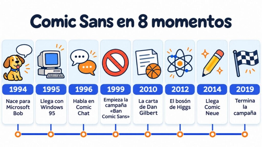
Comic Sans was created for Microsoft Bob, a program designed to get people with no experience comfortable with computers. It had an assistant, a cartoon dog, that talked in speech bubbles.
The problem was that those speech bubbles used Times New Roman. Connare thought it was far too formal for such a lighthearted program, so he designed a comic-style alternative.
The twist? He finished it too late and Microsoft Bob never used it. The first program to include it was 3D Movie Maker, in its pop-up windows and help.
The big leap came with Windows 95. Comic Sans was included in the Windows 95 Plus! pack and as a system font on many computers that came with Windows 95 preinstalled.
Later it became one of the default fonts in Microsoft Publisher and Internet Explorer.
Suddenly, anyone making a poster, a greeting card or a menu had Comic Sans just a click away.
As you can see, its popularity had a lot to do with being in the right place: the home and office computer.
In 1996, Microsoft Comic Chat put it to work in online conversations. This program, which came with Internet Explorer 3.0, displayed chats as comic strip panels, with characters and speech bubbles.
Every message appeared in a speech bubble. And the font in those bubbles was, of course, Comic Sans.
Organized hatred started in Indianapolis. Two graphic designers, Dave and Holly Combs, launched the “Ban Comic Sans” website in 1999 after a client made them use it in an exhibition at a children’s museum.
The campaign asked, half joking and half serious, for people to stop using it out of context.
It lasted two decades: it was shut down in 2019, when Dave Combs felt that the hatred of the font had gotten out of hand.
Anger, a public statement and the worst possible choice. In the summer of 2010, LeBron James left the Cleveland Cavaliers.
The team’s owner, Dan Gilbert, published an open letter to the fans that was very harsh on the player.
The letter was written in Comic Sans, and the typeface got its share of the criticism.
A text full of rage in a font made for kids’ birthday parties: the contrast was impossible to ignore.
It’s the perfect example of why tone matters as much as words.
You’ll see it in your emails too: the same message comes across differently depending on the design, just as it does with emotional marketing.
One of the century’s greatest scientific discoveries arrived in comic book lettering. In July 2012, Fabiola Gianotti, spokesperson for CERN’s ATLAS experiment, presented the results on the Higgs boson with slides in Comic Sans.
Part of the conversation on social media focused on the typeface instead of the discovery.
CERN took it with humor: on April 1, 2014, it announced, as a joke, that it would switch all its publications to Comic Sans.
If you like this kind of brand joke, we have a collection of wordplay with ideas for your subject lines.
The font also had its attempts at rehabilitation. On April 1, 2011, Monotype released Comic Sans Pro, with italics, small caps and new symbols.
The fact that it came out on April Fools’ Day was no coincidence.
In April 2014 came Comic Neue, a redesign by designer Craig Rozynski. His idea was to keep the informal feel of Comic Sans, but with cleaner, more balanced strokes.
Even British politics couldn’t resist. In 2019, the UK Conservative Party posted a tweet about Brexit written in Comic Sans, and the mockery came quickly.
That same year, the “Ban Comic Sans” campaign said goodbye. By then, Comic Sans had become a meme in its own right, just like the most famous errata notice or the meme of the moment.
Does your newsletter need its own font too?
Choose from 11 fonts tested in the Mailrelay editor and send up to 80,000 emails a month for free.
The problem is almost never the font, but where it’s used. Comic Sans conveys friendliness, playfulness and childhood.
When it shows up in a legal notice, a crisis statement or a memorial plaque, the clash between the message and the font is what triggers the rejection.
There are more reasons. For years it was everywhere, and what’s everywhere eventually gets tiresome. Many designers also criticize its irregular spacing, which makes some long texts look messy.
And then there’s the snowball effect. Making fun of Comic Sans became a shared joke, almost part of internet slang, and a quick way to show you know something about design.
The same thing happens with certain rebrandings that go viral because of the criticism.
Connare himself takes it with humor. He has gone as far as saying that Comic Sans is “the best joke I’ve ever told” and has admitted that he has only used it once.
He didn’t get paid anything extra for it either: his only reward was a signed drawing of Mickey Mouse, because Disney used it in its advertising.
Hard as it may be to believe, Comic Sans has defenders with good arguments. And there are quite a few of them.
The first is education. Its “a” and “g” look like the handwritten ones, which helps children who are learning to read and write.
That’s why it’s still widely used in schools and school materials.
The second is dyslexia. Its letters are easy to tell apart, and some dyslexia organizations, such as the British Dyslexia Association, include it among their recommended fonts.
If you’re interested in this topic, our guide to accessible email shows you how to create emails that everyone can read.
The third is an informal context: an invitation to a kid’s birthday party, a poster for a neighborhood party or a game.
There, Comic Sans does exactly what it was asked to do in 1994: make things less serious.
As Connare said, Comic Sans does what it was designed to do. The mistake is asking it to do something it wasn’t designed for.
In practice, it’s not a good idea, and not just for aesthetic reasons. Comic Sans comes installed on Windows and macOS, but not on Android or iOS.
So, on many phones, your email wouldn’t display in Comic Sans: the device would replace it with another font you didn’t choose.
That’s a problem that goes beyond this typeface. In an HTML email, only what the reader’s device has installed looks the same everywhere. It’s the same as with responsive email: you design it once, but each screen displays it in its own way.
That’s why email marketing platforms work with a short list of tested fonts.
You won’t find Comic Sans in the Mailrelay editor. Instead, you have 11 options designed so your newsletter reads well in any inbox. We explain them below.
If you’re looking for the friendly, readable feel of Comic Sans, but without the mockery, Verdana and Tahoma are your best allies: they’re clear, open and easy to read on small screens.
Here are the 11 fonts in the Mailrelay editor and when each one fits.
| Font | Type | When to use it |
|---|---|---|
| Arial | Sans serif, web-safe | The most neutral option: body text for any newsletter |
| Helvetica | Sans serif, web-safe | Clean, modern look; on Windows it usually displays as Arial |
| Verdana | Sans serif, web-safe | Wide, well-spaced letters: the most readable on mobile and the natural alternative to Comic Sans |
| Tahoma | Sans serif, web-safe | Similar to Verdana, but more compact: good for somewhat longer texts |
| Lucida | Sans serif, web-safe | A touch warmer for friendly newsletters |
| Georgia | Serif, web-safe | Headlines or editorial newsletters with a magazine feel |
| Times New Roman | Serif, web-safe | Formal communications, such as legal notices or professional firms |
| Courier New | Monospace, web-safe | Discount codes, order numbers or a “typewriter” nod |
| Lato | Web font | More personality, with a web-safe fallback font |
| Montserrat | Web font | Headlines with character, also with a fallback |
| sans-serif | Generic | The device picks its own sans serif font: useful as a safety net |
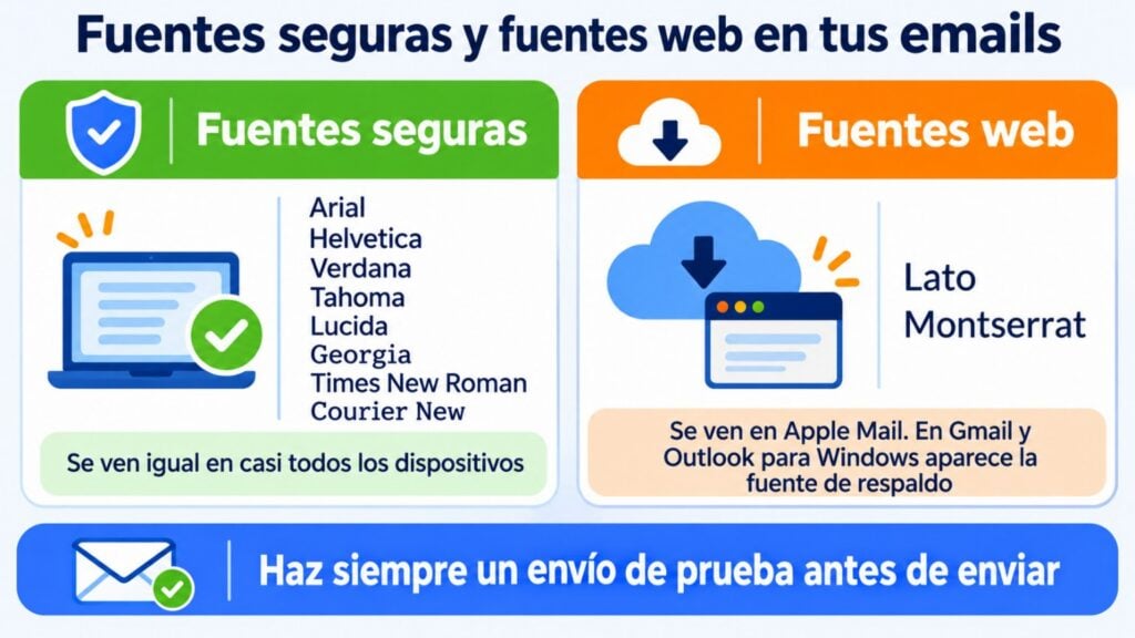
Web-safe fonts come installed on almost every computer and phone, so your email will look the way you designed it. They are Arial, Helvetica, Verdana, Tahoma, Lucida, Georgia, Times New Roman and Courier New.
Lato and Montserrat are web fonts: the email client has to download them to display them. Apple Mail and the iPhone Mail app do. Gmail (on the web and in its apps) and Outlook desktop for Windows don’t.
In those cases the fallback font appears, which is usually a generic sans serif.
That doesn’t mean you should rule them out. You just have to accept that part of your list will see a different font and check that the design holds up to the change.
If you want to learn more about how Outlook behaves, we explain it in our guide to mass email in Outlook.
Choosing the right font is part of your brand image. These tips will help you get it right:
Imagine you choose Montserrat for the headline of your Christmas offer. On the iPhone it looks exactly as you designed it; in Gmail a generic sans serif appears.
If you’ve sent a test beforehand, you’ll know whether you’re happy with both results.
With Mailrelay you don’t have to worry about which fonts work in email: the editor only offers you the ones that display well, with web-safe fonts, two web fonts and a generic fallback option.
You can start from one of our email templates and adjust the typography to your brand. Before sending, you send a test email and check how it looks in your own inboxes.
If you’re torn between two styles, an A/B test will tell you which one works best with your list. Prefer a simpler email? We explain the differences between HTML and plain text.
And if you want a different look in each send, modular email design helps you stay consistent without starting from scratch.
All of this is included in the free account: up to 80,000 emails a month and 20,000 contacts, with human support on every plan. You can see the details on our pricing page.
You won’t find Comic Sans here
But you will find fonts that read well in any inbox, templates and test emails, with human support on every plan.
Comic Sans did exactly what it was asked to do: make a program for beginners less serious.
Its bad reputation comes from being used where it didn’t belong, in angry letters, official statements or major scientific announcements.
The lesson applies to your emails. Typography communicates too, and it has to fit the message and your brand.
Choose a web-safe font for the body, such as Arial or Verdana, add a web font only if it adds something, and always test before sending.
And if you ever miss the lighthearted touch of Comic Sans, remember that you can achieve it with copywriting: a good subject line, a well-placed emoji or one of our funny emails for inspiration.
These are the most common questions about this typeface.
Comic Sans was created by Vincent Connare, a type designer at Microsoft, in 1994. He designed it for the speech bubbles in Microsoft Bob, but he finished it too late and that program never used it.
Mainly because it has been used in serious contexts where its childlike feel doesn’t fit, such as official statements or angry letters.
Its ubiquity for years and designers’ criticism of its spacing also play a part.
Some organizations, such as the British Dyslexia Association, include it among their recommended fonts because its letters are easy to tell apart and its “a” and “g” look like handwritten ones.
Other sans serif fonts, such as Arial or Verdana, serve a similar purpose.
It’s not recommended: it isn’t installed on Android or iOS, so many readers would see a different font. In email it’s best to use web-safe fonts such as Arial, Verdana, Tahoma or Georgia.
If you’re looking for a friendly, readable feel, Verdana and Tahoma are the best alternatives for email.
Outside of email, there’s Comic Neue, a 2014 redesign that keeps the informal style with cleaner strokes.

Jose Argudo
CMO at Mailrelay. Writes about email marketing, copywriting and conversion for small businesses and entrepreneurs.